Pangenome Analysis with Anvi'o: From HPC to Publication-Ready Figures
Pangenome Analysis with Anvi’o: From HPC to Publication-Ready Figures
*🧬 Day 64 of Daily Bioinformatics from Jojy’s Desk
This post walks through a complete pangenome analysis of 15 bacterial genomes using Anvi’o — from raw FASTA files to publication-ready figures. Heavy computation runs on HPC; visualisation and figure generation happen on your laptop. No prior pangenomics experience needed.
What Is a Pangenome — And Why Should You Care?
Imagine you have 15 strains of the same bacterial species isolated from different environments. They’re all the same species, but are they really the same? Do they carry the same genes? Are some strains missing key metabolic pathways? Does your environmental isolate have unique genes not found anywhere else?
A pangenome answers all of these questions at once.
The word “pan” comes from the Greek for “all.” A pangenome represents the complete set of genes across all the genomes in your dataset, organised into three categories:
| Category | Definition | Example |
|---|---|---|
| Core genome | Genes present in all genomes | Housekeeping genes, ribosomal proteins |
| Accessory genome | Genes present in some but not all genomes | Metabolic flexibility, niche adaptation |
| Singleton / unique | Genes present in only one genome | Novel functions, horizontal gene transfer |
💡 In plain terms: The core genome is what makes all your strains the same species. The accessory genome is what makes each strain different. And singletons are what makes one strain truly unique.
In this workflow, we analyse 15 Winogradskyella genomes — a genus of marine bacteria. Our goal: understand what genes are shared, what’s variable, and what’s unique to our environmental isolate PC_D3_3.
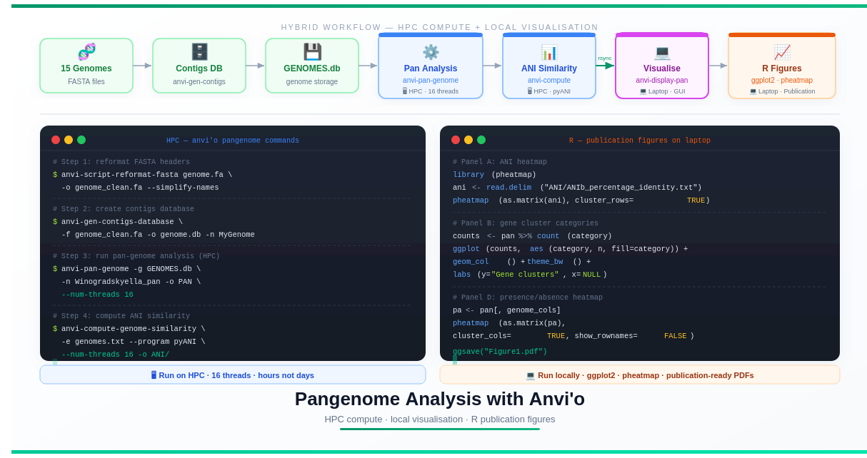
The Big Picture: Hybrid Workflow
One of the challenges of pangenome analysis is that the computational steps are heavy (hours of CPU time, gigabytes of RAM) while the visualisation steps require an interactive graphical interface — something most HPCs don’t support well.
The solution is a hybrid strategy:
HPC Cluster                          Your Laptop
─────────────────────────────────    ──────────────────────────────
1. Reformat FASTA headers            7. Interactive visualisation
2. Create contigs databases    ──▶   8. Export SVG from Anvi'o
3. Build genome storage              9. R figures (ANI heatmap,
4. Run pan-genome analysis               gene cluster bar chart,
5. Compute ANI similarity                presence/absence heatmap)
6. Export summary tables      ──▶   10. Assemble final figure
This is not a limitation — it’s actually a cleaner workflow. Heavy computation belongs on HPC; interactive design work belongs on your laptop.
What You’ll Need
On HPC:
- An active HPC account with at least 16 CPU cores and ~32 GB RAM available
- Conda or Miniconda installed (see Day 2 of our HPC series)
- Internet access to download Anvi’o
On your laptop:
- Conda or Miniconda installed
- R (version ≥ 4.0)
- R packages:
ggplot2,dplyr,tidyr,pheatmap - Enough disk space for the output files (~1–5 GB depending on dataset size)
Your data:
- FASTA files for each genome (one file per genome,
.faor.fastaextension) - All genome files in one directory
Step 1: Install Anvi’o
Anvi’o needs to be installed on both your HPC and your laptop. The HPC installation handles computation; the laptop installation handles visualisation.
# Create a dedicated conda environment — don't install into your base environment
conda create -n anvio-9 python=3.10 -y
conda activate anvio-9

# Install Anvi'o from conda channels
conda install -c conda-forge -c bioconda anvio -y
This takes 5–15 minutes. Grab a coffee.
Once it finishes, verify the installation works:
anvi-self-test
You should see a series of tests run and pass. If you see errors, check the official Anvi’o installation guide — it has excellent troubleshooting steps.
💡 What version are we using? Anvi’o 9 (Sonata). If a newer version is available, it will generally work the same way — command names and core concepts are stable between versions.
Step 2: Organise Your Genome Files
Create a clean project directory and put all your genome FASTA files in one place:
mkdir -p anvio_project/genomes
cd anvio_project/

# Copy your FASTA files in
# Your structure should look like this:
ls genomes/
# PC_D3_3.fa
# GCF_003386165.fa
# GCF_013404085.fa
# GCF_002025905.fa
# ... (15 genomes total)
Naming tip: Use simple, descriptive names. Avoid spaces, special characters, and very long names. PC_D3_3.fa is good. My Genome (environmental isolate, 2024) — FINAL v3.fasta is not.
Step 3: Reformat FASTA Headers
This is a step beginners often skip — and then spend an hour debugging mysterious errors.
Anvi’o requires that FASTA headers are simple and contain no special characters (no spaces, pipes, colons, or parentheses). Reference genomes downloaded from NCBI often have complex headers like:
>NZ_CP023570.1 Winogradskyella sp. PC-D3-3 chromosome, complete genome
Anvi’o will reject this. The anvi-script-reformat-fasta command fixes it automatically:
mkdir genomes_reformatted/

for genome in genomes/*.fa
do
    # Extract the filename without extension for naming
    name=$(basename "$genome" .fa)
    echo "Reformatting: $name"

    anvi-script-reformat-fasta \
        "$genome" \
        -o genomes_reformatted/${name}.fa \
        --simplify-names \
        --report-file genomes_reformatted/${name}_reformat_report.txt
done

echo "All genomes reformatted."
What --simplify-names does: it renames each contig/sequence to a short, clean identifier like c_000000001, c_000000002, etc. The --report-file creates a mapping between the original and new names, so you can always trace back.
After this step:
ls genomes_reformatted/
# PC_D3_3.fa
# GCF_003386165.fa
# ...
# PC_D3_3_reformat_report.txt
# GCF_003386165_reformat_report.txt
# ...
Step 4: Create Contigs Databases
This is Anvi’o’s foundation. Every genome needs its own contigs database — a file that stores the genome sequence, predicted genes, and functional annotations.
mkdir contigs_db/

for genome in genomes_reformatted/*.fa
do
    name=$(basename "$genome" .fa)
    echo "Creating contigs database for: $name"

    anvi-gen-contigs-database \
        -f "$genome" \
        -o contigs_db/${name}.db \
        -n "$name" \
        --num-threads 4
done

echo "All contigs databases created."
What happens under the hood:
- Prodigal identifies and predicts open reading frames (ORFs) — the genes
- Gene sequences are stored in the database
- k-mer frequencies are calculated for each contig
This step takes a few minutes per genome. For 15 genomes, expect 20–45 minutes depending on genome size.
Verify your databases were created:
ls contigs_db/
# PC_D3_3.db
# GCF_003386165.db
# ...

# Check one database
anvi-db-info contigs_db/PC_D3_3.db
Step 5: Run HMM Profiles (Optional but Recommended)
Before building the pangenome, it’s good practice to annotate your genomes with hidden Markov model (HMM) profiles. These identify universal single-copy genes — useful for checking genome completeness and for phylogenetics.
for db in contigs_db/*.db
do
    echo "Running HMMs for: $db"
    anvi-run-hmms -c "$db" --num-threads 4
done
This step uses HMMER to search for bacterial single-copy genes. It takes a few minutes per genome but is worth running — the completeness estimates it produces help you identify low-quality genomes before they distort your pangenome.
Step 6: Create the Genome Storage Database
Now we bring all 15 contigs databases together into a single genome storage database. This is the master file that tells Anvi’o about all your genomes.
First, create a tab-separated file listing your genomes. This is called the external genomes file:
# Create the external genomes file
echo -e "name\tcontigs_db_path" > external-genomes.txt

for db in contigs_db/*.db
do
    name=$(basename "$db" .db)
    echo -e "${name}\tcontigs_db/${name}.db" >> external-genomes.txt
done

# Check it looks right
cat external-genomes.txt
It should look like:
name              contigs_db_path
PC_D3_3           contigs_db/PC_D3_3.db
GCF_003386165     contigs_db/GCF_003386165.db
GCF_013404085     contigs_db/GCF_013404085.db
...
Now create the genome storage:
anvi-gen-genomes-storage \
    -e external-genomes.txt \
    -o GENOMES.db
This creates GENOMES.db — a single database containing references to all 15 genomes. You’ll pass this file to almost every downstream Anvi’o command.
Step 7: Run the Pangenome Analysis
This is the computationally heavy step — run this on HPC, not your laptop.
anvi-pan-genome \
    -g GENOMES.db \
    -n Winogradskyella_pan \
    -o PAN \
    --num-threads 16 \
    --minbit 0.5 \
    --mcl-inflation 10 \
    --use-ncbi-blast
Let’s break down what each flag does:
| Flag | What it does |
|---|---|
-g GENOMES.db | The genome storage we just created |
-n Winogradskyella_pan | Name prefix for all output files |
-o PAN | Output directory |
--num-threads 16 | Use 16 CPU threads (adjust to what your HPC allocation gives you) |
--minbit 0.5 | Sensitivity filter for gene clustering (0.5 is a reasonable default) |
--mcl-inflation 10 | Controls how tightly genes are grouped into clusters (higher = tighter) |
--use-ncbi-blast | Use BLAST for protein similarity (more sensitive than the default DIAMOND) |
For a SLURM job script:
#!/bin/bash
#SBATCH --job-name=pangenome
#SBATCH --output=logs/pangenome_%j.out
#SBATCH --error=logs/pangenome_%j.err
#SBATCH --time=08:00:00
#SBATCH --mem=32G
#SBATCH --cpus-per-task=16

conda activate anvio-9

mkdir -p logs/

anvi-pan-genome \
    -g GENOMES.db \
    -n Winogradskyella_pan \
    -o PAN \
    --num-threads $SLURM_CPUS_PER_TASK \
    --minbit 0.5 \
    --mcl-inflation 10 \
    --use-ncbi-blast
The output is a pan-genome database:
PAN/
├── Winogradskyella_pan-PAN.db      ← the main pan-genome database
└── Winogradskyella_pan-GENOMES.db  ← a copy of genome info
Step 8: Compute Genome Similarity (ANI)
ANI (Average Nucleotide Identity) measures how similar two genomes are at the DNA sequence level. It’s the standard metric for defining bacterial species (≥ 95% ANI = same species).
anvi-compute-genome-similarity \
    -e external-genomes.txt \
    -o ANI \
    --program pyANI \
    --num-threads 16 \
    --pan-db PAN/Winogradskyella_pan-PAN.db
In a SLURM script:
#!/bin/bash
#SBATCH --job-name=ani
#SBATCH --output=logs/ani_%j.out
#SBATCH --time=04:00:00
#SBATCH --mem=16G
#SBATCH --cpus-per-task=16

conda activate anvio-9

anvi-compute-genome-similarity \
    -e external-genomes.txt \
    -o ANI \
    --program pyANI \
    --num-threads $SLURM_CPUS_PER_TASK \
    --pan-db PAN/Winogradskyella_pan-PAN.db
The key output file you’ll use for figures:
ANI/ANIb_percentage_identity.txt
This is a matrix where each cell contains the percentage identity between a pair of genomes.
Step 9: Export Summary Tables
Before downloading to your laptop, export the gene cluster summary — the table that describes every gene cluster, which category it belongs to, and which genomes contain it.
# Export gene cluster summary
anvi-summarize \
    -p PAN/Winogradskyella_pan-PAN.db \
    -g GENOMES.db \
    -o PAN_SUMMARY \
    -C default

# The key file:
# PAN_SUMMARY/Winogradskyella_pan_gene_clusters_summary.txt
Also export specific category lists for downstream R analysis:
# Create output directory for tables
mkdir -p supplementary_tables/

# Quick extraction of cluster categories using anvi-export-table
anvi-export-table \
    PAN/Winogradskyella_pan-PAN.db \
    --table gene_cluster_presence_absence \
    -o supplementary_tables/gene_cluster_presence_absence.tsv
Step 10: The HPC Shortcut — Why Not Visualise There?
Anvi’o has a beautiful interactive viewer accessed with:
anvi-display-pan \
    -p PAN/Winogradskyella_pan-PAN.db \
    -g GENOMES.db
This opens a local web server that you view in a browser. On your laptop, this works perfectly. On HPC, you hit several walls:
- Login nodes don’t allow long-running interactive processes (see Day 3)
- Compute nodes are usually behind firewalls that block browser connections
- Port forwarding is possible but complex to set up and often blocked by institutional IT policies
Rather than fighting the infrastructure, copy the results to your laptop and continue there. This is faster, easier, and means your figure-generation code (R scripts) lives alongside your analysis in a reproducible project.
Step 11: Download Results to Your Laptop
# On your laptop — download the key results
rsync -avz --progress \
    username@hpc.university.edu:~/anvio_project/PAN/ \
    ./anvio_project/PAN/

rsync -avz --progress \
    username@hpc.university.edu:~/anvio_project/ANI/ \
    ./anvio_project/ANI/

rsync -avz --progress \
    username@hpc.university.edu:~/anvio_project/PAN_SUMMARY/ \
    ./anvio_project/PAN_SUMMARY/

rsync -avz --progress \
    username@hpc.university.edu:~/anvio_project/GENOMES.db \
    ./anvio_project/
Your local directory should now look like:
anvio_project/
├── PAN/
│   ├── Winogradskyella_pan-PAN.db
│   └── Winogradskyella_pan-GENOMES.db
├── ANI/
│   └── ANIb_percentage_identity.txt
├── GENOMES.db
└── PAN_SUMMARY/
    └── Winogradskyella_pan_gene_clusters_summary.txt
Step 12: Interactive Visualisation on Your Laptop
With Anvi’o installed locally (same conda install from Step 1), launch the interactive viewer:
conda activate anvio-9

anvi-display-pan \
    -p PAN/Winogradskyella_pan-PAN.db \
    -g GENOMES.db
Anvi’o will open a browser window showing a circular pangenome diagram. Each ring represents one genome; each radial segment represents a gene cluster. Core gene clusters run all the way around; singletons appear in only one ring.
From the viewer you can:
- Colour gene clusters by category (core / accessory / singleton)
- View ANI similarity between genomes
- Inspect specific gene clusters
- Export the figure as SVG: Settings → Export SVG
Save as pangenome_circle.svg — this becomes Panel C of your final figure.
Step 13: Generate Supplementary Tables in R
Switch to R for the quantitative analysis. First, load the gene cluster summary:
library(dplyr)
library(tidyr)

# Load the gene cluster summary table
pan <- read.delim(
    "PAN_SUMMARY/Winogradskyella_pan_gene_clusters_summary.txt",
    check.names = FALSE
)

# Preview the structure
head(pan)
dim(pan)    # rows = gene clusters, columns = metadata + genome columns
The table has columns for metadata (cluster name, genome count, category) and one column per genome (containing 0 or 1 for absent/present).
# Identify which columns are genome columns vs metadata
meta_cols   <- c("gene_cluster_name", "genome_count", "category")
genome_cols <- setdiff(colnames(pan), meta_cols)

cat("Number of gene clusters:", nrow(pan), "\n")
cat("Number of genomes:", length(genome_cols), "\n")
cat("Categories:", unique(pan$category), "\n")
Reshape to long format for counting:
# Convert to long format (one row per genome-cluster pair)
long <- pan %>%
    pivot_longer(
        cols      = all_of(genome_cols),
        names_to  = "genome",
        values_to = "present"
    ) %>%
    filter(present == 1)   # keep only gene clusters present in each genome

# Count gene clusters per genome per category
per_genome <- long %>%
    group_by(genome, category) %>%
    summarise(n = n(), .groups = "drop") %>%
    pivot_wider(
        names_from  = category,
        values_from = n,
        values_fill = 0
    )

# Save as supplementary table
write.table(
    per_genome,
    "supplementary_tables/per_genome_gene_cluster_counts.tsv",
    sep       = "\t",
    quote     = FALSE,
    row.names = FALSE
)

print(per_genome)
Also export per-category tables that become part of your supplementary data:
# Core gene clusters
core <- pan %>%
    filter(category == "CORE") %>%
    select(gene_cluster_name, genome_count, all_of(genome_cols))

write.table(core, "supplementary_tables/core_gene_clusters.tsv",
            sep = "\t", quote = FALSE, row.names = FALSE)

# Accessory gene clusters
accessory <- pan %>%
    filter(category == "ACCESSORY") %>%
    select(gene_cluster_name, genome_count, all_of(genome_cols))

write.table(accessory, "supplementary_tables/accessory_gene_clusters.tsv",
            sep = "\t", quote = FALSE, row.names = FALSE)

# Singleton gene clusters
singletons <- pan %>%
    filter(category == "SINGLETON") %>%
    select(gene_cluster_name, genome_count, all_of(genome_cols))

write.table(singletons, "supplementary_tables/singleton_gene_clusters.tsv",
            sep = "\t", quote = FALSE, row.names = FALSE)

# Unique to PC_D3_3
pc_d3_unique <- pan %>%
    filter(category == "SINGLETON", PC_D3_3 == 1) %>%
    select(gene_cluster_name, genome_count, all_of(genome_cols))

write.table(pc_d3_unique, "supplementary_tables/PC_D3_3_unique_gene_clusters.tsv",
            sep = "\t", quote = FALSE, row.names = FALSE)

cat("PC_D3_3 unique gene clusters:", nrow(pc_d3_unique), "\n")
Step 14: Panel A — ANI Heatmap
library(pheatmap)
library(RColorBrewer)

# Load ANI matrix
ani <- read.delim(
    "ANI/ANIb_percentage_identity.txt",
    row.names = 1,
    check.names = FALSE
)

# ANI values are 0–1; multiply by 100 for percentage
ani_pct <- as.matrix(ani) * 100

# Create heatmap
pdf("figures/Panel_A_ANI_heatmap.pdf", width = 8, height = 7)

pheatmap(
    ani_pct,
    cluster_rows   = TRUE,
    cluster_cols   = TRUE,
    border_color   = NA,
    color          = colorRampPalette(c("#f0f9ff", "#0ea5e9", "#1e3a5f"))(100),
    main           = "Genome Similarity (ANI %)",
    fontsize        = 10,
    fontsize_row    = 9,
    fontsize_col    = 9,
    display_numbers = TRUE,     # show values in cells
    number_format   = "%.1f",   # one decimal place
    number_color    = "white"
)

dev.off()
💡 Interpreting ANI: Values above 95% indicate the same species. Values between 70–95% suggest related species. The heatmap clustering will group your most similar genomes together automatically.
Step 15: Panel B — Gene Cluster Category Counts
library(ggplot2)

# Count clusters per category
counts <- pan %>%
    count(category) %>%
    mutate(category = factor(category, levels = c("CORE", "ACCESSORY", "SINGLETON")))

# Define colours consistent with Anvi'o's default palette
category_colours <- c(
    "CORE"      = "#2a9d8f",
    "ACCESSORY" = "#e9c46a",
    "SINGLETON" = "#e76f51"
)

# Create bar chart
panel_b <- ggplot(counts, aes(x = category, y = n, fill = category)) +
    geom_col(width = 0.6, show.legend = FALSE) +
    geom_text(aes(label = n), vjust = -0.4, fontface = "bold", size = 4) +
    scale_fill_manual(values = category_colours) +
    scale_y_continuous(expand = expansion(mult = c(0, 0.1))) +
    theme_bw(base_size = 12) +
    theme(
        panel.grid.major.x = element_blank(),
        panel.grid.minor   = element_blank(),
        axis.title.x       = element_blank()
    ) +
    labs(
        y     = "Number of gene clusters",
        title = "Pangenome Composition"
    )

ggsave("figures/Panel_B_gene_cluster_categories.pdf",
       panel_b, width = 5, height = 5)

print(panel_b)
Step 16: Panel D — Gene Presence/Absence Heatmap
# Build presence/absence matrix
pa <- pan[, genome_cols]
rownames(pa) <- pan$gene_cluster_name

# Order rows: core first, then accessory, then singletons
row_order <- order(pan$category, pan$genome_count, decreasing = TRUE)
pa_ordered <- pa[row_order, ]

# Create annotation for rows (category)
row_annotation <- data.frame(
    Category = pan$category[row_order]
)
rownames(row_annotation) <- rownames(pa_ordered)

# Annotation colours
ann_colours <- list(
    Category = c(
        "CORE"      = "#2a9d8f",
        "ACCESSORY" = "#e9c46a",
        "SINGLETON" = "#e76f51"
    )
)

pdf("figures/Panel_D_presence_absence_heatmap.pdf", width = 10, height = 8)

pheatmap(
    as.matrix(pa_ordered),
    cluster_rows        = FALSE,      # keep category order
    cluster_cols        = TRUE,       # cluster genomes by similarity
    show_rownames       = FALSE,      # too many clusters to label
    show_colnames       = TRUE,
    annotation_row      = row_annotation,
    annotation_colors   = ann_colours,
    color               = c("#f8fafc", "#0f172a"),   # white = absent, dark = present
    border_color        = NA,
    main                = "Gene Cluster Presence / Absence",
    fontsize_col        = 9,
    gaps_row            = c(
        sum(pan$category[row_order] == "CORE"),
        sum(pan$category[row_order] %in% c("CORE", "ACCESSORY"))
    )
)

dev.off()
Step 17: Assemble the Final Figure
Your four panels are:
| Panel | File | Content |
|---|---|---|
| A | Panel_A_ANI_heatmap.pdf | Genome similarity matrix |
| B | Panel_B_gene_cluster_categories.pdf | Core / accessory / singleton counts |
| C | pangenome_circle.svg | Circular pangenome (exported from Anvi’o viewer) |
| D | Panel_D_presence_absence_heatmap.pdf | Gene presence/absence across all genomes |
Combine them in Inkscape (free), Adobe Illustrator, or Affinity Designer:
- Open a new document at your journal’s required figure width (usually 180 mm for double-column)
- Import each panel individually
- Arrange in a 2×2 grid
- Add panel labels (A, B, C, D) in the top-left corner of each panel — bold, 10pt
- Add a unified legend if needed
- Export as
Figure1.pdf(vector) andFigure1.tiffat 300 DPI (for submission)
┌─────────────────┬─────────────────┐
│  A: ANI Heatmap │  B: Bar Chart   │
│                 │   Core/Acc/Sin  │
├─────────────────┼─────────────────┤
│  C: Circular    │  D: Presence/   │
│  Pangenome      │  Absence Heatmap│
└─────────────────┴─────────────────┘
💡 SVG tip: Panel C (the Anvi’o circle) is exported as SVG, which means it’s a vector graphic — you can resize it to any size without losing quality, and you can edit individual elements in Inkscape.
Complete Project Directory Structure
Here is what your final project should look like:
anvio_project/
│
├── genomes/                    ← original FASTA files
├── genomes_reformatted/        ← clean FASTA files (Anvi'o-compatible)
├── contigs_db/                 ← one .db file per genome
│
├── external-genomes.txt        ← genome list for Anvi'o
├── GENOMES.db                  ← genome storage database
│
├── PAN/                        ← pangenome results
│   ├── Winogradskyella_pan-PAN.db
│   └── Winogradskyella_pan-GENOMES.db
│
├── ANI/                        ← genome similarity results
│   └── ANIb_percentage_identity.txt
│
├── PAN_SUMMARY/                ← exported summary tables
│   └── Winogradskyella_pan_gene_clusters_summary.txt
│
├── supplementary_tables/       ← tables for paper submission
│   ├── per_genome_gene_cluster_counts.tsv
│   ├── core_gene_clusters.tsv
│   ├── accessory_gene_clusters.tsv
│   ├── singleton_gene_clusters.tsv
│   └── PC_D3_3_unique_gene_clusters.tsv
│
├── figures/                    ← publication figures
│   ├── Panel_A_ANI_heatmap.pdf
│   ├── Panel_B_gene_cluster_categories.pdf
│   ├── pangenome_circle.svg
│   ├── Panel_D_presence_absence_heatmap.pdf
│   └── Figure1.pdf             ← final assembled figure
│
└── scripts/
    ├── 01_reformat_fasta.sh
    ├── 02_create_contigs_db.sh
    ├── 03_run_pangenome.sh
    ├── 04_compute_ani.sh
    └── 05_figures.R
Key Results to Report in Your Paper
After running this analysis, you’ll have the numbers to fill in your methods and results sections:
# Quick summary statistics — run this in R
cat("=== Pangenome Summary ===\n")
cat("Total gene clusters:    ", nrow(pan), "\n")
cat("Core gene clusters:     ", sum(pan$category == "CORE"), "\n")
cat("Accessory gene clusters:", sum(pan$category == "ACCESSORY"), "\n")
cat("Singleton gene clusters:", sum(pan$category == "SINGLETON"), "\n")
cat("PC_D3_3 unique clusters:", nrow(pc_d3_unique), "\n")
cat("\n=== Genomes ===\n")
cat("Number of genomes:", length(genome_cols), "\n")
A typical results paragraph looks like:
“The pangenome of 15 Winogradskyella genomes comprised X gene clusters in total. Of these, Y (Z%) constituted the core genome, A (B%) were accessory gene clusters, and C (D%) were singletons unique to individual genomes. The environmental isolate PC_D3_3 harboured E unique gene clusters not found in any other genome in the dataset (Supplementary Table X). Average nucleotide identity (ANI) analysis confirmed that all strains shared >95% identity, consistent with membership in the same species (Figure 1A).”
Common Errors and How to Fix Them
Error: “Sequence names in FASTA have characters Anvi’o doesn’t like”
# Fix: rerun Step 3 with --simplify-names
anvi-script-reformat-fasta genome.fa -o genome_clean.fa --simplify-names
Error: “Some genome names in your external genomes file do not match”
# Check that names in external-genomes.txt exactly match database names
head external-genomes.txt
anvi-db-info contigs_db/PC_D3_3.db | grep "project_name"
# Both should show exactly the same string
Error: anvi-pan-genome runs out of memory
# In your SLURM script, increase memory and reduce threads
#SBATCH --mem=64G
#SBATCH --cpus-per-task=8
# (Fewer threads can sometimes reduce peak memory)
Error: “MCL is not installed”
# Install MCL in your conda environment
conda install -c bioconda mcl -y
R error: “object ‘pan’ not found”
You likely loaded the wrong file or the column names contain extra whitespace. Check with:
names(pan)[1:5]      # check column names
nrow(pan)            # check number of rows
class(pan$category)  # check it's a character/factor
Summary
This workflow demonstrates a clean hybrid approach to pangenome analysis:
| Phase | Where | Tools |
|---|---|---|
| Genome preparation | HPC or laptop | Anvi’o |
| Contigs databases | HPC | Anvi’o + Prodigal |
| Pangenome construction | HPC | Anvi’o + BLAST/DIAMOND + MCL |
| ANI computation | HPC | Anvi’o + pyANI |
| Interactive visualisation | Laptop | Anvi’o browser viewer |
| Figure generation | Laptop | R, ggplot2, pheatmap |
| Final figure assembly | Laptop | Inkscape / Illustrator |
The key insight: don’t fight your HPC’s GUI limitations. Move the results to your laptop and leverage the full power of R for publication-quality figures. The compute belongs on HPC; the creativity belongs on your machine.
References
- Anvi’o: Eren AM et al. (2015) Anvi’o: an advanced analysis and visualization platform for ‘omics data. PeerJ. merenlab.org/software/anvio
- pyANI: Pritchard L et al. (2016) Genomics and taxonomy in diagnostics for food security. Anal. Methods.
- MCL: Enright AJ et al. (2002) An efficient algorithm for large-scale detection of protein families. Nucleic Acids Res.
- pheatmap: Kolde R (2019). pheatmap: Pretty Heatmaps. R package.
Questions about this workflow? Drop a comment below. The complete R script and SLURM submission scripts are available in the companion GitHub repository.