Day 1 — Why Normal Statistics Fail for Microbiome Data (And What We Use Instead)
Day 1 — Why Normal Statistics Fail for Microbiome Data
*This is Day 1 of a 7-day series: Applied Statistics for Microbiome & Genomics Data.* and 🧬 Day 51 of Daily Bioinformatics from Jojy’s Desk All data and R code for this series → github.com/jojyjohn28/microbiome_stats
Let me start with an honest confession.
When I first started working with microbiome data, I did what most people do — I tried to use the statistics I already knew. t-tests. ANOVA. Pearson correlations. They worked fine in other contexts. Why wouldn’t they work here?
They failed. Badly.
Not because I was using them wrong. But because microbiome data breaks almost every assumption those tests are built on. The data is fundamentally different, and it took me a while to really understand why — not just accept it as a rule someone told me.
That’s what this post is about. Before we write a single line of R code, before we run an ordination or a PERMANOVA, I want you to genuinely understand the problem. Because once you do, every method we cover this week will make intuitive sense rather than feeling like a black box you’re supposed to trust.
What Makes Microbiome Data Weird?
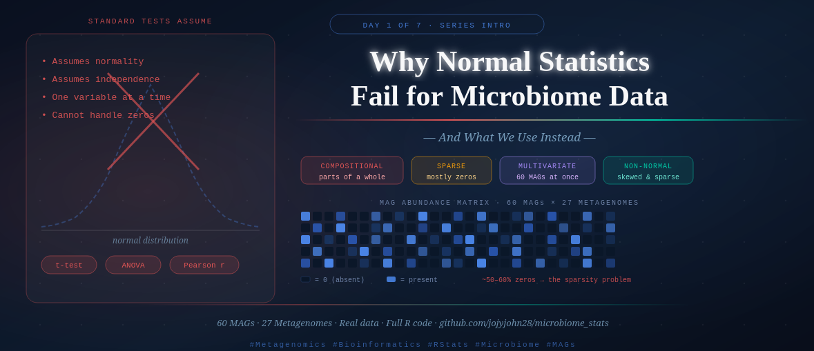
1. It’s Compositional — Counts Are Relative, Not Absolute
Imagine you sequence two samples. In Sample A, you find 1,000 reads from Bacteria X. In Sample B, you find 500 reads from Bacteria X. Is Bacteria X twice as abundant in Sample A?
Not necessarily. It depends on how many total reads you got from each sample. If Sample A had 10,000 total reads and Sample B had 5,000, then Bacteria X makes up exactly 10% of both samples — they’re identical in relative terms.
This is the compositionality problem. Sequencing doesn’t give us absolute counts of microorganisms. It gives us proportions — each MAG or taxon’s abundance is expressed relative to the total sequencing effort. The data always sums to a constant (100%, or total reads), which creates spurious correlations and violates the independence assumptions of standard statistical tests.
A t-test doesn’t know that your numbers are parts of a whole. It treats them as independent measurements. That’s a problem.
2. It’s Sparse — Most Values Are Zero
In a typical MAG abundance table, the majority of cells are zero. A MAG recovered from one environment simply doesn’t appear in another. With 60 MAGs across 27 metagenomes, you might expect 30–60% of your table to be zeros — sometimes more.
Standard statistical methods hate zeros. Log-transformations break at zero. Distance calculations behave strangely when half your data points are identical zeros. Normal distributions have no concept of “absent.”
The sparsity also means your data is highly skewed — a few dominant MAGs have very high abundance, while most have very low or zero abundance. That distribution looks nothing like a bell curve.
3. It’s Multivariate — You Have Many Variables at Once
When you measure blood pressure, you get one number. When you sequence a metagenome, you get 60 MAG abundances simultaneously — 60 variables, all potentially interacting, all measured from the same sample.
Standard tests like t-tests and ANOVA are univariate — they test one variable at a time. You could run 60 separate t-tests (one per MAG). But then you’ve run 60 tests, and by chance alone you’d expect 3 false positives at p < 0.05. Your results would be meaningless.
Microbiome community analysis requires methods that handle all variables together — treating the community as a whole rather than as 60 independent measurements.
4. It’s Non-Normal — The Distributions Are Exotic
The normal (Gaussian) distribution — the famous bell curve — underlies most classical statistics. t-tests, ANOVA, Pearson correlation, linear regression all assume your data is approximately normally distributed.
Microbiome abundance data is not. It tends to follow distributions that are:
- Zero-inflated (excess zeros from absent taxa)
- Right-skewed (a few very abundant taxa, many rare ones)
- Overdispersed (more variance than a Poisson or binomial model would predict)
You can sometimes transform the data to approximate normality (Hellinger transformation, log-ratio transformation), but the underlying biology of the data means you always need to think carefully about whether your assumptions hold.
What Does “Community-Level Analysis” Actually Mean?
Here’s the conceptual shift that changes everything.
In most biology, you ask: “Is gene X differentially expressed?” or “Is species Y more abundant in treatment A?” — one variable, one question.
In microbiome ecology, the primary question is different: “Are these communities different?”
Not one MAG. Not one taxon. The whole community at once — the combination of which organisms are present, in what proportions, and how that combination shifts across samples or conditions.
Think of it like comparing two orchestras. You wouldn’t just compare the number of violins and call that a comparison. You’d compare the full composition — how many of each instrument, how they’re arranged, how the overall sound differs. Community-level analysis is comparing the full orchestra, not individual instruments.
This is why we need:
- Ordination methods (RDA, dbRDA) — to visualize community composition in reduced-dimensional space
- Permutation tests (PERMANOVA) — to test whether community differences are statistically real
- Distance matrices (Bray-Curtis, UniFrac) — to quantify how different two communities are as a whole
So What Do We Use Instead?
Here’s the roadmap for this week — and the logic behind the order:
Day 2 — RDA & dbRDA (Constrained Ordination) We visualize how communities vary across environmental gradients. Euclidean distances for transformed data, Bray-Curtis for raw abundance — and why that choice matters.
Day 3 — PERMANOVA We’ve seen the groups separate visually. Now we test whether the separation is statistically real — using permutation rather than distributional assumptions.
Day 4 — Non-Parametric Tests For taxon-level comparisons (not community-level), we use Wilcoxon and Kruskal-Wallis tests — the non-parametric alternatives to t-tests and ANOVA that don’t assume normality.
Day 5 — Multiple Regression We ask which environmental variables best predict gene or MAG abundance, and how to interpret those relationships biologically.
Day 6 — WGCNA We stop asking about individual MAGs and start asking about modules of co-occurring MAGs — groups that rise and fall together across samples.
Day 7 — Full Workflow Synthesis How all of these methods connect in a real paper, and how to structure a results section that tells a coherent biological story.
The Data We’ll Use All Week
Every post in this series uses the same two files. I want you to recognize them by Day 7 like old friends.
The data comes from a real metagenomic study: 60 Metagenome-Assembled Genomes (MAGs) recovered across 27 metagenomes from different environments. These MAGs represent microbial populations — organisms assembled from sequencing reads without culturing.
All data and code are available at: 🔗 github.com/jojyjohn28/microbiome_stats
File 1: mag_abundance.csv
This is your community matrix — the core data object in every analysis.
- Rows = metagenome samples (27 samples)
- Columns = MAGs (60 MAGs)
- Values = relative abundance of each MAG in each sample
# Load and take a first look
library(tidyverse)

mag_abundance <- read.csv("data/mag_abundance.csv", row.names = 1)

dim(mag_abundance)      # should be 27 rows × 60 columns
head(mag_abundance[, 1:5])   # first look at 5 MAGs
What you’ll notice immediately:
- Many zeros — MAGs absent from most samples
- Values between 0 and 1 (relative abundances)
- High variability across samples — some MAGs are everywhere, most are rare
File 2: metadata.csv
This is your environmental context — what makes samples different from each other.
- Rows = metagenome samples (same 27 samples, same order)
- Columns = environmental and sample variables (salinity, season, location, etc.)
metadata <- read.csv("data/metadata.csv", row.names = 1)

dim(metadata)           # 27 rows × however many metadata columns
head(metadata)          # see what variables you're working with
colnames(metadata)      # list all metadata variables
The metadata is what gives the community data biological meaning. Without it, you just have a table of numbers. With it, you can ask: Do communities differ by salinity? By season? By sampling location? That’s the bridge between pattern and biology.
Checking the Data — Always Do This First
Before any analysis, verify that your samples are in the same order in both files:
# Critical check — rows must match between files
all(rownames(mag_abundance) == rownames(metadata))
# Should return TRUE

#if not returing true, run the below
# Check whether sample names match
identical(colnames(mag_raw), rownames(metadata))

# If not, inspect differences
setdiff(colnames(mag_raw), rownames(metadata))
setdiff(rownames(metadata), colnames(mag_raw))

# Reorder metadata to match abundance table if names are the same but order differs
metadata <- metadata[colnames(mag_raw), , drop = FALSE]

# Check again
identical(colnames(mag_raw), rownames(metadata)) #will return true

# Quick summary of the abundance table
summary(rowSums(mag_abundance))   # row sums (should be ~1 if relative abundance)
sum(mag_abundance == 0) / prod(dim(mag_abundance)) * 100  # % zeros
This sparsity check alone is revealing. When you run it on this data and see that a significant percentage of the table is zeros, you’ll understand viscerally why we don’t just run a t-test.
A Note on Transformation
We’ll cover this in depth on Day 2, but plant this idea now: the same abundance data can be transformed in different ways depending on the analysis.
- Hellinger transformation — square root of relative abundance. Reduces the influence of very abundant MAGs. Used before RDA.
- Bray-Curtis dissimilarity — a distance metric calculated directly from raw relative abundances. Used in dbRDA and PERMANOVA.
- Log-ratio transformation (CLR) — the compositionally correct approach, increasingly used in modern microbiome work.
No single transformation is universally correct. The choice depends on your question and your method. We’ll make that choice explicitly and justify it each time.
⚠️ Common Mistakes to Avoid
Mistake 1: Running t-tests on individual MAGs without multiple testing correction. With 60 MAGs, you’ll get ~3 false positives by chance at p < 0.05. Always correct for multiple comparisons (Day 4 covers this).
Mistake 2: Treating relative abundance as absolute abundance. A MAG that increases in relative abundance might be doing so because something else decreased — not because it truly grew. Keep compositionality in mind throughout.
Mistake 3: Skipping the data check. If your metadata rows don’t match your abundance matrix rows, every analysis silently produces wrong results. Always verify alignment before starting.
Mistake 4: Log-transforming zeros. log(0) is undefined (-Inf in R). If you log-transform without adding a pseudocount, your analysis will fail or produce garbage. Use appropriate transformations — covered on Day 2.
Mistake 5: Jumping straight to ordination without understanding your data. Look at your data first. Check distributions, zeros, outliers. A 10-minute exploration prevents hours of debugging later.
🧭 Key Takeaways
- Microbiome data is compositional (relative, not absolute), sparse (many zeros), multivariate (many variables at once), and non-normal — each property breaks standard statistical assumptions in a different way.
- Community-level analysis treats the full assemblage of organisms as the unit of study, not individual taxa in isolation.
- We need specialized methods — ordination, permutation tests, non-parametric comparisons — because classical tests were not designed for this data structure.
- Our dataset: 60 MAGs × 27 metagenomes, two files (
mag_abundance.csv+metadata.csv), used consistently across all 7 days. - Always check your data before any analysis: dimensions, zero percentage, and row alignment between files.
🔗 What’s Next
Tomorrow on Day 2, we run our first real analysis — constrained ordination with RDA and dbRDA. We’ll ask: Do the environmental variables in our metadata explain the community composition patterns we see across samples? And we’ll visualize the answer with ggplot2.
By the end of Day 2, you’ll have your first publication-quality ordination plot.
All R code and data for this series: github.com/jojyjohn28/microbiome_stats Found this useful? Share it with someone learning microbiome stats — and follow along for Day 2 tomorrow.
🧬 Day 51 — Daily Bioinformatics from Jojy’s Desk