Day 7: Comparative Genomics & Statistical Analysis - Connecting Genomes to Environment
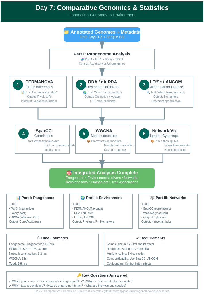
Day 7: Comparative Genomics & Statistical Analysis
| Estimated Time: 6-8 hours | Difficulty: Advanced | Prerequisites: Days 1-6 |
📚 Table of Contents
- Introduction
- Part I: Pangenome Analysis
- Part II: Environmental Associations
- Part III: Co-occurrence Networks
- Part IV: Advanced Statistical Tests
- Integration & Interpretation
🎯 Introduction
Welcome to Day 7! You’ve annotated genomes and discovered specialized functions. Now the critical questions:
Comparative Genomics:
- What genes are shared vs. unique?
- How do strains differ functionally?
- What defines core vs. accessory genome?
Environmental Associations:
- How do environmental factors influence microbiome composition?
- Which taxa associate with specific conditions?
- What drives community assembly?
Network Analysis:
- Which organisms co-occur?
- What metabolic interactions exist?
- How do communities respond to perturbations?
📊 Part I: Pangenome Analysis
Overview
Pangenome = Core genome (all strains) + Accessory genome (some strains) + Unique genes (one strain)
Quick Guide to Tools
1. PanX (Recommended - Detailed Post Available)
See our comprehensive PanX tutorial: [Link to your detailed blog post]
Quick start:
# Install
git clone https://github.com/neherlab/pan-genome-analysis.git
cd pan-genome-analysis

# Run PanX
./panX.py -fn input_genomes/ -sl species_name -t 8

# View results
firefox vis/index.html
Key outputs:
- Core/accessory gene counts
- Gene presence/absence matrix
- Phylogenetic tree + gene gain/loss
- Interactive visualization
When to use: Multiple strains of same species, want interactive viz
Detailed tutorial available - See our full PanX blog post for complete workflow! https://jojyjohn28.github.io/blog/panx-pangenome-analysis/
2. Anvi’o (Comprehensive Platform)
Installation:
conda create -n anvio-7.1 -c bioconda -c conda-forge anvio=7.1
conda activate anvio-7.1
Quick pangenome workflow:
# Step 1: Create contigs database per genome
for genome in genomes/*.fa; do
    name=$(basename $genome .fa)
    anvi-gen-contigs-database -f $genome -o ${name}.db
    anvi-run-hmms -c ${name}.db
done

# Step 2: Create genomes storage
anvi-gen-genomes-storage -e external-genomes.txt -o GENOMES.db

# Step 3: Run pangenome
anvi-pan-genome -g GENOMES.db \
                --project-name my_pangenome \
                --num-threads 8

# Step 4: Visualize
anvi-display-pan -p my_pangenome/my_pangenome-PAN.db \
                 -g GENOMES.db
Anvi’o strengths:
- Beautiful interactive interface
- Integrates metabolism (KEGG)
- Functional enrichment analysis
- Publication-quality figures
Note: Full Anvi’o tutorial coming soon! This is a quick-start version.
3. Roary (Fast - Good for Windows)
Installation:
conda create -n roary -c bioconda roary
conda activate roary
Usage:
# Requires GFF files from Prokka
roary -p 8 -e -n -v prokka_gff/*.gff

# Outputs
# gene_presence_absence.csv  - Main results
# core_gene_alignment.aln    - For phylogeny
Visualize with Phandango:
# Upload to https://jameshadfield.github.io/phandango/
# Files: gene_presence_absence.csv + tree.nwk
Roary advantages:
- Very fast (1000s of genomes)
- Simple to use
- Works on Windows (via WSL or Conda)
- Great for quick comparisons
4. BPGA (Bacterial Pangenome Analysis)
Good for Windows users!
Download: http://www.iicb.res.in/bpga/download.html
GUI workflow:
- Import GFF/GBK files
- Select analysis options
- Run pangenome
- Export results
Features:
- User-friendly GUI
- No command line needed
- Phylogenetic analysis
- Functional classification
Best for: Windows users, small-medium datasets (<100 genomes)
Pangenome Interpretation
Key metrics:
# Calculate pangenome statistics
import pandas as pd

# Read gene presence/absence
pa = pd.read_csv('gene_presence_absence.csv')

n_genomes = len(pa.columns) - 14  # Subtract metadata columns

# Core genes (in all genomes)
core = pa[pa.iloc[:, 14:].sum(axis=1) == n_genomes]
print(f"Core genes: {len(core)} ({len(core)/len(pa)*100:.1f}%)")

# Accessory genes (in some genomes)
accessory = pa[(pa.iloc[:, 14:].sum(axis=1) > 1) &
               (pa.iloc[:, 14:].sum(axis=1) < n_genomes)]
print(f"Accessory genes: {len(accessory)} ({len(accessory)/len(pa)*100:.1f}%)")

# Unique genes (in one genome)
unique = pa[pa.iloc[:, 14:].sum(axis=1) == 1]
print(f"Unique genes: {len(unique)} ({len(unique)/len(pa)*100:.1f}%)")

# Pangenome size
print(f"Pangenome size: {len(pa)} genes")
Typical results:
- Core genome: 40-60% of pangenome
- Accessory: 30-50%
- Unique: 10-20%
🌍 Part II: Environmental Associations
Understanding Metadata Effects
Research questions:
- How does pH affect community composition?
- Which taxa are enriched in diseased vs. healthy samples?
- Do temporal patterns exist?
Data Preparation
# Load packages
library(vegan)
library(phyloseq)
library(ggplot2)

# Create abundance matrix
# Rows = samples, Columns = MAGs/taxa
abundance <- read.csv('mag_abundance.csv', row.names=1)

# Load metadata
metadata <- read.csv('sample_metadata.csv', row.names=1)
# Columns: pH, Temperature, Season, Treatment, etc.

# Ensure matching
abundance <- abundance[rownames(metadata), ]
PERMANOVA: Testing Community Differences
PERMANOVA (Permutational Multivariate Analysis of Variance) tests if groups have different centroids.
library(vegan)

# Calculate Bray-Curtis distance
dist_matrix <- vegdist(abundance, method="bray")

# Test effect of treatment
permanova_result <- adonis2(dist_matrix ~ Treatment,
                           data=metadata,
                           permutations=999)
print(permanova_result)

# Multiple factors
permanova_multi <- adonis2(dist_matrix ~ Treatment + pH + Temperature,
                          data=metadata,
                          permutations=999)
print(permanova_multi)

# Pairwise comparisons
library(pairwiseAdonis)
pairwise <- pairwise.adonis(dist_matrix,
                            metadata$Treatment,
                            p.adjust.m="BH")
Interpretation:
- P < 0.05: Groups significantly different
- R² value: Proportion of variance explained
- Higher R² = stronger effect
RDA & db-RDA: Constrained Ordination
RDA (Redundancy Analysis) = PCA + regression
db-RDA = RDA on distance matrix
# RDA (for Hellinger-transformed data)
abundance_hell <- decostand(abundance, method="hellinger")

rda_result <- rda(abundance_hell ~ pH + Temperature + Nutrients,
                  data=metadata)

# Summary
summary(rda_result)

# Plot
plot(rda_result, scaling=2)
ordisurf(rda_result, metadata$pH, add=TRUE)

# Significance testing
anova(rda_result, permutations=999)
anova(rda_result, by="terms", permutations=999)  # Individual terms
anova(rda_result, by="axis", permutations=999)   # Individual axes
db-RDA (distance-based):
# For Bray-Curtis or other distances
dbrda_result <- capscale(dist_matrix ~ pH + Temperature + Nutrients,
                         data=metadata)

# Plot with environmental vectors
plot(dbrda_result)
ef <- envfit(dbrda_result, metadata[,c("pH", "Temperature", "Nutrients")],
             perm=999)
plot(ef, p.max=0.05, col="red")

# Variance partitioning
varpart_result <- varpart(abundance_hell,
                         ~pH, ~Temperature, ~Nutrients,
                         data=metadata)
plot(varpart_result)
When to use:
- RDA: Linear responses
- db-RDA: Non-linear responses, any dissimilarity metric
- PERMANOVA: Overall group differences
Differential Abundance Analysis
LEfSe (Linear discriminant analysis Effect Size)
# Format data for LEfSe
# First line: sample IDs
# Second line: class (e.g., Healthy vs Disease)
# Third line: subclass (optional)
# Remaining: feature abundances

# Run LEfSe
lefse_format_input.py input.txt formatted.txt -c 2 -u 1 -o 1000000
lefse_run.py formatted.txt lefse_results.txt
lefse_plot_res.py lefse_results.txt lefse_plot.pdf
LEfSe identifies: Taxa enriched in specific groups
ANCOM (Analysis of Compositions of Microbiomes)
library(ANCOMBC)

# Run ANCOM-BC2
ancom_result <- ancombc2(data=phyloseq_obj,
                        fix_formula="Treatment + pH",
                        p_adj_method="BH",
                        prv_cut=0.10,
                        group="Treatment")

# View results
ancom_result$res
ANCOM advantage: Handles compositional data properly (avoids false positives)
🕸️ Part III: Co-occurrence Networks
Why Networks?
Research questions:
- Which organisms co-occur?
- Are there keystone species?
- What microbial interactions exist?
- How does network structure change with conditions?
SparCC: Correlation for Compositional Data
# Install SparCC
git clone https://github.com/bio-developer/SparCC3.git
cd SparCC3

# Run SparCC
python SparCC.py abundance.txt -i 20 --cor_file=sparcc_corr.txt

# Calculate p-values (100 permutations)
python MakeBootstraps.py abundance.txt -n 100 -o bootstraps/
for i in {0..99}; do
    python SparCC.py bootstraps/boot_$i.txt -i 20 --cor_file=bootstraps/cor_$i.txt
done
python PseudoPvals.py sparcc_corr.txt bootstraps/cor_ 100 -o sparcc_pvals.txt
Why SparCC? Handles compositionality better than Pearson/Spearman
Network Visualization
library(igraph)
library(ggraph)

# Read correlations
corr <- read.table('sparcc_corr.txt', row.names=1, header=T)
pvals <- read.table('sparcc_pvals.txt', row.names=1, header=T)

# Filter significant correlations
corr[pvals > 0.05] <- 0
corr[abs(corr) < 0.3] <- 0  # Only strong correlations

# Create network
net <- graph_from_adjacency_matrix(as.matrix(corr),
                                   mode="undirected",
                                   weighted=TRUE,
                                   diag=FALSE)

# Remove isolated nodes
net <- delete.vertices(net, degree(net)==0)

# Plot
plot(net,
     vertex.size=5,
     vertex.color=ifelse(V(net)$corr>0, "red", "blue"),
     edge.color=ifelse(E(net)$weight>0, "red", "blue"),
     edge.width=abs(E(net)$weight)*2)

# Network statistics
transitivity(net)  # Clustering coefficient
average.path.length(net)  # Average path length
degree.distribution(net)  # Degree distribution

# Identify hubs (highly connected nodes)
hubs <- which(degree(net) > mean(degree(net)) + 2*sd(degree(net)))
V(net)$name[hubs]
WGCNA: Weighted Gene Co-expression Network Analysis
For gene-level or MAG-level modules
library(WGCNA)

# Prepare data (samples as rows)
datExpr <- t(abundance)

# Choose soft threshold
powers <- c(1:20)
sft <- pickSoftThreshold(datExpr, powerVector=powers, verbose=5)
plot(sft$fitIndices[,1], sft$fitIndices[,2],
     xlab="Soft Threshold", ylab="Scale Free Topology Model Fit")

# Construct network
net <- blockwiseModules(datExpr,
                       power=sft$powerEstimate,
                       TOMType="unsigned",
                       minModuleSize=5,
                       reassignThreshold=0,
                       mergeCutHeight=0.25,
                       numericLabels=TRUE,
                       pamRespectsDendro=FALSE,
                       verbose=3)

# Module colors
moduleColors <- labels2colors(net$colors)

# Correlate modules with traits
moduleTraitCor <- cor(net$MEs, metadata[,c("pH", "Temperature")],
                     use="p")
moduleTraitPvalue <- corPvalueStudent(moduleTraitCor, nrow(datExpr))

# Visualize
textMatrix <- paste(signif(moduleTraitCor, 2), "\n(",
                   signif(moduleTraitPvalue, 1), ")", sep="")
labeledHeatmap(Matrix=moduleTraitCor,
              xLabels=colnames(metadata[,c("pH", "Temperature")]),
              yLabels=names(net$MEs),
              colors=blueWhiteRed(50),
              textMatrix=textMatrix,
              cex.text=0.5)

# Export network
exportNetworkToCytoscape(net$TOM,
                        edgeFile="CytoscapeInput-edges.txt",
                        nodeFile="CytoscapeInput-nodes.txt",
                        weighted=TRUE,
                        threshold=0.02)
WGCNA identifies: Modules of co-expressed genes/MAGs and their environmental associations
📈 Part IV: Advanced Statistical Tests
Mantel Test: Matrix Correlation
# Test correlation between distance matrices
mantel_result <- mantel(dist_matrix_community,
                       dist_matrix_environmental,
                       method="spearman",
                       permutations=999)

# Partial Mantel (control for third variable)
partial_mantel <- mantel.partial(dist_matrix_community,
                                dist_matrix_environmental,
                                dist_matrix_geographic,
                                method="spearman",
                                permutations=999)
Use case: Do environmental distances predict community distances?
Procrustes Analysis: Shape Comparison
# Compare two ordinations
prc <- protest(rda1, rda2, permutations=999)
plot(prc)

# Correlation
prc$t0  # Procrustes correlation
prc$signif  # P-value
Use case: Do two datasets show similar patterns?
Distance-based Linear Models (DistLM)
library(mvabund)

# Fit model
distlm_result <- manyglm(abundance ~ pH + Temperature + Treatment,
                        data=metadata,
                        family="negative.binomial")

# ANOVA
anova(distlm_result)

# Plot
plot(distlm_result)
🔗 Integration & Interpretation
Complete Workflow Example
# 1. Test overall differences
permanova <- adonis2(dist_matrix ~ Treatment, data=metadata)

# 2. Identify which taxa differ
deseq_results <- DESeq2_analysis()
sig_taxa <- deseq_results[deseq_results$padj < 0.05, ]

# 3. Test environmental associations
rda_result <- rda(abundance ~ pH + Temperature, data=metadata)

# 4. Build co-occurrence network
network <- sparcc_network(abundance)

# 5. Find modules correlated with environment
wgcna_modules <- WGCNA_analysis(abundance, metadata)

# 6. Identify keystone species
keystone <- identify_hubs(network)

# 7. Create integrated visualization
integrated_plot(permanova, deseq_results, network, wgcna_modules)
Interpretation Framework
Question 1: Are communities different?
- PERMANOVA: P < 0.05 → Yes, significantly different
- R² = 0.3 → Treatment explains 30% of variation
Question 2: Which taxa drive differences?
- DESeq2/LEfSe: 15 MAGs enriched in treatment
- Indicator species analysis: 8 strong indicators
Question 3: What environmental factors matter?
- RDA: pH (R² = 0.25, P < 0.001) most important
- Temperature (R² = 0.10, P < 0.01) secondary
Question 4: How do organisms interact?
- Network: 150 significant correlations
- 5 modules identified via WGCNA
- 3 keystone hub species
Question 5: Integration
- Hub species enriched in treatment group
- Module 1 correlates with pH (r = 0.7, P < 0.001)
- Core pangenome includes pH response genes
💡 Best Practices
Statistical Considerations
- Multiple testing correction - Always adjust P-values (BH, Bonferroni)
- Sample size - Need n > 20 for robust statistics
- Compositionality - Use appropriate methods (SparCC, ANCOM)
- Confounders - Control for batch effects, sequencing depth
- Replication - Biological replicates > technical replicates
Data Transformation
# For count data
abundance_hell <- decostand(abundance, "hellinger")  # RDA
abundance_clr <- compositions::clr(abundance)  # PCA

# For distances
dist_bray <- vegdist(abundance, "bray")  # General
dist_jaccard <- vegdist(abundance, "jaccard")  # Presence/absence
dist_unifrac <- UniFrac(phyloseq_obj, weighted=TRUE)  # Phylogenetic
🔧 Troubleshooting
PERMANOVA: High dispersion
# Test homogeneity of dispersion
betadisper_result <- betadisper(dist_matrix, metadata$Treatment)
permutest(betadisper_result)

# If P < 0.05, use PERMDISP2 instead of PERMANOVA
RDA: Collinearity issues
# Check VIF (Variance Inflation Factor)
vif.cca(rda_result)

# VIF > 10: Remove collinear variables
Networks: Too sparse/dense
# Adjust correlation threshold
min_corr <- 0.3  # Increase for sparser network
max_corr <- 0.8  # Decrease for denser network

# Adjust p-value
max_pval <- 0.05  # More stringent = sparser
📊 Visualization Gallery
Publication-Quality Plots
# NMDS with environmental vectors
nmds <- metaMDS(abundance, distance="bray")
plot(nmds)
ef <- envfit(nmds, metadata, permutations=999)
plot(ef, p.max=0.05, col="red", cex=1.2)

# Network with ggraph
ggraph(network, layout="fr") +
  geom_edge_link(aes(color=weight), alpha=0.5) +
  geom_node_point(aes(size=degree, color=module)) +
  theme_graph()

# Heatmap with metadata
pheatmap(abundance,
        annotation_col=metadata,
        scale="row",
        clustering_distance_rows="correlation")
✅ Success Checklist
- Pangenome analyzed (core/accessory defined)
- PERMANOVA tests completed
- Environmental associations identified (RDA/db-RDA)
- Differential abundance analysis done
- Co-occurrence network constructed
- Network modules correlated with metadata
- Key findings integrated and interpreted
📚 Key Resources
Pangenomics
- PanX - See my detailed tutorial https://jojyjohn28.github.io/blog/panx-pangenome-analysis/
- Anvi’o
- Roary
- BPGA
Statistical Analysis
Networks
➡️ What’s Next?
Congratulations! You’ve completed the core metagenomics analysis pipeline!
Next steps:
- Workflow Wrappers & Web Platforms
- MetaWRAP for complete workflows
- Galaxy for web-based analysis
- KBase platform
Repo for today’s code and other details
🔗 Day 7 →
Last updated: February 2026