Genome Visualization Tools — A Beginner's Guide to Seeing Your Genome
Genome visualization tools — a beginner’s guide to seeing your genome
🧬 𝐷𝑎𝑦 72 𝑜𝑓 𝐷𝑎𝑖𝑙𝑦 𝐵𝑖𝑜𝑖𝑛𝑓𝑜𝑟𝑚𝑎𝑡𝑖𝑐𝑠 𝑓𝑟𝑜𝑚 𝐽𝑜𝑗𝑦’𝑠
You assembled a genome. Or you downloaded one from NCBI. You have a .fasta or a .gbk file sitting on your computer, and you want to actually see what is in it — genes, GC content, features, how everything is arranged.
But where do you start?
This post introduces four tools that cover the main use cases: from beautiful one-click circular maps to detailed interactive genome browsing. No programming background is needed for any of these (though a command line helps for one of them).
A quick primer: what are we visualizing?
A genome file contains DNA sequence. By itself, sequence is just a string of A, T, G, C characters — not very useful visually. What makes visualization meaningful is annotation: knowing where genes start and stop, which strand they are on, what they encode, whether regions have unusual GC content or repeats.
The most common file formats you will encounter:
| Format | What it contains | Common extension |
|---|---|---|
| FASTA | Raw sequence only | .fa, .fasta, .fna |
| GenBank | Sequence + annotations | .gb, .gbk, .gbff |
| GFF3 | Annotations only (no sequence) | .gff, .gff3 |
| BAM/CRAM | Short read alignments to a reference | .bam, .cram |
Most visualization tools want either a GenBank file (sequence + annotations bundled together) or a FASTA + GFF3 pair (sequence and annotations separately). If you only have a FASTA, you will need to annotate it first — tools like Prokka or PGAP do this automatically for prokaryotes.
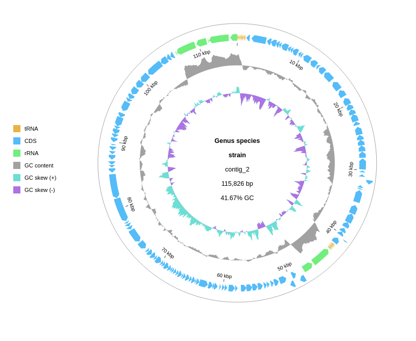
Tool 1: Proksee — the easiest starting point
What it is: A browser-based platform for prokaryotic genome visualization and annotation. No installation, no command line, no account required to get started.
Best for: Beginners who want a visual result in minutes. Also excellent for running annotation tools (Prokka, CARD, AMRFinder) directly on the platform.
Website: proksee.ca
What Proksee does
Upload a FASTA file, and Proksee builds a circular genome map immediately. From there you can:
- Run Prokka to annotate genes directly inside the browser
- Add tracks for GC content, GC skew, COG categories, AMR genes, prophages
- Customize colours, labels, and legend
- Download PNG, SVG, or a JSON archive of your project
Step-by-step: from raw FASTA to annotated circular map
1. Upload your genome
Go to proksee.ca → New Project → Browse → select your .fasta or .fa file → Create Map.
The status page will appear for a few seconds while the initial map is built. When it loads, you will see a circular map — mostly empty, because you have not added annotations yet.
2. Run Prokka for annotation
In the right-hand Sidebar, find the Tools panel → click Prokka → Start. The default settings work well for most bacteria. Click OK.
A Job Tab opens and shows a live log as Prokka runs. For a typical bacterial genome (~4–5 Mb) this takes about 1–2 minutes.
3. Add features to the map
When the job finishes, the Report Card shows a summary (for example: “1,761 features found”). Click Add Features to Map → choose a track and legend → OK.
You will now see all annotated genes on the circular map, colour-coded by feature type.
4. Save your project
This is the most commonly forgotten step. Proksee does not auto-save. Click Save Changes in the top bar before closing the browser tab.
5. Download results
In the Sidebar’s Download panel:
- PNG or SVG for publication-quality images
- JSON to save a complete project archive (can be re-loaded into Proksee later)
- Sequences to export nucleotide or amino acid sequences of annotated features
What the output looks like
The default circular map shows:
- Outer ring: forward-strand CDSs
- Inner ring: reverse-strand CDSs
- GC content track (if added): deviation from mean GC
- GC skew track: positive (leading strand synthesis) vs negative regions
When to use Proksee
- You are new to genome visualization and want results quickly
- You want to run annotation tools without setting up a command-line environment
- You need a clean circular figure for a paper or presentation
- You are working with a prokaryotic genome (Proksee is designed for bacteria and archaea)
Tool 2: gbdraw — publication-quality diagrams from the command line or browser
What it is: A Python-based tool for generating circular and linear genome diagrams. Available as a web app (no installation) or as a Bioconda package for local use.
Best for: Clean, customizable figures for publication. Especially good for comparative genomics (showing BLAST similarity between two genomes side by side).
Web app: gbdraw.app — runs entirely in your browser, your data never leaves your machine.
Citation: Kawato, S. (2026). gbdraw: a genome diagram generator for microbes and organelles. bioRxiv. https://doi.org/10.64898/2026.04.07.716863
What gbdraw does
- Takes a GenBank/DDBJ flatfile or a GFF3 + FASTA pair as input
- Produces circular or linear genome diagrams
- Exports to SVG, PNG, PDF, EPS, or PS
- Supports comparative genomics tracks from BLAST output (outfmt 6 or 7)
- Fine-grained control over colours, labels, legends, and track layout
Using gbdraw in the browser (no installation needed)
Go to gbdraw.app. The interface lets you:
- Upload a GenBank file (
.gbor.gbk) or a GFF3 + FASTA pair - Choose circular or linear layout
- Configure colours and tracks
- Download the resulting SVG or PNG
No Streamlit install, no Python setup. Your data stays on your local machine.
Installing gbdraw locally (Bioconda)
mamba create -n gbdraw -c conda-forge -c bioconda gbdraw
conda activate gbdraw
gbdraw -h
To launch the local GUI version (same interface as the web app, but running on your machine):
gbdraw gui
For PNG/PDF/EPS/PS export from a local install, add the optional export dependency:
python -m pip install -e ".[dev,export]"
Basic command-line usage
Circular diagram from a GenBank file:
gbdraw -i genome.gbk -o my_genome_circle
# Output: my_genome_circle.svg (and .png if export is installed)
Linear diagram:
gbdraw --linear -i genome.gbk -o my_genome_linear
Comparative diagram (two genomes + BLAST output):
# First run BLAST to compare the two genomes
makeblastdb -in genome2.fasta -dbtype nucl
blastn -query genome1.fasta -db genome2.fasta -outfmt 6 -out blast_results.txt

# Then pass both GenBank files and the BLAST result to gbdraw
gbdraw -i genome1.gbk genome2.gbk --blast blast_results.txt -o comparison
What input files does gbdraw need?
Option A — GenBank flatfile (easiest)
If you downloaded your genome from NCBI, the .gbff file from the RefSeq or GenBank FTP already contains everything gbdraw needs. If you assembled and annotated your genome with Prokka, it produces a .gbk file directly.
Option B — GFF3 + FASTA pair
If your annotation is in GFF3 format (common output from PGAP, BAKTA, or manual annotation), keep the .gff3 and .fasta files together and pass both to gbdraw:
gbdraw -i annotation.gff3 genome.fasta -o my_genome
When to use gbdraw
- You need a polished, publication-ready figure (SVG output is fully editable in Illustrator or Inkscape)
- You want to compare two related genomes and show the BLAST similarity as a ribbon between them
- You are working with organelle genomes (mitochondria, chloroplasts) — gbdraw handles these particularly well
- You want fine-grained control over every visual element
Tool 3: Artemis — the full genome browser for detailed annotation work
What it is: A desktop genome browser and annotation editor from the Wellcome Sanger Institute. Written in Java, runs on Windows, Mac, and Linux.
Best for: Detailed inspection of genome features — looking at individual genes, editing annotations, viewing read alignments (via the integrated BamView), and comparing two genomes side by side (via ACT, Artemis Comparison Tool).
Download: github.com/sanger-pathogens/Artemis
The Artemis software suite
The Artemis package includes four tools:
| Tool | What it does |
|---|---|
| Artemis | Genome browser + annotation editor |
| ACT | Pairwise genome comparison viewer |
| BamView | BAM/CRAM read alignment viewer |
| DNAPlotter | Circular and linear genome diagram generator |
Prerequisites
Artemis requires Java 11 or later. The easiest route is:
- Download OpenJDK 11 from adoptopenjdk.net — select OpenJDK 11 + HotSpot for your platform
- Install it
- Download the Artemis release
.jaror OS-specific installer from the GitHub Releases page
If you use Bioconda, you can skip the Java setup entirely:
conda install -c bioconda artemis
What Artemis shows you
When you open a GenBank or GFF3 file in Artemis, you see:
- Sequence view — the raw DNA, scrollable, with annotation features drawn as coloured boxes above and below the sequence (above = forward strand, below = reverse strand)
- Feature list — a table of all annotated features (CDS, rRNA, tRNA, etc.) that you can click to jump to on the sequence
- Six-frame translation — all six reading frames shown simultaneously, letting you spot potential ORFs even in unannotated regions
- Graph tracks — GC content, GC deviation, entropy, and other sequence statistics plotted as graphs that scroll with the sequence
Opening a genome in Artemis
# From the command line (if installed via Bioconda):
art genome.gbk

# Or just double-click the Artemis.jar file and use File > Open
BamView: viewing read alignments inside Artemis
If you have mapped short reads to your genome (producing a .bam file), you can open it inside Artemis to see read depth and individual alignments in context of the annotation:
File → Open BAM / VCF → select your .bam file.
This is particularly useful for:
- Checking coverage of a gene you are interested in
- Identifying regions with unexpectedly high or low coverage
- Inspecting variant sites manually
ACT: comparing two genomes
ACT (Artemis Comparison Tool) takes two genome files and a BLAST comparison file and shows them as horizontal sequence lanes with coloured ribbons connecting regions of similarity. This is the classic view for comparing related bacterial genomes or looking at genomic rearrangements.
# Generate BLAST comparison first
makeblastdb -in genome2.fasta -dbtype nucl -out genome2_db
blastn -query genome1.fasta -db genome2_db -outfmt 6 -out comparison.txt

# Open ACT
act genome1.gbk comparison.txt genome2.gbk
When to use Artemis
- You want to manually inspect and edit gene annotations
- You need to look at specific genes in detail — sequence, translation, qualifiers
- You have read alignments (BAM files) and want to view them in context of annotations
- You are comparing two closely related genomes to identify rearrangements or deletions (use ACT)
- You want six-frame translation to find unannotated ORFs
Tool 4: Bandage — for visualizing assembly graphs
What it is: A desktop tool for visualizing and exploring genome assembly graphs (the output of assemblers like SPAdes, Flye, or Velvet before the final contigs are called).
Best for: Understanding how your assembly went — identifying tangled regions, circular elements (plasmids, circular chromosomes), and repeat-induced complexity.
Download: rrwick.github.io/Bandage
Why assembly graphs matter for beginners
When an assembler processes your reads, it builds a de Bruijn graph or overlap graph before calling contigs. The final contigs you get are just one possible path through this graph. Bandage lets you see the actual graph — which reveals:
- Whether your chromosome assembled into a single clean circle (good) or many tangled fragments (complex repeat structure)
- Plasmids, which often appear as separate circular elements in the graph
- Repeat regions, which appear as “bubbles” or tangles in the graph
How to use Bandage
- Run your assembler and keep the assembly graph file (
.gfafor SPAdes/Flye, or.fastgfor older SPAdes) - Open Bandage → File → Load Graph → select the
.gfafile - Click Draw Graph
The graph is drawn with each node representing a sequence segment and edges representing connections. You can:
- Click on a node to see its sequence and coverage
- BLAST a sequence against the graph to find where it maps
- Label nodes with BLAST hits or taxonomic annotations
When to use Bandage
- Right after assembly, to assess assembly quality
- When you suspect plasmids are present in your sample
- When your assembly has many small contigs and you want to understand why
- For long-read assemblies (Nanopore/PacBio) where circular elements are common
A detailed post is available here Visualizing Genome Assemblies with Bandage
Comparison: which tool should you use?
| Situation | Best tool |
|---|---|
| Quick circular map from a FASTA file | Proksee |
| Publication-quality circular or linear figure | gbdraw |
| Comparing two genomes side by side with BLAST ribbons | gbdraw or Artemis/ACT |
| Detailed gene-level inspection and annotation editing | Artemis |
| Viewing read alignments in context of annotations | Artemis + BamView |
| Understanding assembly quality and finding plasmids | Bandage |
| No installation, browser only | Proksee or gbdraw.app |
A typical beginner workflow
If you are starting from scratch with a newly assembled bacterial genome:
Step 1 — Assess assembly quality: Open the assembly graph in Bandage. Check whether the chromosome assembled as a single circle or many fragments. Identify any plasmid-sized circular elements.
Step 2 — Annotate: Use Prokka (either via command line or directly inside Proksee) to call genes, rRNAs, tRNAs, and other features. This produces a GenBank file.
Step 3 — Quick visualization: Load the Prokka GenBank output into Proksee for an immediate interactive circular map. Add GC content and GC skew tracks. This is your working figure for lab meetings and presentations.
Step 4 — Publication figure: Once you are happy with the annotation, pass the GenBank file to gbdraw (web app or command line) for a clean, fully exportable SVG/PDF figure.
Step 5 — Detailed inspection: Open the GenBank file in Artemis when you need to look at specific genes in detail, compare two strains with ACT, or overlay read alignments from a BAM file.
Common beginner mistakes
Mistake 1: Trying to visualize a FASTA file directly
A raw FASTA file has no annotation. Circular map tools will show you a circle with nothing on it. Annotate first with Prokka (or download a GenBank file from NCBI that already has annotations).
Mistake 2: Forgetting to save in Proksee
Proksee does not auto-save. If you close the tab before clicking Save Changes, your annotation additions and visual customizations are gone. Save early, save often.
Mistake 3: Not checking the assembly graph before publishing
Many beginners go straight from assembly to annotation without ever looking at the assembly graph. A Bandage plot takes five minutes and can reveal that what you thought was a single chromosome is actually three disconnected large contigs — that changes how you interpret everything downstream.
Mistake 4: Using a circular map tool for a multi-contig assembly
Proksee and gbdraw work best with complete or near-complete single-contig assemblies. If your assembly has 50 contigs, a circular map will concatenate them in an arbitrary order and the result will be visually misleading. Fix the assembly first (with tools like Unicycler for short reads, or Flye + Medaka for long reads) or use a linear visualization instead.
Summary
| Tool | Input | Installation | Best output |
|---|---|---|---|
| Proksee | FASTA or GenBank | None (browser) | Interactive circular map + annotation |
| gbdraw | GenBank or GFF3+FASTA | None (browser) or Bioconda | Publication SVG/PDF |
| Artemis | GenBank, FASTA, GFF3, BAM | Java + download | Detailed annotation browser |
| Bandage | Assembly graph (.gfa) | Desktop app | Assembly quality + plasmid detection |
Start with Proksee for your first genome — you will have a circular map in under five minutes. When you need a figure for a paper, switch to gbdraw. When you need to dig into specific genes or compare strains, open Artemis.
Tools covered: Proksee, gbdraw (citation), Artemis (Wellcome Sanger Institute), Bandage. All are free and open-source.