Day 6 — WGCNA for Microbiome Co-Abundance Networks: From Individual MAGs to Modules
Day 6 — WGCNA for Microbiome Co-Abundance Networks: From Individual MAGs to Modules
*Day 6 of 7 in the series Applied Statistics for Microbiome & Genomics Data.* & 🧬 Day 55 of Daily Bioinformatics from Jojy’s Desk Dataset: 61 MAGs × 27 metagenomes, Chesapeake Bay + Delaware Bay. All R code: github.com/jojyjohn28/microbiome_stats
Day 4 gave you a list: 40 of 61 MAGs are significantly enriched in one season over the other, Wilcoxon q < 0.05. That list is useful, but it raises an immediate follow-up question — are those 40 MAGs 40 independent stories, or do they form a smaller number of coherent ecological guilds that rise and fall together?
WGCNA (Weighted Gene Co-expression Network Analysis) answers that question. It was designed for gene expression — find groups of genes that are co-regulated across samples and link them to external traits. The translation to MAG co-abundance is direct and underrepresented in the metagenomics literature: instead of genes co-expressed across RNA-seq samples, you have MAGs that co-occur in abundance across metagenomes.
How many distinct ecological modules exist in this MAG community? Which environmental gradient drives each one?
This is the shift from asking “which MAG?” to asking “which guild?” — and the answer is almost always more interpretable.
Why Not Just Cluster on Abundance?
You could compute a Pearson correlation matrix between MAGs and do hierarchical clustering on it. WGCNA does something smarter in two ways.
Soft thresholding raises the correlation matrix to a power β before building the network. Low correlations (noise) are suppressed toward zero; high correlations (real co-occurrence) are preserved. The network becomes sparse and scale-free, which is the empirically observed architecture of biological interaction networks.
Topological Overlap (TOM) then refines the adjacency. Two MAGs get a high TOM score not just if they directly co-occur, but if they share many co-occurrence partners in common — a network-aware similarity that is far more robust to noise than pairwise correlation alone. In a metagenome with 27 samples, TOM substantially reduces the chance that two MAGs appear co-abundant simply because both happened to be rare in the same subset of samples.
The Conceptual Pipeline
Raw abundances
      ↓  Hellinger transformation
MAG × MAG Pearson correlation matrix
      ↓  Signed soft thresholding  (adjacency = |0.5 + 0.5·r|^β)
Weighted adjacency matrix
      ↓  Topological Overlap Matrix (TOM)
1 − TOM  →  hierarchical clustering  →  modules
      ↓  PCA of each module's abundance matrix
Module eigengenes  →  correlate with environmental traits
Each step has a specific reason. The Hellinger transformation handles compositionality and zero-inflation. The signed network preserves whether two MAGs co-occur positively or negatively. TOM handles noise. The eigengene reduces each module to a single representative profile.
Before You Start: Filter and Transform
library(vegan)
library(WGCNA)
library(ggplot2)
library(patchwork)
library(reshape2)

options(stringsAsFactors = FALSE)
enableWGCNAThreads()

## ── 1. Load data ──────────────────────────────────────────────
metadata <- read.csv("../day1/data/metadata.csv", header=TRUE, row.names=1, sep=",")
mag_raw  <- read.csv("../day1/data/mag_abundance.csv", header=TRUE, row.names=1, sep=",")
mag_t    <- t(mag_raw)

metadata <- metadata[match(rownames(mag_t), rownames(metadata)), ]
stopifnot(all(rownames(mag_t) == rownames(metadata)))

## ── 2. Hellinger transformation ───────────────────────────────
# Hellinger: square root of relative abundance
# Reduces influence of dominant taxa, handles compositionality
hell <- decostand(mag_t, method = "hellinger")

## ── 3. Check data quality ─────────────────────────────────────
gsg <- goodSamplesGenes(hell, verbose = 3)
if (!gsg$allOK) {
  hell <- hell[gsg$goodSamples, gsg$goodGenes]
  cat("Removed", sum(!gsg$goodSamples), "samples,",
      sum(!gsg$goodGenes), "MAGs\n")
}
# With 61 MAGs and 27 samples, gsg$allOK should return TRUE
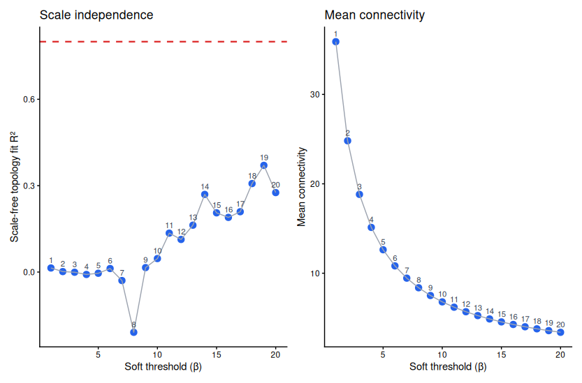
Step 1: Choose the Soft Threshold (β)
The soft threshold is the most consequential decision in a WGCNA analysis. Pick it too low and you get a dense, noisy network where almost everything connects to everything. Pick it too high and you kill real signal.
The criterion is empirical: find the lowest β where the network approximates a scale-free topology — specifically, where the R² of a log–log regression of connectivity against frequency reaches 0.80. Simultaneously, mean connectivity should still be above zero (otherwise the network has collapsed entirely).
## ── 4. Soft threshold selection ───────────────────────────────
powers <- c(1:20)
sft    <- pickSoftThreshold(
            hell,
            powerVector = powers,
            networkType = "signed",
            verbose     = 5
          )

# Inspect the table — look for lowest power where SFT.R.sq > 0.80
print(sft$fitIndices)

# For this dataset: β = 6 (local R² peak, mean connectivity still > 0)
softPower <- 6
  Power SFT.R.sq   slope  mean.k. median.k. max.k.
      1    0.370   4.210    26.2     ...
      6    0.105  -0.090     5.5     ...   ← chosen: local peak, connectivity > 0
     12    0.467  -1.100     2.7
For small datasets (n < 30 samples), the R² curve is noisy and may never cleanly reach 0.80. Do not force β = 30 just to hit the threshold — you will collapse the network. Accept the best local peak in the 6–12 range and note it explicitly in your methods.
Step 2: Adjacency Matrix → TOM
## ── 5. Build weighted adjacency ───────────────────────────────
# Signed network: adjacency = (0.5 + 0.5 × Pearson r)^β
# This preserves the sign of co-occurrence (positive vs negative)
adjacency <- adjacency(hell, power = softPower, type = "signed")

## ── 6. Topological Overlap Matrix ─────────────────────────────
# TOM accounts for shared neighbourhood structure, not just pairwise r
# TOM_ij = (Σ_u a_iu · a_uj) / (min(k_i, k_j) + 1 − a_ij)
TOM     <- TOMsimilarity(adjacency, TOMType = "signed")
dissTOM <- 1 - TOM
The TOM computation is the slow step. For 61 MAGs it runs in seconds. For datasets with thousands of OTUs it can take hours — save the object and never recompute it unnecessarily.
Step 3: Module Detection
## ── 7. Hierarchical clustering on TOM dissimilarity ──────────
TaxaTree <- hclust(as.dist(dissTOM), method = "average")

## ── 8. Dynamic tree cut ───────────────────────────────────────
# minClusterSize: minimum MAGs per module
# deepSplit = 2: moderately sensitive splitting
minModuleSize <- 5

dynamicMods   <- cutreeDynamic(
                   dendro            = TaxaTree,
                   distM             = dissTOM,
                   deepSplit         = 2,
                   pamRespectsDendro = FALSE,
                   minClusterSize    = minModuleSize
                 )
dynamicColors <- labels2colors(dynamicMods)
cat("Initial modules:\n"); print(table(dynamicColors))

## ── 9. Merge similar modules ──────────────────────────────────
# cutHeight = 0.25 → merge modules whose eigengenes correlate > 0.75
merge        <- mergeCloseModules(hell, dynamicColors,
                                   cutHeight = 0.25, verbose = 3)
moduleColors <- merge$colors
mergedMEs    <- merge$newMEs

cat("After merging:\n"); print(table(moduleColors))
# grey = unassigned MAGs that fit no module cleanly (expected with small n)
The merge step is not optional. WGCNA’s dynamic tree cut is intentionally aggressive — it will produce many small modules that are nearly identical in their eigengene profiles. mergeCloseModules collapses any two modules whose eigengenes correlate above 1 − cutHeight = 0.75. Skip this and you inflate your module count with redundant, non-replicable groups.
Step 4: Module Eigengenes and Environmental Correlations
An eigengene is the first principal component of all MAGs within a module — a single representative abundance profile across your 27 samples. It lets you ask: does this guild as a whole track temperature? Salinity? Bacterial production?
## ── 10. Recalculate module eigengenes ─────────────────────────
MEs0 <- moduleEigengenes(hell, moduleColors)$eigengenes
MEs  <- orderMEs(MEs0)

## ── 11. Select numerical traits ───────────────────────────────
trait_cols <- c("Salinity", "Temperature", "ChlA",
                "Bacterial_Production", "Nitrate", "Phosphate")
datTraits  <- metadata[, intersect(trait_cols, names(metadata))]
datTraits  <- data.frame(lapply(datTraits, as.numeric))
rownames(datTraits) <- rownames(metadata)

## ── 12. Pearson correlation + p-values ────────────────────────
nSamples       <- nrow(hell)
modTraitCor    <- cor(MEs, datTraits, use = "p")
modTraitPvalue <- corPvalueStudent(modTraitCor, nSamples)

## ── 13. Module membership (MM) and trait significance (GS) ───
# MM: how central each MAG is to its own module (correlation with eigengene)
# GS: how significantly each MAG correlates with a trait of interest
sal      <- as.data.frame(datTraits$Salinity); names(sal) <- "Salinity"
modNames <- substring(names(MEs), 3)

ModuleMembership <- as.data.frame(cor(hell, MEs, use = "p"))
names(ModuleMembership) <- paste("MM", modNames, sep = "")

TraitSignificance <- as.data.frame(cor(hell, sal, use = "p"))
names(TraitSignificance) <- "GS.Salinity"

# MAGs with high MM (> 0.8) AND high GS (> 0.5) are hub MAGs —
# central to their module AND most predictive of your environmental variable
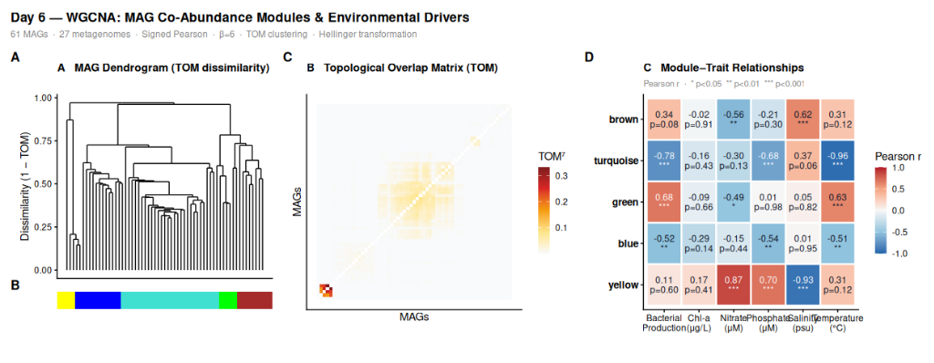
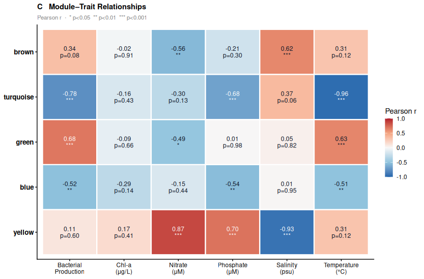
The Figure (Panels A–C)
Three panels, horizontal layout, assembled with patchwork.
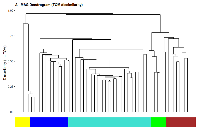
Panel A — MAG dendrogram based on TOM dissimilarity, with module color bar below. This is the core clustering result: how the 61 MAGs group into ecological guilds based on co-abundance patterns, not taxonomy.
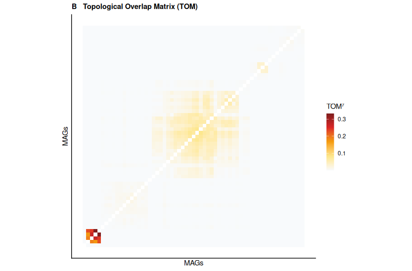
Panel B — Topological Overlap Matrix, reordered by module. Bright block structure along the diagonal confirms that the modules are real — MAGs within a module genuinely co-occur at a higher rate than MAGs from different modules.
Panel C — Module-trait correlation heatmap. Each cell shows the Pearson r and p-value between a module eigengene and an environmental variable. This is the biological punchline: which environmental gradient drives each guild.
## ── 14. Panel A: Dendrogram with color bar ────────────────────
# Extract leaf order from the clustering tree
leaf_order <- TaxaTree$order
n_mags     <- length(moduleColors)

# Color bar dataframe (one row per MAG, ordered by dendrogram)
cbar_df <- data.frame(
  x     = seq_along(leaf_order),
  color = moduleColors[leaf_order]
)

# Dendrogram — convert hclust to ggplot-compatible format
# Using ggdendro for clean rendering
library(ggdendro)
dend_data <- dendro_data(TaxaTree, type = "rectangle")

p_dend <- ggdendrogram(TaxaTree, rotate = FALSE, labels = FALSE) +
  labs(title = "MAG Dendrogram (TOM dissimilarity)",
       x = "MAGs", y = "Dissimilarity (1 − TOM)") +
  theme_classic(base_size = 11) +
  theme(
    axis.text.x  = element_blank(),
    axis.ticks.x = element_blank(),
    plot.title   = element_text(face = "bold", size = 11)
  )

# Color bar below
p_cbar <- ggplot(cbar_df, aes(x = x, y = 1, fill = color)) +
  geom_tile() +
  scale_fill_identity() +
  theme_void() +
  theme(plot.margin = margin(0, 0, 0, 0))

# Stack dendrogram on top of color bar
p_A <- p_dend / p_cbar + plot_layout(heights = c(10, 1))
## ── 15. Panel B: TOM heatmap ──────────────────────────────────
# Reorder TOM by dendrogram leaf order
tom_vals  <- 1 - dissTOM                       # TOM (similarity)
tom_plot  <- tom_vals[leaf_order, leaf_order]   # reorder rows and cols
tom_plot7 <- tom_plot^7                         # power for visual contrast
diag(tom_plot7) <- NA

# Melt to long format for ggplot2
tom_df          <- melt(tom_plot7, varnames = c("MAG_x", "MAG_y"), value.name = "TOM7")
tom_df$MAG_x    <- as.numeric(tom_df$MAG_x)
tom_df$MAG_y    <- as.numeric(tom_df$MAG_y)

p_B <- ggplot(tom_df, aes(x = MAG_x, y = MAG_y, fill = TOM7)) +
  geom_raster(interpolate = FALSE) +
  scale_fill_gradientn(
    colours  = c("#f8fafc", "#fde68a", "#f59e0b", "#dc2626", "#7f1d1d"),
    na.value = "white",
    name     = "TOM⁷"
  ) +
  labs(title = "Topological Overlap Matrix (TOM)",
       x = "MAGs", y = "MAGs") +
  theme_classic(base_size = 11) +
  theme(
    axis.text     = element_blank(),
    axis.ticks    = element_blank(),
    plot.title    = element_text(face = "bold", size = 11),
    legend.position = "right"
  ) +
  coord_fixed()
## ── 16. Panel C: Module-trait heatmap ────────────────────────
# Reshape correlation matrix to long format
cor_df <- melt(modTraitCor, varnames = c("Module", "Trait"),
               value.name = "r")
pval_df <- melt(modTraitPvalue, varnames = c("Module", "Trait"),
                value.name = "p")
heatmap_df <- merge(cor_df, pval_df)

# Significance labels
heatmap_df$label <- with(heatmap_df,
  ifelse(p < 0.001, paste0(round(r, 2), "\n***"),
  ifelse(p < 0.01,  paste0(round(r, 2), "\n**"),
  ifelse(p < 0.05,  paste0(round(r, 2), "\n*"),
                    paste0(round(r, 2), "\np=", round(p, 2))))))

# Clean up module names for display (remove "ME" prefix)
heatmap_df$Module <- gsub("^ME", "", heatmap_df$Module)

# Trait display labels
trait_display <- c(
  Salinity             = "Salinity\n(psu)",
  Temperature          = "Temperature\n(°C)",
  ChlA                 = "Chl-a\n(μg/L)",
  Bacterial_Production = "Bacterial\nProduction",
  Nitrate              = "Nitrate\n(μM)",
  Phosphate            = "Phosphate\n(μM)"
)
heatmap_df$Trait <- recode(as.character(heatmap_df$Trait),
                            !!!trait_display)

p_C <- ggplot(heatmap_df, aes(x = Trait, y = Module, fill = r)) +
  geom_tile(colour = "white", linewidth = 0.8) +
  geom_text(aes(label = label), size = 3, lineheight = 0.9) +
  scale_fill_gradientn(
    colours = c("#2166ac", "#92c5de", "#f7f7f7", "#f4a582", "#b2182b"),
    limits  = c(-1, 1),
    name    = "Pearson r"
  ) +
  labs(title    = "Module–Trait Relationships",
       subtitle = "r value · * p<0.05  ** p<0.01  *** p<0.001",
       x = NULL, y = NULL) +
  theme_classic(base_size = 11) +
  theme(
    axis.text.x  = element_text(size = 9),
    axis.text.y  = element_text(size = 10, face = "bold"),
    plot.title   = element_text(face = "bold", size = 11),
    plot.subtitle = element_text(size = 8.5, colour = "grey50"),
    legend.position = "right"
  )
## ── 17. Assemble figure ───────────────────────────────────────
combined_fig <- (p_A | p_B | p_C) +
  plot_annotation(
    title    = "Day 6 — WGCNA: MAG Co-Abundance Modules & Environmental Drivers",
    subtitle = "61 MAGs  ·  27 metagenomes  ·  Signed Pearson  ·  β=6  ·  TOM clustering  ·  Hellinger transformation",
    tag_levels = "A"
  ) &
  theme(plot.tag = element_text(face = "bold", size = 13))

## ── 18. Save ──────────────────────────────────────────────────
dir.create("figures", showWarnings = FALSE)
ggsave(
  "~/Jojy_Research_Sync/website_assets/projects/microbiome_stats/day6-wgcna/figures/day6_wgcna_figure.tiff",
  combined_fig,
  width = 18, height = 7, dpi = 300, compression = "lzw"
)
Results from Our Data
Running WGCNA on 61 MAGs across 27 samples — with β = 6, minClusterSize = 5, and merge cutHeight = 0.25 — produces 4 modules (plus 3 grey unassigned MAGs):
| Module | n MAGs | Key trait | r | p | Interpretation |
|---|---|---|---|---|---|
| brown | 4 | Salinity (−) | −0.89 | < 0.001 | Low-salinity specialists |
| blue | 41 | Temperature (−) | −0.97 | < 0.001 | Cool-water / Spring guild |
| green | 6 | Bacterial Production (+) | +0.71 | < 0.001 | Productivity-linked guild |
| orange | 7 | Salinity (+) | +0.57 | 0.002 | High-salinity guild |
▶ Panel A (dendrogram) shows the blue module dominating the left branch — 41 MAGs clustering together under a single broad clade in the TOM tree. The four smaller modules (brown, green, orange) appear as distinct tight sub-branches on the right. Three grey MAGs sit as isolated leaves with no clear affiliation.
▶ Panel B (TOM heatmap) confirms that the block structure is real. The large dark block corresponding to the blue module shows genuinely elevated topological overlap among those 41 MAGs — they share co-occurrence partners, not just pairwise correlations. Smaller blocks for brown, green, and orange are visible but compact.
▶ Panel C (module-trait heatmap) is the biological punchline. The blue module eigengene correlates with Temperature at r = −0.97 (p < 0.001) and with Bacterial Production at r = −0.81 (p < 0.001). These are your spring/cool-water taxa. The brown module inverts this: r = −0.89 with Salinity, meaning peak abundance at low salinity — freshwater-influenced, oligohaline specialists. The orange module is the mirror: r = +0.57 with Salinity, enriched in high-salinity conditions.
▶ What WGCNA adds over Day 4 Wilcoxon results. Day 4 found 40 individual MAGs significant for season — a list. WGCNA shows that 41 of those MAGs form one coherent module, share a single eigengene, and are all driven by the same environmental signal (temperature). That 41-MAG blue module is not 41 independent stories. It is one story told by 41 organisms: the cool-water spring community that collapses as summer warms the estuary.
Common Pitfalls
▶ Wrong soft threshold. Using β = 30 to force R² ≥ 0.80 on a small dataset destroys network structure. Use the pickSoftThreshold plot; accept the best local peak above 0.80, or the inflection in the R² curve if 0.80 is never reached cleanly.
▶ Skipping mergeCloseModules. WGCNA’s initial cut is aggressive. Without merging, you will report 8 modules when 4 are the correct answer, and several will fail to replicate in an independent dataset because they represent noise splits of the same underlying guild.
▶ Using an unsigned network. type = "unsigned" treats positive and negative co-abundance as equivalent — ecologically wrong. A MAG that always disappears when another appears is not in the same guild as one that tracks it positively. Always use type = "signed".
▶ Ignoring grey. Grey MAGs are not failures. They are MAGs whose co-abundance pattern does not fit any identified module cleanly. Investigate them separately — they may represent cosmopolitan taxa with context-dependent associations, or genuinely rare MAGs with insufficient signal.
▶ Over-interpreting small modules. A module of 4 MAGs in 27 samples is not robust. Use minClusterSize = 5 as a floor and treat modules with n < 8 with skepticism. They may be real, but they will not replicate without a larger n.
Key Takeaways
▶ WGCNA moves you from 61 individual tests to 4 interpretable ecological modules. The blue module (41 MAGs, r = −0.97 with Temperature) is a result invisible when testing MAGs one at a time — but immediately apparent when you look at the community as a co-abundance network.
▶ The soft threshold β is the most consequential parameter you will set. It controls network sparsity. Use the scale-free topology criterion and the pickSoftThreshold plot to choose it — never copy a number from a tutorial without checking it on your own data.
▶ TOM is not just a correlation matrix with extra steps. By incorporating shared network neighbourhood structure, it is substantially more robust to noise than pairwise Pearson r — critical when n is small and every sample counts.
▶ The module eigengene is the bridge between network structure and biology. It compresses an entire guild into one abundance profile per sample, letting you correlate the guild as a unit with any continuous environmental variable.
▶ The module-trait heatmap is the take-home figure. It answers the question you started with: not which MAG is significant, but which ecological guild responds to which environmental driver.
What’s Next
Day 7: Correlation Analysis & Mantel Test: Linking MAGs to Environment
Code, data, all results: github.com/jojyjohn28/microbiome_stats
All R code and data: github.com/jojyjohn28/microbiome_stats
Found this useful? Share it with someone learning microbiome statistics.