Day 2 — Constrained Ordination: RDA & dbRDA for Microbiome Community Analysis
Day 2 — Constrained Ordination: RDA & dbRDA for Microbiome Community Analysis
*This is Day 2 of the series: Applied Statistics for Microbiome & Genomics Data.* and 🧬 Day 52 of Daily Bioinformatics from Jojy’s Desk All data and R code → github.com/jojyjohn28/microbiome_stats
On Day 1, we established why standard statistics fail for microbiome data — compositionality, sparsity, multivariate structure, and non-normality. Today we run our first real analysis.
The question we’re asking: Do environmental variables explain how MAG communities are structured across our 27 metagenomes?
To answer it, we use constrained ordination — specifically RDA (Redundancy Analysis). This is one of the most powerful and widely used methods in microbial ecology, and by the end of this post you’ll know how to run it, interpret it, and read the figure it produces.
🧬 The Biological Question
We have 61 MAGs sampled across 27 metagenomes from two estuaries — Chesapeake Bay and Delaware Bay — collected in Spring and Summer. The metadata contains environmental measurements: Salinity, Temperature, ChlA, Nitrate, Phosphate, Silicate, nCells, SF, and more.
The biological question is: which environmental gradients best explain the variation in who is present and how abundant they are?
Are Chesapeake and Delaware communities different? Does season matter? Is salinity the dominant driver, or is it temperature? Constrained ordination lets us answer all of these simultaneously — in a single visual.
📊 The Statistical Concept
What is ordination?
Ordination is a way to take a high-dimensional dataset — 61 MAGs measured across 27 samples — and compress it into 2 dimensions that capture the most variance. Instead of looking at 61 separate plots, you see one plot where each sample is a point and samples with similar communities cluster together.
Unconstrained ordination (PCA, PCoA, NMDS) just finds the axes of maximum variance in the community data itself, ignoring any environmental information.
Constrained ordination (RDA, dbRDA) goes further — it finds the axes of community variance that are explained by your environmental variables. The constraint is what makes it powerful: you’re not just describing the pattern, you’re connecting it to measured environmental drivers.
RDA vs dbRDA — which one to use?
This comes down to your distance measure:
RDA (Redundancy Analysis) works in Euclidean space. Because raw abundance data doesn’t behave well in Euclidean space (the double-zero problem — two samples sharing an absent MAG appear falsely similar), we first apply a Hellinger transformation to the abundance matrix. This square-roots the relative abundances, down-weighting dominant MAGs and making the data Euclidean-friendly.
dbRDA (distance-based RDA) works with any distance matrix — including Bray-Curtis, which is the standard dissimilarity metric for ecological community data. Bray-Curtis ignores shared absences entirely, making it more appropriate when zero-inflation is high. In practice, dbRDA with Bray-Curtis is more robust for microbiome data, but both approaches are valid and commonly used.
Today we use RDA with Hellinger transformation, which is what the R script implements. We’ll briefly show the dbRDA equivalent so you can run both.
⚙️ The R Code
Step 1 — Load libraries and data
library(vegan)
library(ggplot2)
library(ggrepel)

# Load metadata — rows = samples, columns = environmental variables
metadata <- read.csv("data/metadata.csv", header = TRUE, row.names = 1, sep = ",")

# Load MAG abundance — rows = MAGs, columns = samples
mag_raw <- read.csv("data/mag_abundance.csv", header = TRUE, row.names = 1, sep = ",")
Step 2 — Prepare the community matrix
# The abundance table has MAGs as rows and samples as columns
# RDA needs samples as rows — so we transpose
mag_t <- t(mag_raw)   # now 27 rows (samples) × 61 columns (MAGs)

# Hellinger transformation:
# Divides each value by the row sum (converts to relative abundance)
# then takes the square root — reduces dominance of highly abundant MAGs
spe.hel <- decostand(mag_t, method = "hellinger")
Why Hellinger? Raw abundance values are dominated by a handful of very abundant MAGs (e.g. Pelagibacterales). The Hellinger transformation down-weights these dominant MAGs so that rare MAGs also contribute meaningfully to the ordination. Without this step, your RDA would essentially be an ordination of Pelagibacterales.
Step 3 — Prepare the environmental matrix
env <- metadata[, c("Salinity", "Temperature", "Depth", "PAR",
                    "Attenuation", "Bacterial_Production", "nCells",
                    "ChlA", "Nitrate", "Ammonium", "Phosphate", "Silicate"),
                drop = FALSE]

# Force numeric (prevents hidden character → NA issues)
env <- as.data.frame(env)
env[] <- lapply(env, function(x) as.numeric(as.character(x)))

# Check missing values
colSums(is.na(env))

# Remove samples with missing environmental data
keep <- complete.cases(env)

env2 <- env[keep, , drop = FALSE]
spe.hel <- spe.hel[keep, , drop = FALSE]
metadata <- metadata[keep, , drop = FALSE]

# Standardize AFTER cleaning
env.z <- decostand(env2, method = "stand")
Step 4 — Forward selection of significant variables
Rather than throwing all 13 variables into the model, we use forward selection to find only those that significantly and independently explain community variance:
# Full model (upper bound)
spe.rda.full <- rda(spe.hel ~ ., data = env.z)

# Forward selection — adds variables one by one, keeps only significant ones
# stops when adding more variables would exceed the full model's R²
fwd.sel <- ordiR2step(
  rda(spe.hel ~ 1, data = env.z),
  scope = formula(spe.rda.full),
  direction = "forward",
  R2scope = TRUE,
  permutations = 1000,
  trace = FALSE
)

# See which variables were selected
fwd.sel$call
Forward selection selected: Temperature, Salinity, Phosphate, ChlA, Silicate, Nitrate, SF, nCells — all biologically meaningful drivers of estuarine microbial communities.
Step 5 — Build the final model
# Final RDA model with forward-selected variables
spe.rda.signif <- rda(spe.hel ~ Temperature + Salinity + Phosphate +
                        ChlA + Silicate + Nitrate + nCells,
                      data = env.z)

# Adjusted R² — how much community variance is explained?
RsquareAdj(spe.rda.signif)

# Test overall model significance (permutation test)
anova.cca(spe.rda.signif, permutations = 1000)

# Test significance of each individual term
anova.cca(spe.rda.signif, permutations = 1000, by = "term")

# Test significance of each axis
anova.cca(spe.rda.signif, permutations = 1000, by = "axis")
Why permutation tests? Because our data violates the normality assumptions of classical F-tests,
anova.cca()tests significance by randomly shuffling the data 1000 times and asking: how often would we see this pattern by chance? This is the non-parametric equivalent of an F-test — no distributional assumptions required.
Step 6 — Extract scores and build the triplot
# Extract % variance explained by RDA1 and RDA2
perc <- round(100 * (summary(spe.rda.signif)$cont$importance[2, 1:2]), 2)

# Season, Bay and size fraction — now clean columns in metadata
Season   <- metadata$Season   # "Spring" or "Summer"
Bay      <- metadata$Bay      # "Chesapeake" or "Delaware"
Fraction <- metadata$SF       # "Particle-attached" or "Free_living"

# Site scores — split by season for colour-coding
sc_si_summer <- scores(spe.rda.signif, display = "sites")[Season == "Summer", ]
sc_si_spring <- scores(spe.rda.signif, display = "sites")[Season == "Spring", ]

# Species (MAG) scores
sc_sp <- scores(spe.rda.signif, display = "species", choices = c(1, 2), scaling = 1)

# Biplot arrows — environmental variables
sc_bp <- scores(spe.rda.signif, display = "bp", choices = c(1, 2), scaling = 1)

# Only label MAGs with strong contributions (|score| > 0.35 on either axis)
high_score_mags <- rownames(sc_sp)[rowSums(abs(sc_sp) > 0.35) > 0]

# Build the triplot
plot(spe.rda.signif,
     scaling = 1, type = "none", frame = FALSE,
     xlim = c(-1.0, 1.5), ylim = c(-0.5, 0.5),
     xlab = paste0("RDA1 (", perc[1], "%)"),
     ylab = paste0("RDA2 (", perc[2], "%)"))

# Summer samples — red
points(sc_si_summer, pch = 21, col = "black", bg = "red2", cex = 1.2)

# Spring samples — green
points(sc_si_spring, pch = 21, col = "black", bg = "green3", cex = 1.2)

# MAG positions — yellow squares
points(sc_sp, pch = 22, col = "black", bg = "#f2bd33", cex = 1.2)

# Labels for most influential MAGs only
text(sc_sp[high_score_mags, ] + c(0.20, 0.15),
     labels = high_score_mags, col = "grey4", font = 3, cex = 0.6)

# Environmental arrows
arrows(0, 0, sc_bp[, 1], sc_bp[, 2], col = "blue", lwd = 1.2)
text(x = sc_bp[, 1] - 0.1, y = sc_bp[, 2] - 0.03,
     labels = rownames(sc_bp), col = "blue", cex = 1, font = 2)
dbRDA alternative (Bray-Curtis)
library(vegan)

# Calculate Bray-Curtis dissimilarity from raw (non-transformed) data
bc_dist <- vegdist(mag_t, method = "bray")

# dbRDA — same formula, uses distance matrix instead of raw data
spe.dbrda <- dbrda(bc_dist ~ Temperature + Salinity + Phosphate +
                     ChlA + Silicate + Nitrate + SF + nCells,
                   data = env.z)

# Same interpretation workflow applies
Rsquareadj(spe.dbrda)
anova.cca(spe.dbrda, step = 1000)
Use dbRDA with Bray-Curtis when your data is very sparse (>60% zeros) or when you want a distance metric that is more robust to compositional variation. Use RDA + Hellinger when you want the simplicity of a linear model framework.
🔍 Reading the Output — How to Interpret the Figure
The figure below is the actual RDA triplot from this analysis. It contains three types of information simultaneously — that’s why it’s called a triplot.
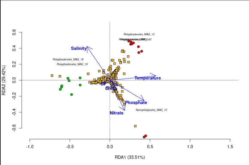
A triplot has three layers, each telling you something different:
Layer 1 — The Sample Points (circles)
Each circle is one of the 27 metagenomes.
- 🔴 Red circles = Summer samples
- 🟢 Green circles = Spring samples
What to look for: Do the colours cluster separately? If Summer and Spring samples are separated along an axis, that axis captures seasonal variation in community composition. In our plot, Summer and Spring samples form distinct groups — microbial communities in summer are compositionally different from those in spring.
Samples that plot close together have similar MAG communities. Samples far apart have dissimilar communities.
Layer 2 — The MAG Scores (yellow squares)
| Each yellow square is one of the 61 MAGs. Only MAGs with strong scores ( | score | > 0.35 on either axis) are labelled to avoid clutter. |
What to look for: A MAG positioned near a cluster of samples is more abundant in those samples. A MAG positioned far from the origin has a strong relationship with the constrained axes — it’s responding strongly to the environmental gradients. MAGs near the center of the plot are not well-explained by the environmental variables in the model.
For example, if Pelagibacterales_MAG_18 plots near the Summer samples along the salinity gradient, it means this MAG is more abundant in high-salinity summer samples.
Layer 3 — The Environmental Arrows (blue arrows)
Each arrow represents one environmental variable (Salinity, Temperature, ChlA, Nitrate, etc.).
Four rules for reading arrows:
-
Arrow direction — points toward samples where that variable is highest. Samples in the direction an arrow points have high values of that variable.
-
Arrow length — longer arrows explain more variance. Short arrows have weak relationships with the community structure shown.
-
Arrow angle between two arrows — arrows pointing in the same direction indicate positively correlated variables. Opposite directions = negative correlation. Right angles = uncorrelated.
-
Arrow angle vs. axis — an arrow pointing along RDA1 means that variable is strongly associated with the main axis of community variation.
In our plot, the Salinity arrow typically aligns with RDA1, confirming that salinity is the dominant environmental gradient structuring MAG communities across these estuaries — a classic result in estuarine microbial ecology.
Reading the axis labels
RDA1 (XX%) RDA2 (XX%)
These percentages tell you how much of the constrained variance is captured by each axis — not total variance in the community data, but variance that is explained by the environmental model. RDA1 captures the strongest environmental signal, RDA2 the second strongest.
The adjusted R² from Rsquareadj() tells you the total fraction of community variance explained by all selected variables combined. Always report this alongside your plot.
⚠️ Common Mistakes
Mistake 1: Running RDA without transforming the abundance data. Raw abundance values violate the Euclidean distance assumption of RDA. Always apply Hellinger (or CLR) transformation before rda(). Skipping this step distorts the ordination and inflates the apparent influence of dominant MAGs.
Mistake 2: Overinterpreting weak axes. If RDA2 explains only 3% of constrained variance, be cautious about interpreting the vertical separation of your samples. Always check whether axes are significant with anova.cca(..., by = "axis") before discussing them.
Mistake 3: Confusing correlation with causation. An arrow pointing toward a cluster of samples means that variable covaries with that community type — not that it causes it. Temperature and Salinity are both correlated with season; the arrow angles don’t tell you which is the actual driver.
Mistake 4: Not checking model significance before interpretation. Always run anova.cca(spe.rda.signif, step = 1000) first. If the overall model is not significant (p > 0.05), the triplot has no interpretive value.
Mistake 5: Using all variables without selection. Including 13 correlated environmental variables inflates R² and overfits the model. Always use forward selection (ordiR2step) or another variable reduction approach before building your final model.
Mistake 6: Ignoring that dbRDA and RDA can give different pictures. If your results change substantially between RDA+Hellinger and dbRDA+Bray-Curtis, that’s telling you something important about the data structure. Run both and compare.
🧭 Key Takeaways
- RDA constrains ordination axes to variance explained by environmental variables — it connects community patterns to measured drivers.
- Hellinger transformation is required before RDA to handle the double-zero problem and down-weight dominant MAGs.
- dbRDA with Bray-Curtis is the distance-based alternative — more robust when data is very sparse or highly compositional.
- The triplot shows three things at once: sample positions, MAG positions, and environmental arrows — each layer answers a different question.
- Always use permutation tests (
anova.cca) to assess significance — classical F-tests assume normality, which microbiome data violates. - Forward selection (
ordiR2step) prevents overfitting by retaining only variables that significantly and independently contribute to the model. - Report adjusted R² alongside your plot — it tells readers how much of the community variance is actually explained.
🔗 What’s Next
Tomorrow on Day 3, we take the next logical step: we’ve seen the communities separate by season and bay in the ordination — now we formally test whether those differences are statistically real using PERMANOVA (adonis2). We’ll also cover the critical assumption test that most papers skip: homogeneity of dispersion with betadisper.
All R code and data: github.com/jojyjohn28/microbiome_stats Found this useful? Share it with someone learning microbiome statistics.
🧬 Day 52 — Daily Bioinformatics from Jojy’s Desk