Co-occurrence Networks from Genome Abundance Data — A Complete R Workflow
Co-occurrence networks from genome abundance data — a complete R workflow
🧬 𝐷𝑎𝑦 71 𝑜𝑓 𝐷𝑎𝑖𝑙𝑦 𝐵𝑖𝑜𝑖𝑛𝑓𝑜𝑟𝑚𝑎𝑡𝑖𝑐𝑠 𝑓𝑟𝑜𝑚 𝐽𝑜𝑗𝑦’𝑠
You have a genome relative abundance table. You have metadata. You want to know who lives with whom, which organisms are keystone taxa, and whether modules of co-occurring genomes respond to salinity or season.
This post walks through the complete pipeline — from raw files to publication-ready network plots, hub statistics, Zi-Pi keystone roles, and module ecology tests — using real estuarine metagenome data from Chesapeake and Delaware Bay.
What is a co-occurrence network?
A co-occurrence network represents ecological associations between microbial taxa. Each node is a taxon (here, a reference genome). Each edge connects two taxa that occur together — or avoid each other — across samples more often than expected by chance.
The key insight is statistical: we are not measuring who eats whom or who helps whom. We are measuring whose abundances tend to rise and fall together across environmental gradients. When two genomes consistently co-occur, it could mean shared habitat preference, syntrophic interaction, or common response to an environmental driver. When two genomes are negatively correlated, it might indicate competitive exclusion or niche separation.
What co-occurrence networks are good for:
- Identifying ecological guilds (modules of taxa that respond similarly to the environment)
- Detecting potential keystone taxa — nodes whose removal would fragment the network
- Comparing community structure across habitats (free-living vs. particle-attached, bay to bay)
- Generating hypotheses for experimental follow-up
What they cannot tell you:
- Direct biological interactions (for that you need experiments)
- Causality — correlation is not mechanism
The three main correlation approaches
Pearson correlation
The classical approach: measure the linear association between abundance vectors across samples. Fast and simple, but it assumes normality and is severely distorted by the compositional nature of relative abundance data (everything sums to 1, so the abundances are not independent).
When to use: Absolute abundance data (e.g., cell counts). Avoid for relative abundance.
Spearman rank correlation
Spearman replaces raw values with ranks before computing the correlation, which makes it robust to outliers and non-normal distributions. It does not fully solve the compositionality problem, but combining it with centered log-ratio (CLR) normalization before ranking largely mitigates this.
When to use: Relative abundance after CLR normalization — the standard for genome- or OTU-level data. This is what we use in this workflow.
Formula:
ρ = 1 − (6 Σd²) / (n(n²−1))
where d is the rank difference between paired observations.
SparCC (Sparse Correlations for Compositional data)
SparCC was designed specifically for compositional microbiome data. It explicitly models the log-ratio framework, estimates pairwise correlations while accounting for the closure constraint, and bootstraps p-values. It is more theoretically correct than Spearman for raw relative abundances, but is substantially slower (hours for large matrices) and harder to parallelize.
When to use: If you want the most statistically rigorous inference on untransformed relative abundances, especially for 16S OTU tables where CLR is harder to justify. For genome-resolved data with CLR normalization, Spearman is generally sufficient.
| Method | Compositionality-aware | Speed | Interpretability |
|---|---|---|---|
| Pearson | No | Fast | Simple |
| Spearman + CLR | Partially | Fast | Good |
| SparCC | Yes | Slow | Moderate |
What files do you need?
1. Relative abundance table
A matrix of genomes × samples (or samples × genomes — the code transposes it). Values are relative abundances that sum to 1 per sample.
For 16S data: Use phyloseq to export an OTU table, or export directly from QIIME2 as a feature table. Convert to relative abundance with transform_sample_counts(ps, function(x) x/sum(x)).
For genome-resolved metagenomics: Generate with CoverM in genome mode:
coverm genome \
  --bam-files sample1.bam sample2.bam \
  --genome-fasta-directory /path/to/genomes/ \
  --methods relative_abundance \
  --min-covered-fraction 0 \
  --output-file genome_relative_abundance.tsv
The output is a TSV with genomes as rows and samples as columns — exactly what this workflow expects.
2. Metadata file
A sample-level table with at minimum:
-
sample— sample IDs matching the column names of your abundance table - Environmental variables:
Bay,size_fraction,season,Salinity
sample     Bay          size_fraction      season  Salinity
CP_S1_FL   Chesapeake   Free Living        Spring  5.2
CP_S1_PA   Chesapeake   Particle Attached  Spring  5.2
DE_S1_FL   Delaware     Free Living        Spring  18.4
3. Taxonomy file
A genome-level table mapping genome IDs to GTDB taxonomy strings. The taxonomy column should follow the GTDB format:
d__Bacteria;p__Proteobacteria;c__Gammaproteobacteria;...
This can be an Excel file or TSV — the code reads both. If you built your abundance table from GTDB genomes, GTDB-Tk classify_wf will have produced this as gtdbtk.bac120.summary.tsv.
The R workflow — annotated
Libraries
library(tidyverse)
library(microeco)      # microtable object, convenient wrapper
library(NetCoMi)       # network construction and comparison
library(igraph)        # graph operations and centrality
library(tidygraph)     # tidy interface to igraph
library(ggraph)        # ggplot2-style network plotting
library(readxl)        # read taxonomy from Excel
library(viridis)       # colour palettes
library(patchwork)     # combine ggplots
Step 1: Read and match inputs
abund <- read.delim("genome_relative_abundance.tsv",
                    header = TRUE, row.names = 1, check.names = FALSE)
meta  <- read.delim("metadata_updated.csv",
                    header = TRUE, sep = "\t", stringsAsFactors = FALSE)

# Clean whitespace — a silent killer of sample matching
rownames(abund) <- trimws(rownames(abund))
meta$sample     <- trimws(meta$sample)

# Match to common samples only
common_samples <- intersect(rownames(abund), meta$sample)
abund <- abund[common_samples, ]
meta  <- meta[match(common_samples, meta$sample), ]
stopifnot(all(rownames(abund) == meta$sample))  # never skip this check

# Transpose: genomes as rows, samples as columns
abund_t <- t(abund) %>% as.data.frame()
The stopifnot is important. If rows are misaligned, every subsequent statistical test will silently return garbage.
Step 2: Group labels
meta <- meta %>%
  mutate(
    Bay2      = case_when(Bay == "Chesapeake" ~ "CP", Bay == "Delaware" ~ "DE", TRUE ~ Bay),
    Fraction2 = case_when(size_fraction == "Free Living" ~ "FL",
                          size_fraction == "Particle Attached" ~ "PA", TRUE ~ size_fraction),
    Group     = paste(Bay2, Fraction2, sep = "_")
  )
rownames(meta) <- meta$sample
This creates four groups: CP_PA, CP_FL, DE_PA, DE_FL. Building separate networks per group lets you compare how community structure changes with bay and size fraction.
Step 3: Global prevalence filtering
prev       <- rowSums(abund_t > 0) / ncol(abund_t)
abund_filt <- abund_t[prev >= 0.3, ]                      # present in ≥30% of all samples
abund_filt <- abund_filt[rowMeans(abund_filt) > 0.0005, ] # and mean abundance >0.05%
Two filters work together here. The prevalence filter removes rare taxa that appear in too few samples to produce stable correlations. The mean abundance filter removes ultra-rare genomes that would create noise without contributing meaningful ecological signal. Together they reduce the matrix from ~25,000 genomes to a manageable set of several hundred core community members.
Step 4: Build the microeco object
dataset <- microtable$new(otu_table = abund_filt, sample_table = meta)
dataset$tidy_dataset()
dataset$otu_table <- as.matrix(dataset$otu_table)
microeco is a convenient container that keeps the abundance table and sample metadata in sync. It also provides the accessor methods that later parts of the pipeline expect.
Step 5: Spearman network construction (per group)
This is the core of the pipeline. For each group, we extract the relevant samples, apply a within-group prevalence filter (stricter than the global one), and pass the matrix to NetCoMi::netConstruct.
net_g <- netConstruct(
  data        = mat_filt,      # samples × taxa matrix
  measure     = "spearman",    # correlation method
  normMethod  = "clr",         # centered log-ratio transform first
  zeroMethod  = "pseudo",      # add small pseudo-count to zeros
  sparsMethod = "threshold",   # keep edges above a cutoff
  thresh      = 0.3,           # |ρ| ≥ 0.3
  verbose     = 1
)
Why CLR before Spearman? Relative abundances are compositional — they are constrained to sum to 1, which induces spurious negative correlations between unrelated taxa. CLR transforms each value as log(x / geometric_mean(row)), removing the closure constraint and making the data suitable for Spearman.
Why threshold = 0.3? This is a commonly used cutoff that retains biologically meaningful correlations while pruning weak associations that may be noise. You can tune this — lower values produce denser, noisier networks; higher values produce sparser but more conservative networks.
Per-group filtering (prevalence ≥ 40%, mean > 0.001): Tighter than the global filter because within a single group (say, 9 Chesapeake particle-attached samples) a genome needs to be consistently detected to produce a reliable correlation.
After construction, convert to an igraph object and annotate edges:
g_obj <- graph_from_adjacency_matrix(adj, mode = "undirected",
                                      weighted = TRUE, diag = FALSE)
g_obj <- delete_edges(g_obj, E(g_obj)[weight == 0])
E(g_obj)$sign       <- ifelse(E(g_obj)$weight > 0, "positive", "negative")
E(g_obj)$abs_weight <- abs(E(g_obj)$weight)
V(g_obj)$degree     <- degree(g_obj)
Step 6: Attach taxonomy to graph nodes
tax_parsed <- tax %>%
  separate(gtdb_taxonomy,
           into = c("Domain","Phylum","Class","Order","Family","Genus","Species"),
           sep = ";", fill = "right") %>%
  mutate(across(Domain:Species, ~gsub("^[a-z]__", "", .)))
The regex ^[a-z]__ strips GTDB prefixes (d__, p__, c__, etc.), leaving clean names. After parsing, attach to the graph:
V(g_obj)$Phylum  <- tax_parsed$Phylum[match(V(g_obj)$name,  tax_parsed$genome)]
V(g_obj)$Genus   <- tax_parsed$Genus[match(V(g_obj)$name,   tax_parsed$genome)]
V(g_obj)$Phylum[is.na(V(g_obj)$Phylum)] <- "Unknown"
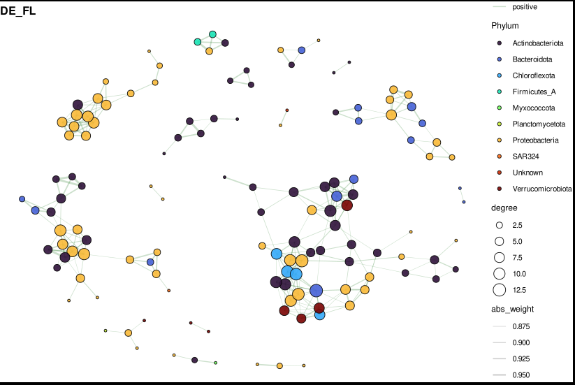
Step 7: Visualize — phylum-coloured network
For plots with many edges (typical networks have hundreds to thousands), subset to the top 300 edges by absolute weight first. This keeps the figure readable without losing the high-confidence associations.
subset_top_edges <- function(g_obj, top_n = 300) {
  edf <- igraph::as_data_frame(g_obj, what = "edges") %>%
    arrange(desc(abs_weight)) %>%
    slice(1:top_n)
  keep_nodes <- unique(c(edf$from, edf$to))
  graph_from_data_frame(edf,
    vertices = igraph::as_data_frame(g_obj, "vertices") %>% filter(name %in% keep_nodes),
    directed = FALSE)
}
The plotting function uses ggraph with Fruchterman-Reingold layout — a force-directed algorithm that places densely connected nodes closer together, naturally revealing community modules:
plot_net_phylum <- function(g_obj, title_text, top_labels = 15) {
  tbl <- as_tbl_graph(g_obj) %>%
    activate(nodes) %>%
    mutate(label_me = rank(-degree, ties.method = "first") <= top_labels)

  ggraph(tbl, layout = "fr") +
    geom_edge_link(aes(color = sign, width = abs_weight), alpha = 0.25) +
    geom_node_point(aes(size = degree, fill = Phylum), shape = 21,
                    color = "black", alpha = 0.9) +
    geom_node_text(aes(label = ifelse(label_me, Genus, "")),
                   repel = TRUE, size = 2.5) +
    scale_edge_color_manual(values = c(positive = "darkgreen", negative = "red3")) +
    scale_edge_width(range = c(0.2, 1.2)) +
    scale_fill_viridis_d(option = "turbo") +
    theme_void() +
    ggtitle(title_text)
}

# Combine into 2×2 panel
p_final <- (p_cp_pa | p_cp_fl) / (p_de_pa | p_de_fl)
ggsave("network_phylum_2x2.pdf", p_final, width = 12, height = 10)
Reading the plot:
- Node size = degree (number of direct connections)
- Node colour = phylum
- Edge colour: green = positive co-occurrence, red = negative (mutual exclusion)
- Edge width = correlation strength
- Labels = genus names of the top 15 hubs by degree
Step 8: Network statistics
For each group, calculate global topology metrics:
data.frame(
  Nodes           = gorder(x),
  Edges           = gsize(x),
  Density         = edge_density(x),
  AvgDegree       = mean(degree(x)),
  Transitivity    = transitivity(x, type = "global"),
  Modularity      = modularity(cluster_walktrap(x)),
  Components      = components(x)$no,
  AvgPathLength   = mean_distance(x, directed = FALSE, unconnected = TRUE),
  Diameter        = diameter(x, directed = FALSE, unconnected = TRUE),
  PositiveEdges   = sum(E(x)$weight > 0),
  NegativeEdges   = sum(E(x)$weight < 0),
  Pos_Neg_Ratio   = sum(E(x)$weight > 0) / (sum(E(x)$weight < 0) + 1)
)
Key things to look at when comparing FL vs PA networks:
- Modularity — higher modularity means more distinct sub-communities
- Positive:negative ratio — particle-attached communities often show more positive associations (shared resource patch), free-living more negative (open water competition)
- Average path length — shorter paths = more integrated community
Step 9: Hub detection
For each group, rank all nodes by degree, betweenness, closeness, and eigenvector centrality. The top 20 hubs per group are the candidate keystone taxa.
node_table_df <- data.frame(
  Genome      = V(x)$name,
  Degree      = degree(x),
  Betweenness = betweenness(x, directed = FALSE),
  Closeness   = closeness(x, normalized = TRUE),
  Eigenvector = eigen_centrality(x)$vector,
  Phylum      = V(x)$Phylum,
  Genus       = V(x)$Genus
)
Then test hub abundances against environmental metadata:
# Wilcoxon: does hub abundance differ between size fractions?
p_fraction = wilcox.test(Abundance ~ Fraction2)$p.value

# Kruskal-Wallis: does it change across seasons?
p_season = kruskal.test(Abundance ~ season)$p.value

# Spearman: does it correlate with salinity?
rho_salinity = cor(Abundance, Salinity, method = "spearman")
All p-values are Benjamini-Hochberg corrected within each test type. A hub that is both highly connected AND significantly associated with an environmental gradient is a strong candidate for an ecologically important organism.
Step 10: Zi-Pi keystone role analysis
The Zi-Pi framework classifies each node into one of four ecological roles based on two metrics:
- Zi (within-module connectivity z-score) — how well-connected is this node compared to others in its own module? High Zi = module hub.
- Pi (among-module connectivity) — what fraction of this node’s connections cross module boundaries? High Pi = connector.
Role assignment:
  Zi ≤ 2.5, Pi ≤ 0.62  →  Peripheral    (most taxa)
  Zi ≤ 2.5, Pi > 0.62  →  Connector     (bridges modules, potential ecosystem engineer)
  Zi > 2.5, Pi ≤ 0.62  →  Module hub    (dominant within one module)
  Zi > 2.5, Pi > 0.62  →  Network hub   (rare, highly influential globally)
The calculation:
calc_zipi <- function(g_obj, group_name) {
  wc   <- cluster_walktrap(g_obj)   # detect modules
  memb <- membership(wc)
  A    <- as.matrix(as_adjacency_matrix(g_obj, attr = "weight", sparse = FALSE))
  A[A != 0] <- 1                    # binarize for connectivity counts

  # Zi: within-module z-score
  # For each node i in module m: Zi = (k_i,m − mean(k_m)) / sd(k_m)

  # Pi: participation coefficient
  # Pi_i = 1 − Σ_m (k_i,m / k_i)²
  # = 1 when connections are evenly spread across all modules
  # = 0 when all connections are within one module
}
The participation coefficient Pi is the key quantity. A taxon that connects equally to three modules (Pi ≈ 0.67) likely plays a bridging role in the community — potentially transferring metabolites, genetic material, or simply co-occurring with many different ecological guilds.
Keystones (connectors + module hubs + network hubs) are written to keystone_taxa.csv with full taxonomy annotations.
Step 11: Module annotation and ecology tests
Modules are detected with cluster_walktrap — a random-walk algorithm that identifies groups of nodes between which random walkers tend to be “trapped.” Each module is then described by its dominant phyla and tested against environmental gradients.
# Module relative abundance per sample
module_sample_abund <- module_df %>%
  inner_join(otu, by = "Genome") %>%
  pivot_longer(-c(Group, Genome, Module), names_to = "sample", values_to = "Abundance") %>%
  group_by(Group, Module, sample) %>%
  summarise(ModuleAbundance = sum(Abundance))

# Test each module against salinity, fraction, season
# Spearman ρ with salinity
# Wilcoxon FL vs PA
# Kruskal-Wallis across seasons
# All BH-corrected within each Group
A module that is significantly more abundant in particle-attached samples AND positively correlated with salinity represents an ecological guild with a clear environmental niche — these are the most interpretable and publishable findings.
Summary of outputs
| File | Contents |
|---|---|
network_phylum_2x2.pdf | Visual network panels, phylum-coloured |
edge_summary_spearman.csv | Node/edge counts per group |
network_stats_final.csv | Density, modularity, path length, pos/neg ratio |
node_table_with_taxonomy.csv | All centrality metrics + taxonomy per genome |
top_hubs.csv | Top 20 hubs per group |
hub_metadata_stats.csv | Hub abundance tests (fraction, season, salinity) |
zipi_roles.csv | Full Zi-Pi table with role assignments |
keystone_taxa.csv | Connectors + module hubs + network hubs only |
module_membership.csv | Module assignment per genome |
module_phylum_summary.csv | Phylum composition of each module |
module_salinity_stats.csv | Spearman ρ with salinity per module |
module_fraction_stats.csv | FL vs PA Wilcoxon per module |
module_season_stats.csv | Kruskal-Wallis season test per module |
Common pitfalls
Sample ID mismatches — always trimws() your IDs and run stopifnot(all(rownames(abund) == meta$sample)) before any analysis. Silent misalignment is the most common source of wrong results.
Too many taxa in network — if you pass 5,000 taxa to netConstruct, the correlation matrix will be 5,000 × 5,000 and will take hours. The global prevalence + abundance filters are not optional. Start conservative (≥30% prevalence globally, ≥40% within group).
Choosing the threshold — thresh = 0.3 is a starting point. If your network is too dense (density > 0.1), increase to 0.4–0.5. If it is too sparse (most nodes disconnected), lower to 0.25. Always report the threshold you used.
Compositionality — if you are working with raw 16S relative abundances without CLR normalization, Spearman correlations will be biased. Either apply CLR (as done here via normMethod = "clr") or use SparCC. Never use Pearson on untransformed relative abundances.
Interpreting Zi-Pi — the thresholds (Zi > 2.5, Pi > 0.62) were proposed for gut microbiome data. For environmental communities, particularly sparse ones, fewer nodes will exceed these thresholds. If no network hubs appear in your data, that is an ecological finding, not a bug.
Ecological interpretation
In our estuarine dataset, the main questions were:
Free-living vs. particle-attached (FL vs. PA): PA networks consistently showed higher modularity and a higher positive:negative edge ratio, consistent with the idea that particle surfaces act as concentrated resource patches where syntrophic or facilitative interactions dominate. FL communities showed more competitive structure (more negative edges, lower modularity).
Bay comparison (CP vs. DE): Delaware Bay networks showed stronger salinity-correlated module structure, reflecting its stronger salinity gradient compared to Chesapeake Bay.
Keystone taxa: Connector nodes identified by Zi-Pi analysis were enriched in Planktomycetota and Bacteroidota — phyla known for their roles in particle degradation and cross-ecosystem carbon cycling.
A companion github repo
This workflow uses R packages NetCoMi, igraph, tidygraph, ggraph, microeco, and patchwork. Data: 36 estuarine metagenomes from Chesapeake and Delaware Bay. Genomes: 1,000 reference genomes from GTDB r220.