Visualize Your Data — Day 5: Bubble Plots in Bioinformatics
📊 Visualize Your Data – Day 5: Bubble Plots
In Day 1, we explored distributions with box and violin plots.
In Day 2, we revealed patterns using heatmaps.
In Day 3, we visualized sample relationships with ordination plots.
In Day 4, we combined statistics and biology with volcano plots.
Today, we’re exploring bubble plots—a powerful way to visualize multi-dimensional data where you need to show relationships across three or more variables simultaneously.
Bubble plots are particularly useful in functional genomics, metabolic profiling, and ecological studies where you want to display abundance, diversity, and context all in one figure.
🎯 What Do Bubble Plots Show?
A bubble plot extends a scatter plot by encoding additional variables:
- X-axis: First categorical or continuous variable (e.g., taxonomic order, sample type)
- Y-axis: Second categorical or continuous variable (e.g., metabolic function, gene family)
- Bubble size: Quantitative variable (e.g., gene abundance, expression level)
- Bubble color: Additional variable (e.g., genome count, diversity metric)
This allows you to visualize 4 dimensions of data in a single plot—far more information than a traditional scatter plot or heatmap.
🔬 Where You’ll See Bubble Plots
Bubble plots are commonly used for:
- Functional genomics: Gene abundance across taxa and functions
- Metabolic potential: Distribution of metabolic pathways across microbial communities
- Pathway analysis: Enrichment of pathways across conditions
- Ecological studies: Species abundance across sites and environmental gradients
- Comparative genomics: Gene presence/absence with genomic context
- Multi-omics integration: Combining abundance, expression, and metadata
If you need to show “which taxa have which functions and how abundant they are,” a bubble plot is your friend.
🧪 Toy Dataset (Metabolic Potential)
Let’s simulate a dataset similar to functional gene abundance across microbial orders—a common use case in metagenomics.
R Version
set.seed(123)

# Simulate microbial orders
orders <- c("Burkholderiales", "Rhodobacterales", "Flavobacteriales",
            "Alteromonadales", "Oceanospirillales")

# Simulate metabolic functions
functions <- c("Nitrogen_fixation", "Sulfur_oxidation", "Carbon_fixation",
               "Denitrification", "Methanogenesis")

# Simulate locations
locations <- c("Delaware", "Chesapeake")

# Create all combinations
bubble_data <- expand.grid(
  Order = orders,
  Function = functions,
  Bay = locations,
  stringsAsFactors = FALSE
)

# Simulate gene abundance (some orders have more genes for certain functions)
bubble_data$gene_abundance <- rpois(nrow(bubble_data), lambda = 15)

# Simulate number of genomes (context)
bubble_data$num_genomes <- sample(5:50, nrow(bubble_data), replace = TRUE)

# Add some biological realism: not all orders have all functions
bubble_data$gene_abundance <- ifelse(
  runif(nrow(bubble_data)) < 0.3,
  0,
  bubble_data$gene_abundance
)

# Remove zero-abundance rows for cleaner visualization
bubble_data <- bubble_data %>% filter(gene_abundance > 0)

head(bubble_data)
              Order          Function        Bay gene_abundance num_genomes
1  Burkholderiales Nitrogen_fixation   Delaware             18          32
2 Rhodobacterales Nitrogen_fixation   Delaware             22          45
3 Burkholderiales  Sulfur_oxidation   Delaware             11          28
4 Rhodobacterales  Sulfur_oxidation   Delaware             19          41
5  Burkholderiales  Carbon_fixation   Delaware             15          35
6 Rhodobacterales  Carbon_fixation   Delaware             20          38
📊 Basic Bubble Plot in R
library(ggplot2)
library(dplyr)

ggplot(bubble_data, aes(x = Order, y = Function)) +
  geom_point(
    aes(size = gene_abundance, color = num_genomes),
    alpha = 0.75
  ) +
  scale_size_continuous(
    range = c(3, 15),
    name = "Gene\nabundance"
  ) +
  scale_color_viridis_c(
    name = "Number of\ngenomes"
  ) +
  facet_wrap(~ Bay) +
  theme_minimal() +
  theme(
    axis.text.x = element_text(angle = 45, hjust = 1, face = "bold"),
    axis.text.y = element_text(face = "bold"),
    panel.grid.major = element_line(color = "grey90"),
    panel.grid.minor = element_blank()
  ) +
  labs(
    x = "",
    y = "",
    title = "Metabolic Potential Across Microbial Orders"
  )
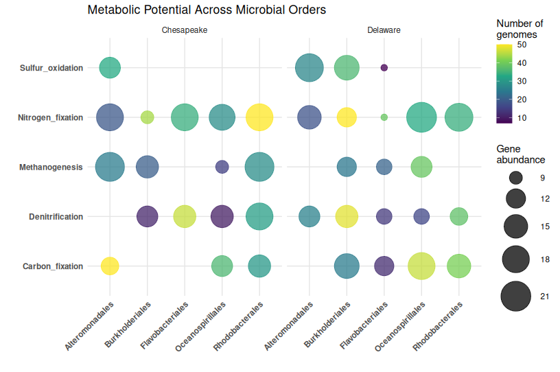
What this shows:
- Bubble size: How abundant each gene is in that order
- Bubble color: How many genomes contribute to that order
- Position: Which order has which function
- Facets: Comparison across locations
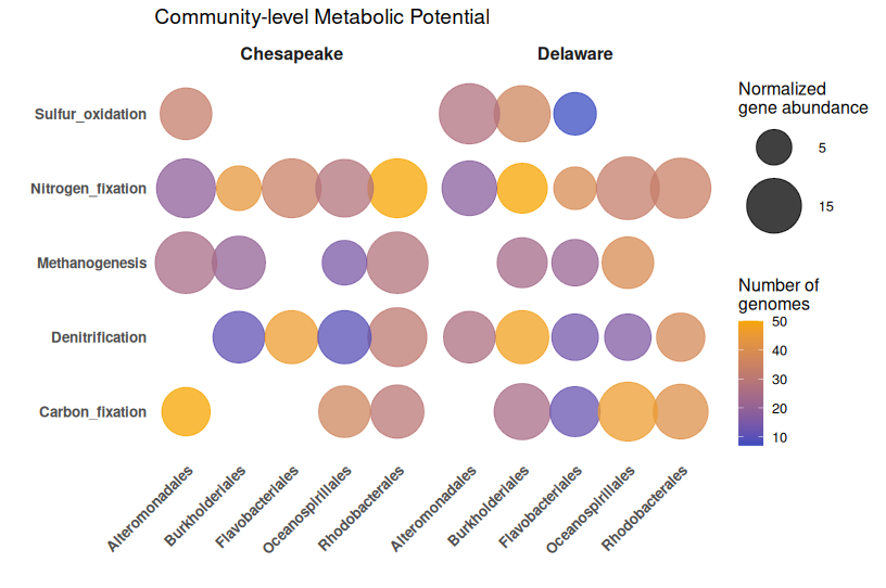
🎨 Enhanced Bubble Plot with Better Styling
library(ggplot2)
library(dplyr)

ggplot(bubble_data, aes(x = Order, y = Function)) +
  geom_point(
    aes(size = gene_abundance, color = num_genomes),
    alpha = 0.75
  ) +
  scale_size_continuous(
    limits = c(1, max(bubble_data$gene_abundance)),
    range = c(4, 20),
    breaks = c(5, 15, 25, 35),
    name = "Normalized\ngene abundance"
  ) +
  scale_color_gradient(
    low = "#3B4CC0",
    high = "#F7A501",
    name = "Number of\ngenomes"
  ) +
  facet_wrap(~ Bay) +
  theme_minimal(base_size = 12) +
  theme(
    axis.text.x = element_text(angle = 45, hjust = 1, face = "bold", size = 10),
    axis.text.y = element_text(face = "bold", size = 10),
    panel.grid.major = element_blank(),
    panel.grid.minor = element_blank(),
    strip.text = element_text(face = "bold", size = 12),
    legend.position = "right"
  ) +
  labs(
    x = "",
    y = "",
    title = "Community-level Metabolic Potential"
  )
🐍 Python Version
Create Toy Data (Python)
import numpy as np
import pandas as pd
import itertools

np.random.seed(123)

# Define categories
orders = ["Burkholderiales", "Rhodobacterales", "Flavobacteriales",
          "Alteromonadales", "Oceanospirillales"]
functions = ["Nitrogen_fixation", "Sulfur_oxidation", "Carbon_fixation",
             "Denitrification", "Methanogenesis"]
locations = ["Delaware", "Chesapeake"]

# Create all combinations
combinations = list(itertools.product(orders, functions, locations))

bubble_data = pd.DataFrame(combinations, columns=['Order', 'Function', 'Bay'])

# Simulate gene abundance
bubble_data['gene_abundance'] = np.random.poisson(15, len(bubble_data))

# Simulate number of genomes
bubble_data['num_genomes'] = np.random.randint(5, 51, len(bubble_data))

# Add sparsity (some orders don't have all functions)
mask = np.random.random(len(bubble_data)) < 0.3
bubble_data.loc[mask, 'gene_abundance'] = 0

# Remove zeros for cleaner visualization
bubble_data = bubble_data[bubble_data['gene_abundance'] > 0]

print(bubble_data.head())
Basic Bubble Plot (Python)
import matplotlib.pyplot as plt
import numpy as np

# Prepare data for Delaware
delaware_data = bubble_data[bubble_data['Bay'] == 'Delaware']

# Create figure
fig, (ax1, ax2) = plt.subplots(1, 2, figsize=(14, 6), sharey=True)

# Delaware
for idx, row in delaware_data.iterrows():
    ax1.scatter(
        row['Order'],
        row['Function'],
        s=row['gene_abundance'] * 20,  # Scale size
        c=[row['num_genomes']],
        cmap='viridis',
        alpha=0.75,
        vmin=bubble_data['num_genomes'].min(),
        vmax=bubble_data['num_genomes'].max()
    )

ax1.set_title('Delaware', fontweight='bold')
ax1.set_xlabel('')
ax1.set_ylabel('')
ax1.tick_params(axis='x', rotation=45)
ax1.grid(False)

# Chesapeake
chesapeake_data = bubble_data[bubble_data['Bay'] == 'Chesapeake']

scatter = None
for idx, row in chesapeake_data.iterrows():
    scatter = ax2.scatter(
        row['Order'],
        row['Function'],
        s=row['gene_abundance'] * 20,
        c=[row['num_genomes']],
        cmap='viridis',
        alpha=0.75,
        vmin=bubble_data['num_genomes'].min(),
        vmax=bubble_data['num_genomes'].max()
    )

ax2.set_title('Chesapeake', fontweight='bold')
ax2.set_xlabel('')
ax2.tick_params(axis='x', rotation=45)
ax2.grid(False)

# Add colorbars
cbar = plt.colorbar(scatter, ax=[ax1, ax2], label='Number of genomes')

plt.suptitle('Metabolic Potential Across Microbial Orders',
             fontsize=14, fontweight='bold', y=1.02)
plt.tight_layout()
plt.show()
Enhanced with Seaborn (Python)
import seaborn as sns
import matplotlib.pyplot as plt

# Create numeric mappings for categorical variables
bubble_data['Order_num'] = pd.Categorical(bubble_data['Order']).codes
bubble_data['Function_num'] = pd.Categorical(bubble_data['Function']).codes

fig, axes = plt.subplots(1, 2, figsize=(14, 6), sharey=True)

for idx, bay in enumerate(['Delaware', 'Chesapeake']):
    subset = bubble_data[bubble_data['Bay'] == bay]

    scatter = axes[idx].scatter(
        subset['Order_num'],
        subset['Function_num'],
        s=subset['gene_abundance'] * 20,
        c=subset['num_genomes'],
        cmap='viridis',
        alpha=0.75
    )

    axes[idx].set_xticks(range(len(orders)))
    axes[idx].set_xticklabels(orders, rotation=45, ha='right')
    axes[idx].set_yticks(range(len(functions)))
    axes[idx].set_yticklabels(functions)
    axes[idx].set_title(bay, fontweight='bold', fontsize=12)
    axes[idx].set_xlabel('')
    axes[idx].set_ylabel('')
    axes[idx].grid(False)

# Add colorbar
cbar = plt.colorbar(scatter, ax=axes, label='Number of genomes')

plt.suptitle('Community-level Metabolic Potential',
             fontsize=14, fontweight='bold', y=0.98)
plt.tight_layout()
plt.show()
⚠️ Common Mistakes with Bubble Plots
1. Overlapping bubbles that hide data
The problem: Too many bubbles in the same location make interpretation impossible
Solutions:
- Use
alphatransparency - Jitter positions slightly
- Filter to show only top N features
- Use faceting to separate groups
2. Inconsistent bubble scaling
The mistake: Bubble area doesn’t scale proportionally with values
Why it matters: Human perception interprets area, not radius
Solution: Use scale_size_area() in ggplot2 or properly scale in Python
3. Too many categories
The problem: 20+ categories on X or Y axis become unreadable
Better approach: Filter to top categories, use hierarchical grouping, or consider a heatmap instead
4. Poor color choice for third variable
The mistake: Using a diverging palette for sequential data
Better approach:
- Sequential data (counts, abundance) → sequential palette (viridis, blues)
- Diverging data (fold changes) → diverging palette (RdBu)
5. Not normalizing data appropriately
The mistake: Comparing raw counts across samples with different sequencing depths
Solution: Normalize by:
- Sequencing depth (reads per million)
- Genome completeness (for MAG-based analyses)
- Sample size or effort
6. Missing context in legends
The mistake: Legend says “size” without units
Better: “Gene abundance (normalized by genome completeness)”
7. Forgetting to filter zeros
The problem: Empty bubbles (size = 0) clutter the plot
Solution: Remove zero-abundance entries before plotting
✅ Best Practices for Bubble Plots
1. Normalize your data appropriately
For genomic data:
- Normalize by sequencing depth
- Adjust for genome completeness (MAGs)
- Use relative abundances when comparing across samples
2. Choose bubble sizes carefully
- Too small: Hard to see differences
- Too large: Overlapping obscures patterns
- Sweet spot:
range = c(3, 15)in ggplot2 works well for most cases
3. Use meaningful color scales
- Sequential for counts/abundance (viridis, YlOrRd)
- Diverging for fold changes (RdBu, PiYG)
- Ensure colorblind-friendly palettes
4. Limit categories
- Keep X and Y axes to ≤ 10-15 categories
- Filter to top taxa/functions if needed
- Use faceting for additional grouping variables
5. Add context with additional variables
Bubble plots shine when you encode 4+ dimensions:
- Position (X, Y)
- Size (abundance)
- Color (diversity, genome count, p-value)
- Shape (optional, but use sparingly)
6. Use transparency wisely
alpha = 0.6-0.8 helps see overlapping bubbles without losing visibility
7. Clean up axes
- Remove grid lines if they clutter
- Rotate X-axis labels for readability
- Use bold fonts for categorical labels
8. State normalization in legends
Always document: “Gene abundance normalized by average genome completeness”
🔍 Real-World Example: Metabolic Potential in Estuaries
I used bubble plot answer Which microbial orders possess key metabolic functions in estuarine ecosystems, and how does this vary between Delaware and Chesapeake Bays? The below figure is from my upcoming manuscript which is accepted in ISME communications. More details coming soon.
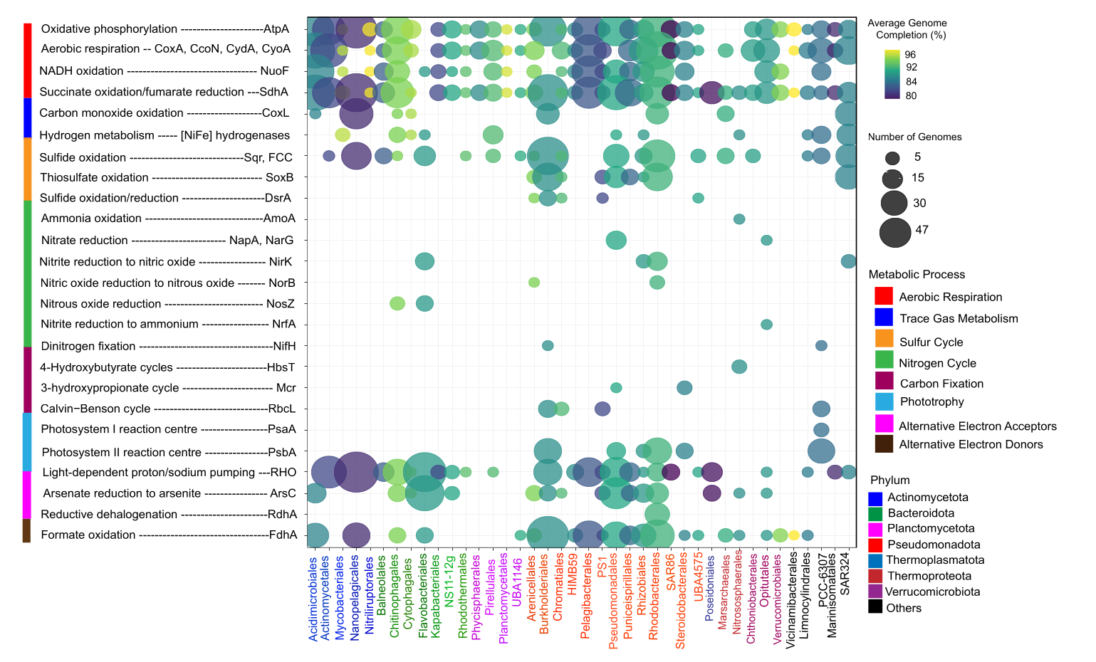
The Data
- X-axis: Microbial orders (from MAG taxonomy)
- Y-axis: Metabolic marker genes (nitrogen fixation, sulfur cycling, etc.)
- Bubble size: Normalized gene abundance
- Bubble color: Number of genomes contributing (genomic context)
- Facets: Geographic location (Delaware vs. Chesapeake)
Key Insights from This Type of Plot
✓ Taxonomic distribution: Which orders are metabolically diverse
✓ Functional specialization: Orders with high abundance of specific genes
✓ Geographic patterns: Differences between Delaware and Chesapeake
✓ Genomic context: Whether patterns are driven by many genomes or few
🆚 Bubble Plot vs. Heatmap: When to Use Which?
| Feature | Bubble Plot | Heatmap |
|---|---|---|
| Best for | Sparse data, multi-dimensional | Dense data, continuous values |
| Handles zeros | Excellent (just no bubble) | Poor (empty cells look odd) |
| Shows magnitude | Via size (less precise) | Via color (precise) |
| Additional variable | Color can encode 4th dimension | Limited to 3 dimensions |
| Readability | Good for ≤100 cells | Good for hundreds of cells |
| Pattern recognition | Moderate | Excellent with clustering |
Rule of thumb:
- Sparse, multi-dimensional data → Bubble plot
- Dense, continuous matrix → Heatmap
📌 Key Takeaways
✅ Bubble plots encode 4+ dimensions in one visualization
✅ Best for sparse, categorical data with quantitative values
✅ Normalize appropriately—especially for genomic data
✅ Filter categories to maintain readability (≤15 per axis)
✅ Use transparency to handle overlapping bubbles
✅ Color should be meaningful—not just decorative
✅ Document normalization in legends and captions
✅ Pair with statistical testing—bubble plots are exploratory
This is part of the “Visualize Your Data” series. Check out Day 1: Box Plots, Day 2: Heatmaps, Day 3: Ordination Plots, and Day 4: Volcano Plots if you missed them.
Have questions about bubble plots or functional genomics visualization? Drop a comment below!