Visualize Your Data — Day 4: Volcano Plots in Bioinformatics
📊 Visualize Your Data – Day 4: Volcano Plots
In Day 1, we explored distributions with box and violin plots.
In Day 2, we revealed patterns using heatmaps.
In Day 3, we visualized sample relationships with ordination plots.
Today, we’re diving into volcano plots—the visualization where statistics meets biology.
Volcano plots are the gold standard for displaying differential expression or abundance results. They simultaneously show both the magnitude of change (fold change) and statistical significance (p-value), making it easy to identify the most important features at a glance.
🎯 What Do Volcano Plots Show?
A volcano plot displays:
- X-axis: Log2 fold change (magnitude and direction of change)
- Y-axis: -log10(adjusted p-value) (statistical significance)
This layout creates a “volcano” shape where:
- Significant upregulated features appear in the upper right
- Significant downregulated features appear in the upper left
- Non-significant features cluster at the bottom
The key insight: You want features that are both biologically meaningful (large fold change) AND statistically significant (small p-value).
🔬 Where You’ll See Volcano Plots
Volcano plots are essential in:
- Differential gene expression (RNA-seq, microarray)
- Differential abundance analysis (metagenomics, proteomics)
- Metabolomics (compound abundance changes)
- Functional enrichment (pathway or enzyme differences)
- Any comparison where you have fold changes and p-values
If you read papers involving “differential analysis,” you’ll see volcano plots.
🧪 Toy Dataset (Differential Expression)
Let’s simulate differential expression data similar to what you’d get from DESeq2 or edgeR.
R Version
set.seed(123)

# Simulate 1000 genes
n_genes <- 1000

# Most genes: no change (log2FC near 0, high p-values)
baseline_fc <- rnorm(n_genes * 0.85, mean = 0, sd = 0.5)
baseline_pval <- runif(n_genes * 0.85, 0.05, 1)

# Some upregulated genes (positive log2FC, low p-values)
up_fc <- rnorm(n_genes * 0.075, mean = 2, sd = 0.5)
up_pval <- runif(n_genes * 0.075, 0, 0.01)

# Some downregulated genes (negative log2FC, low p-values)
down_fc <- rnorm(n_genes * 0.075, mean = -2, sd = 0.5)
down_pval <- runif(n_genes * 0.075, 0, 0.01)

# Combine all
volcano_data <- data.frame(
  Gene = paste0("Gene_", 1:n_genes),
  log2FoldChange = c(baseline_fc, up_fc, down_fc),
  pvalue = c(baseline_pval, up_pval, down_pval),
  stringsAsFactors = FALSE
)

# Calculate adjusted p-values (FDR correction)
volcano_data$padj <- p.adjust(volcano_data$pvalue, method = "fdr")

# Add significance classification
volcano_data$Significant <- ifelse(
  volcano_data$padj < 0.05 & abs(volcano_data$log2FoldChange) > 1,
  ifelse(volcano_data$log2FoldChange > 1, "Upregulated", "Downregulated"),
  "Not Significant"
)

head(volcano_data)
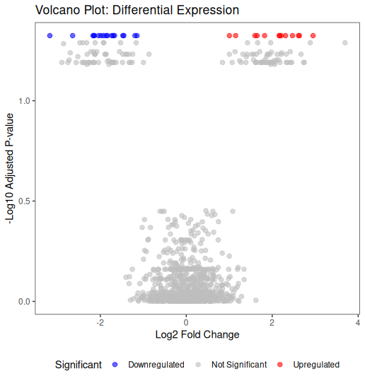
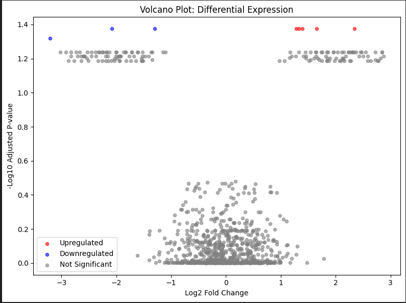
📊 Basic Volcano Plot in R
library(ggplot2)

ggplot(volcano_data, aes(x = log2FoldChange, y = -log10(padj))) +
  geom_point(aes(color = Significant), alpha = 0.6, size = 2) +
  scale_color_manual(values = c(
    "Upregulated" = "red",
    "Downregulated" = "blue",
    "Not Significant" = "grey"
  )) +
  theme_bw() +
  labs(
    title = "Volcano Plot: Differential Expression",
    x = "Log2 Fold Change",
    y = "-Log10 Adjusted P-value"
  ) +
  theme(
    panel.grid.major = element_blank(),
    panel.grid.minor = element_blank(),
    legend.position = "bottom"
  )
Key elements:
- Red points: significantly upregulated
- Blue points: significantly downregulated
- Grey points: not significant
- Points higher on Y-axis: more significant
- Points further from X=0: larger fold changes
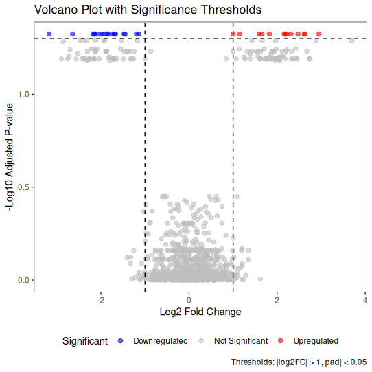
🎨 Enhanced Volcano Plot with Thresholds
Adding reference lines helps readers identify significance thresholds.
library(ggplot2)

ggplot(volcano_data, aes(x = log2FoldChange, y = -log10(padj))) +
  geom_point(aes(color = Significant), alpha = 0.6, size = 2) +

  # Add threshold lines
  geom_hline(yintercept = -log10(0.05), linetype = "dashed", color = "black") +
  geom_vline(xintercept = c(-1, 1), linetype = "dashed", color = "black") +

  scale_color_manual(values = c(
    "Upregulated" = "red",
    "Downregulated" = "blue",
    "Not Significant" = "grey"
  )) +

  theme_bw() +
  labs(
    title = "Volcano Plot with Significance Thresholds",
    x = "Log2 Fold Change",
    y = "-Log10 Adjusted P-value",
    caption = "Thresholds: |log2FC| > 1, padj < 0.05"
  ) +
  theme(
    panel.grid.major = element_blank(),
    panel.grid.minor = element_blank(),
    legend.position = "bottom"
  )
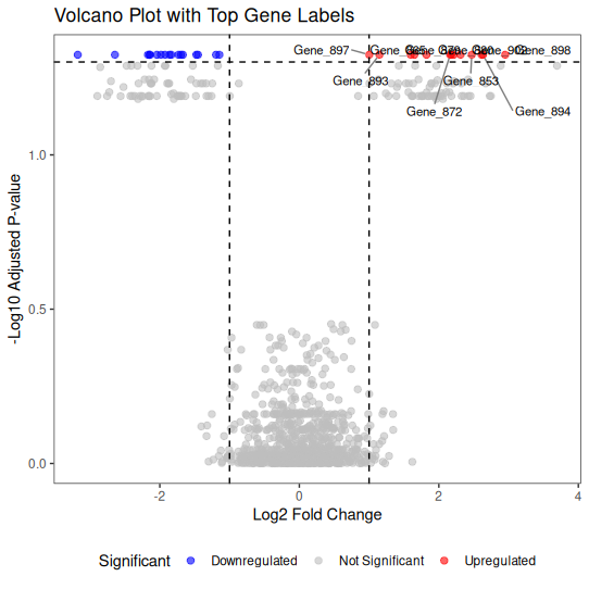
🏷️ Labeling Top Genes
For publication figures, you often want to label the most significant features.
library(ggplot2)
library(ggrepel)

# Select top 10 most significant genes
top_genes <- volcano_data %>%
  filter(Significant != "Not Significant") %>%
  arrange(padj) %>%
  head(10)

ggplot(volcano_data, aes(x = log2FoldChange, y = -log10(padj))) +
  geom_point(aes(color = Significant), alpha = 0.6, size = 2) +

  # Add labels for top genes
  geom_text_repel(
    data = top_genes,
    aes(label = Gene),
    size = 3,
    box.padding = 0.5,
    point.padding = 0.3,
    segment.color = 'grey50',
    max.overlaps = 20
  ) +

  geom_hline(yintercept = -log10(0.05), linetype = "dashed", color = "black") +
  geom_vline(xintercept = c(-1, 1), linetype = "dashed", color = "black") +

  scale_color_manual(values = c(
    "Upregulated" = "red",
    "Downregulated" = "blue",
    "Not Significant" = "grey"
  )) +

  theme_bw() +
  labs(
    title = "Volcano Plot with Top Gene Labels",
    x = "Log2 Fold Change",
    y = "-Log10 Adjusted P-value"
  ) +
  theme(
    panel.grid.major = element_blank(),
    panel.grid.minor = element_blank(),
    legend.position = "bottom"
  )
📐 Real Example: DESeq2 Workflow
Here’s how volcano plots fit into a typical DESeq2 analysis:
library(DESeq2)

# Assume you have countData and colData prepared
# dds <- DESeqDataSetFromMatrix(
#   countData = countData,
#   colData = colData,
#   design = ~ condition
# )

# Run DESeq2
# dds <- DESeq(dds)
# results <- results(dds)

# Extract results as data frame
# res_df <- as.data.frame(results)
# res_df$Gene <- rownames(res_df)

# Create volcano plot
# ggplot(res_df, aes(x = log2FoldChange, y = -log10(padj))) +
#   geom_point(aes(color = padj < 0.05 & abs(log2FoldChange) > 1)) +
#   scale_color_manual(values = c("grey", "red")) +
#   theme_bw() +
#   labs(x = "Log2 Fold Change", y = "-Log10 Adjusted P-value")
🐍 Python Version
Create Toy Data (Python)
import numpy as np
import pandas as pd
from scipy.stats import false_discovery_control

np.random.seed(123)

n_genes = 1000

# Baseline genes
baseline_fc = np.random.normal(0, 0.5, int(n_genes * 0.85))
baseline_pval = np.random.uniform(0.05, 1, int(n_genes * 0.85))

# Upregulated genes
up_fc = np.random.normal(2, 0.5, int(n_genes * 0.075))
up_pval = np.random.uniform(0, 0.01, int(n_genes * 0.075))

# Downregulated genes
down_fc = np.random.normal(-2, 0.5, int(n_genes * 0.075))
down_pval = np.random.uniform(0, 0.01, int(n_genes * 0.075))

# Combine
volcano_data = pd.DataFrame({
    'Gene': [f'Gene_{i}' for i in range(1, n_genes + 1)],
    'log2FoldChange': np.concatenate([baseline_fc, up_fc, down_fc]),
    'pvalue': np.concatenate([baseline_pval, up_pval, down_pval])
})

# FDR correction
volcano_data['padj'] = false_discovery_control(volcano_data['pvalue'])

# Classify significance
def classify_significance(row):
    if row['padj'] < 0.05 and abs(row['log2FoldChange']) > 1:
        return 'Upregulated' if row['log2FoldChange'] > 1 else 'Downregulated'
    return 'Not Significant'

volcano_data['Significant'] = volcano_data.apply(classify_significance, axis=1)
Basic Volcano Plot (Python)
import matplotlib.pyplot as plt

# Create color mapping
colors = {'Upregulated': 'red', 'Downregulated': 'blue', 'Not Significant': 'grey'}

fig, ax = plt.subplots(figsize=(8, 6))

for category, color in colors.items():
    subset = volcano_data[volcano_data['Significant'] == category]
    ax.scatter(
        subset['log2FoldChange'],
        -np.log10(subset['padj']),
        c=color,
        label=category,
        alpha=0.6,
        s=20
    )

ax.set_xlabel('Log2 Fold Change')
ax.set_ylabel('-Log10 Adjusted P-value')
ax.set_title('Volcano Plot: Differential Expression')
ax.legend()
ax.grid(False)
plt.tight_layout()
plt.show()
Enhanced with Thresholds (Python)
import matplotlib.pyplot as plt

fig, ax = plt.subplots(figsize=(8, 6))

# Plot points
for category, color in colors.items():
    subset = volcano_data[volcano_data['Significant'] == category]
    ax.scatter(
        subset['log2FoldChange'],
        -np.log10(subset['padj']),
        c=color,
        label=category,
        alpha=0.6,
        s=20
    )

# Add threshold lines
ax.axhline(y=-np.log10(0.05), color='black', linestyle='--', linewidth=1)
ax.axvline(x=-1, color='black', linestyle='--', linewidth=1)
ax.axvline(x=1, color='black', linestyle='--', linewidth=1)

ax.set_xlabel('Log2 Fold Change')
ax.set_ylabel('-Log10 Adjusted P-value')
ax.set_title('Volcano Plot with Significance Thresholds')
ax.legend()
ax.grid(False)
plt.tight_layout()
plt.show()
With Labels (Python)
import matplotlib.pyplot as plt
from adjustText import adjust_text  # pip install adjustText

fig, ax = plt.subplots(figsize=(10, 7))

# Plot all points
for category, color in colors.items():
    subset = volcano_data[volcano_data['Significant'] == category]
    ax.scatter(
        subset['log2FoldChange'],
        -np.log10(subset['padj']),
        c=color,
        label=category,
        alpha=0.6,
        s=20
    )

# Select top 10 genes for labeling
top_genes = volcano_data[
    volcano_data['Significant'] != 'Not Significant'
].nsmallest(10, 'padj')

# Add labels
texts = []
for _, row in top_genes.iterrows():
    texts.append(
        ax.text(
            row['log2FoldChange'],
            -np.log10(row['padj']),
            row['Gene'],
            fontsize=8
        )
    )

# Adjust text to avoid overlaps
adjust_text(texts, arrowprops=dict(arrowstyle='->', color='grey', lw=0.5))

# Thresholds
ax.axhline(y=-np.log10(0.05), color='black', linestyle='--', linewidth=1)
ax.axvline(x=-1, color='black', linestyle='--', linewidth=1)
ax.axvline(x=1, color='black', linestyle='--', linewidth=1)

ax.set_xlabel('Log2 Fold Change')
ax.set_ylabel('-Log10 Adjusted P-value')
ax.set_title('Volcano Plot with Top Gene Labels')
ax.legend()
ax.grid(False)
plt.tight_layout()
plt.show()
⚠️ Common Mistakes with Volcano Plots
1. Not using adjusted p-values
The mistake: Plotting raw p-values instead of FDR-adjusted p-values
Why it matters: Multiple testing correction is essential—raw p-values inflate false positives
2. Arbitrary fold change thresholds
The mistake: Using |log2FC| > 2 when biological significance occurs at smaller changes
Better approach: Choose thresholds based on biological context, not arbitrary rules
3. Ignoring low-abundance features
The mistake: Including genes with very low counts that show large fold changes
Why it matters: Low-abundance features can have inflated fold changes due to small denominators
4. Over-labeling
The mistake: Labeling too many genes, making the plot cluttered
Better approach: Label only the top 5-10 most significant features
5. Not stating thresholds
The mistake: Showing significance cutoffs without documenting them
Better approach: Always state thresholds in figure legends (e.g., “padj < 0.05, |log2FC| > 1”)
6. Confusing fold change with log2 fold change
The mistake: Interpreting log2FC = 2 as “2-fold change”
Reality: log2FC = 2 means 4-fold change (2² = 4)
7. Using inappropriate colors
The mistake: Red/green color schemes (not colorblind-friendly)
Better approach: Use red/blue or other accessible color combinations
✅ Best Practices for Volcano Plots
1. Always use adjusted p-values
Use FDR-corrected p-values (padj from DESeq2, qvalue from other tools).
2. Pre-filter low-abundance features
Remove genes/features with very low counts before differential analysis.
3. Choose biologically meaningful thresholds
Common choices:
- padj < 0.05 (statistical significance)
-
** log2FC > 1** (2-fold change)
But adjust based on your field and biology.
4. State your thresholds clearly
| Always document in figure legends: “Significant features: padj < 0.05 and | log2FC | > 1” |
5. Label strategically
Label only the most important features (top by padj or specific genes of interest).
6. Use accessible colors
Avoid red/green combinations. Use red/blue or other colorblind-friendly palettes.
7. Include statistics in text
Don’t rely only on the plot—report numbers:
- “457 genes were significantly upregulated”
- “239 genes were significantly downregulated”
8. Export as vector graphics
Save as PDF or SVG for publication-quality figures.
🔍 Understanding Log2 Fold Change
Quick reference for interpreting log2FC values:
| log2FC | Actual Fold Change | Interpretation |
|---|---|---|
| -3 | 0.125× (1/8) | 8-fold decrease |
| -2 | 0.25× (1/4) | 4-fold decrease |
| -1 | 0.5× (1/2) | 2-fold decrease |
| 0 | 1× | No change |
| 1 | 2× | 2-fold increase |
| 2 | 4× | 4-fold increase |
| 3 | 8× | 8-fold increase |
Remember: log2FC is symmetric around zero, making it ideal for visualization.
🎨 Real-World Workflow
Here’s how volcano plots fit into a complete analysis:
- Run differential analysis (DESeq2, edgeR, limma)
- Extract results with log2FC and adjusted p-values
- Filter low-abundance features (optional but recommended)
- Create volcano plot to visualize results
- Identify top hits for follow-up
- Validate with other methods (qPCR, orthogonal datasets)
- Integrate with other analyses (GO enrichment, pathway analysis)
Volcano plots are a visualization step, not a statistical test. The statistics come from your differential analysis tool (DESeq2, etc.).
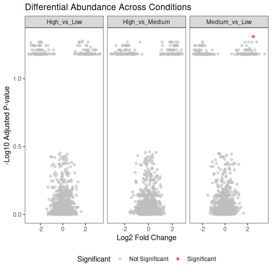
📊 Faceted Volcano Plots (Multiple Comparisons)
When you have multiple comparisons (e.g., different conditions), faceted plots help.
library(ggplot2)
library(dplyr)

# Simulate data for 3 conditions
set.seed(123)
conditions <- c("High_vs_Low", "Medium_vs_Low", "High_vs_Medium")

volcano_multi <- bind_rows(lapply(conditions, function(cond) {
  n <- 1000
  data.frame(
    Gene = paste0("Gene_", 1:n),
    log2FoldChange = c(
      rnorm(n * 0.85, 0, 0.5),
      rnorm(n * 0.075, 2, 0.5),
      rnorm(n * 0.075, -2, 0.5)
    ),
    pvalue = c(
      runif(n * 0.85, 0.05, 1),
      runif(n * 0.075, 0, 0.01),
      runif(n * 0.075, 0, 0.01)
    ),
    Condition = cond
  )
}))

volcano_multi$padj <- p.adjust(volcano_multi$pvalue, method = "fdr")
volcano_multi$Significant <- ifelse(
  volcano_multi$padj < 0.05 & abs(volcano_multi$log2FoldChange) > 1,
  "Significant", "Not Significant"
)

# Faceted plot
ggplot(volcano_multi, aes(x = log2FoldChange, y = -log10(padj))) +
  geom_point(aes(color = Significant), alpha = 0.6, size = 1.5) +
  facet_wrap(~ Condition, scales = "free_x") +
  scale_color_manual(values = c("Significant" = "red", "Not Significant" = "grey")) +
  theme_bw() +
  labs(
    title = "Differential Abundance Across Conditions",
    x = "Log2 Fold Change",
    y = "-Log10 Adjusted P-value"
  ) +
  theme(
    panel.grid.major = element_blank(),
    panel.grid.minor = element_blank(),
    legend.position = "bottom"
  )
📌 Key Takeaways
✅ Volcano plots combine magnitude and significance in one view
✅ Always use adjusted p-values (FDR correction is standard)
✅ Choose thresholds based on biology, not arbitrary cutoffs
✅ Label strategically—too many labels create clutter
✅ State your thresholds clearly in figure legends
✅ Pre-filter low-abundance features to avoid misleading fold changes
✅ Export as vector graphics for publication
✅ Volcano plots visualize results—the statistics come from your differential analysis tool
🧬 Special Note: Metatranscriptomics and Gene Copy Number
When working with metatranscriptomics (MTX) data, volcano plots from standard differential expression tools can be misleading. Here’s why:
The Problem: Copy Number Confounding
A gene might appear “differentially expressed” in your volcano plot, but the question is:
Is this gene truly upregulated at the transcript level, or does the sample simply have more copies of this gene (higher DNA abundance)?
Standard differential expression tools (DESeq2, edgeR) cannot distinguish between:
- True transcriptional changes (biological regulation)
- Differences in gene copy number (genomic abundance)
The Solution: MTX Modeling
For metatranscriptomics studies, you should consider MTX modeling approaches that adjust for DNA abundance:
MTX (R package) is specifically designed for this:
- Built on MaAsLin2 framework
- Integrates feature-specific covariates
- Adjusts for DNA abundance as a continuous covariate
- Determines whether expression changes are independent of gene copy number
When to Use MTX Modeling
✅ Use MTX modeling when:
- You have paired metagenome (DNA) and metatranscriptome (RNA) data
- You want to identify truly differentially expressed genes
- You need to control for gene copy number variation
❌ Standard DESeq2/edgeR alone when:
- You only have RNA-seq data (no paired DNA)
- Working with isolate transcriptomics (not community-level)
Workflow Integration
- Standard approach: DESeq2 → Volcano plot (shows abundance changes)
- MTX approach: MTX modeling → Volcano plot (shows true expression changes, adjusted for DNA)
Key takeaway: If your volcano plot shows differential abundance in metatranscriptomics data, validate whether changes are due to expression or copy number by incorporating DNA abundance as a covariate.
This is especially important in microbial ecology where community composition (DNA) and activity (RNA) can vary independently.
📚 Learn more: https://github.com/biobakery/MTX_model
🔜 What’s Next?
Day 5: Bubble plots
This is part of the “Visualize Your Data” series. Check out Day 1: Box Plots, Day 2: Heatmaps, and Day 3: Ordination Plots if you missed them.
Have questions about volcano plots, differential analysis, or MTX modeling? Drop a comment below!
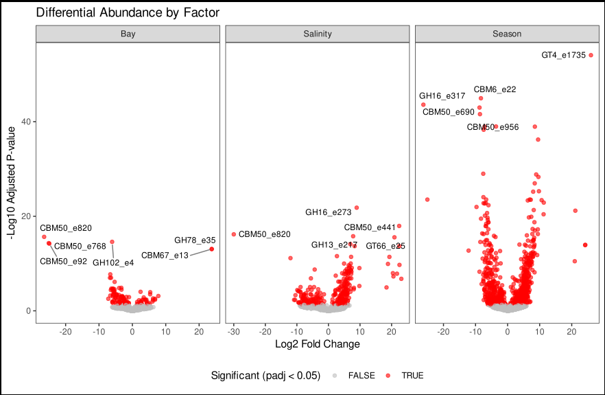
The image is created from real sets of data from one of my project and it is shoing differential expression of CAZYmes acorss different abiotic facotors.