Visualize Your Data — Day 3: Ordination Plots (PCA, PCoA, NMDS) in Bioinformatics
📊 Visualize Your Data – Day 3: Ordination Plots
In Day 1, we explored distributions using box and violin plots.
In Day 2, we visualized patterns using heatmaps.
Today, we tackle one of the most fundamental visualization techniques in bioinformatics and microbial ecology: ordination plots.
Ordination methods reduce high-dimensional data (hundreds or thousands of features) into 2D or 3D space, making it possible to visualize relationships among samples based on their overall composition.
🎯 What Questions Do Ordination Plots Answer?
Ordination plots help you explore:
-
Are samples more similar within groups than between groups?
(e.g., Do healthy and diseased microbiomes separate?) -
Do environmental or experimental factors structure communities?
(e.g., Does diet affect gut microbiome composition?) -
Which samples cluster together based on overall composition?
(e.g., Do ocean samples from the same depth group together?)
⚠️ Critical: Ordination is exploratory, not a statistical test
Ordination plots show patterns, but they don’t prove those patterns are statistically significant. Always pair ordination with proper statistical testing (PERMANOVA, ANOSIM, etc.).
🔬 Where You’ll See Ordination Plots
Ordination methods are ubiquitous in:
- Microbiome and metagenomics studies (sample composition)
- Transcriptomics (gene expression patterns)
- Metabolomics (metabolite profiles)
- Functional ecology (pathway or enzyme abundance)
- Environmental monitoring (community structure across sites)
If you read papers in microbial ecology or systems biology, you’ve seen ordination plots—often multiple times per paper.
🧪 Toy Dataset (Community Matrix)
We’ll create a sample × feature matrix, similar to OTU/ASV counts, gene abundances, or pathway profiles.
set.seed(123)

community_data <- matrix(
  rpois(100, lambda = 10),
  nrow = 20
)

rownames(community_data) <- paste0("Sample_", 1:20)
colnames(community_data) <- paste0("Feature_", 1:5)

metadata <- data.frame(
  Group = rep(c("A", "B"), each = 10),
  row.names = rownames(community_data)
)
This simulates 20 samples across 2 groups (A and B) with 5 features each.
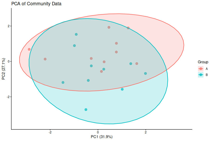
📌 PCA — Principal Component Analysis
When to Use PCA
✅ Data are continuous (normalized counts, expression values)
✅ Euclidean distances are meaningful (after appropriate transformation)
✅ Linear relationships dominate your data
Common applications:
- Transcriptomics (RNA-seq, microarray)
- Normalized abundance data (log-transformed counts)
- Quality control in genomics (detecting batch effects)
How PCA Works
PCA finds directions (principal components) of maximum variance in your data. The first PC captures the most variance, the second PC captures the next most (orthogonal to PC1), and so on.
Important: PCA axes represent variance, not necessarily biological meaning. PC1 might capture technical variation, sequencing depth, or a dominant biological gradient.
PCA in R
# Perform PCA (scale = TRUE centers and scales variables)
pca_res <- prcomp(community_data, scale. = TRUE)

# Extract PC coordinates
pca_df <- data.frame(
  pca_res$x,
  Group = metadata$Group
)

# Calculate variance explained
var_explained <- round(100 * pca_res$sdev^2 / sum(pca_res$sdev^2), 1)

# Plot
library(ggplot2)

ggplot(pca_df, aes(PC1, PC2, color = Group)) +
  geom_point(size = 3, alpha = 0.7) +
  theme_classic() +
  labs(
    title = "PCA of Community Data",
    x = paste0("PC1 (", var_explained[1], "%)"),
    y = paste0("PC2 (", var_explained[2], "%)")
  )
📌 Key Points About PCA
- Always report variance explained by each PC in axis labels
- PCA assumes linear relationships—not ideal for highly non-linear data
- Euclidean distance may not be appropriate for count data (consider transformations)
- Use
scale = TRUEunless you have a specific reason not to
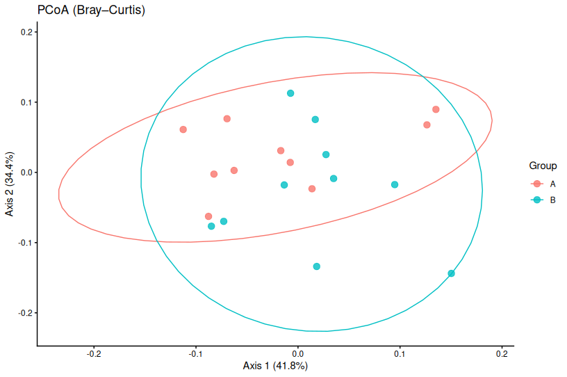
📌 PCoA — Principal Coordinates Analysis
When to Use PCoA
✅ You want to use non-Euclidean distances
✅ Common in microbiome and ecology studies
✅ Flexible choice of distance metrics (Bray–Curtis, Jaccard, UniFrac, etc.)
Common applications:
- Microbiome studies (Bray–Curtis, weighted/unweighted UniFrac)
- Community ecology (presence–absence or abundance-based distances)
- Any analysis where distance metric matters more than raw values
How PCoA Works
Unlike PCA, which operates on raw data, PCoA starts with a distance matrix between samples. It then finds coordinates that best preserve those pairwise distances.
This means you can use any distance metric appropriate for your data:
- Bray–Curtis: Abundance-based, good for count data
- Jaccard: Presence–absence, ignores abundance
- Weighted UniFrac: Phylogenetically-informed distances for microbiome data
PCoA in R (Bray–Curtis Distance)
library(vegan)

# Calculate Bray–Curtis distance matrix
dist_bc <- vegdist(community_data, method = "bray")

# Perform PCoA
pcoa_res <- cmdscale(dist_bc, eig = TRUE, k = 2)

# Calculate variance explained
var_exp <- round(100 * pcoa_res$eig[1:2] / sum(pcoa_res$eig), 1)

# Create data frame for plotting
pcoa_df <- data.frame(
  Axis1 = pcoa_res$points[,1],
  Axis2 = pcoa_res$points[,2],
  Group = metadata$Group
)

# Plot
ggplot(pcoa_df, aes(Axis1, Axis2, color = Group)) +
  geom_point(size = 3, alpha = 0.7) +
  theme_classic() +
  labs(
    title = "PCoA (Bray–Curtis Distance)",
    x = paste0("PCoA Axis 1 (", var_exp[1], "%)"),
    y = paste0("PCoA Axis 2 (", var_exp[2], "%)")
  )
📌 Key Points About PCoA
- Distance metric matters: Different metrics can produce very different plots
- Always state which distance metric you used in figure legends
- PCoA preserves pairwise distances, not variance
- Negative eigenvalues can occur with some distance metrics (usually negligible)
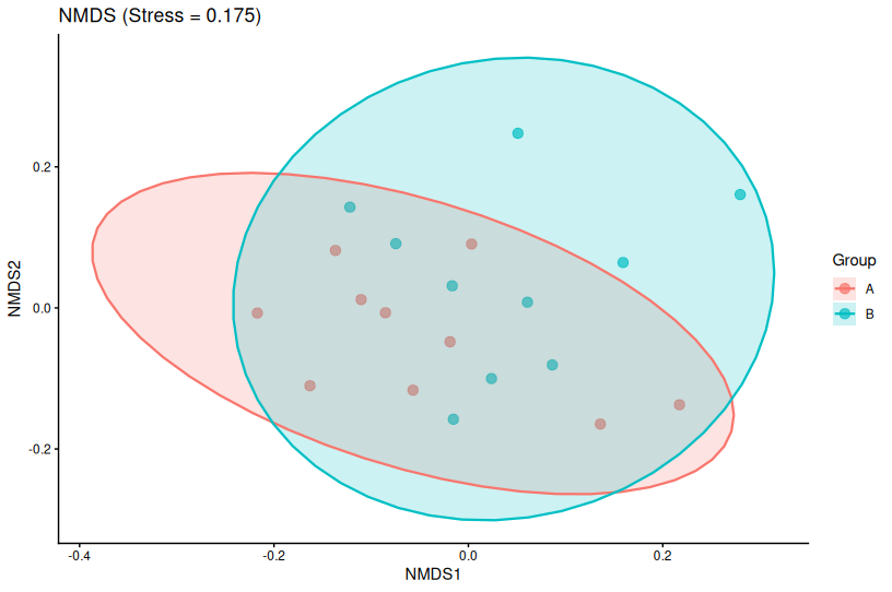
📌 NMDS — Non-metric Multidimensional Scaling
When to Use NMDS
✅ Data are non-linear or zero-inflated
✅ Rank order of distances matters more than exact values
✅ Very common in community ecology and microbiome studies
Why NMDS is popular in ecology:
- Handles non-linear relationships better than PCA/PCoA
- Robust to zero-inflated count data
- Only requires rank ordering of distances to be preserved
- More flexible for ecological data
How NMDS Works
NMDS is an iterative algorithm that:
- Starts with random sample positions in reduced space
- Moves points to better match the rank order of original distances
- Repeats until convergence
The stress value measures how well the reduced space preserves distance rankings:
- Stress < 0.05: Excellent fit
- Stress < 0.10: Good fit
- Stress < 0.20: Acceptable
- Stress > 0.20: Poor fit (interpretation may be misleading)
NMDS in R
library(vegan)

# Perform NMDS
nmds_res <- metaMDS(
  community_data,
  distance = "bray",
  k = 2,           # Number of dimensions
  trymax = 100     # Maximum iterations
)

# Extract coordinates
nmds_df <- data.frame(
  NMDS1 = nmds_res$points[,1],
  NMDS2 = nmds_res$points[,2],
  Group = metadata$Group
)

# Plot with stress value
ggplot(nmds_df, aes(NMDS1, NMDS2, color = Group)) +
  geom_point(size = 3, alpha = 0.7) +
  theme_classic() +
  labs(
    title = paste0("NMDS (Stress = ", round(nmds_res$stress, 3), ")"),
    x = "NMDS1",
    y = "NMDS2"
  )
📌 Key Points About NMDS
- Always report stress values in your figure or legend
- NMDS axes are arbitrary—rotation and scaling don’t matter
- Results can vary slightly between runs (use
set.seed()for reproducibility) - High stress? Try increasing dimensions (k = 3) or question if NMDS is appropriate
📝 PCA vs PCoA vs NMDS — Quick Decision Guide
| Method | Best For | Key Assumption | Distance |
|---|---|---|---|
| PCA | Continuous, normalized data | Linear variance structure | Euclidean |
| PCoA | When distance metric matters | Distance metric is appropriate | Any metric |
| NMDS | Ecological count data, non-linear | Rank order preservation | Any metric |
Decision Tree:
- Is your data continuous and normalized? → Try PCA first
- Do you need a specific distance metric (e.g., Bray–Curtis)? → Use PCoA
- Is your data highly non-linear or zero-inflated? → Consider NMDS
- Are you analyzing microbiome data? → PCoA or NMDS with Bray–Curtis/UniFrac
⚠️ Common Mistakes with Ordination Plots
1. Interpreting axes as direct biological gradients
The mistake: “PC1 shows temperature effects”
The reality: PC1 shows the direction of maximum variance, which might correlate with temperature
2. Comparing coordinates across different methods
The mistake: “Sample A has a higher NMDS1 value than in the PCA”
The reality: Axes from different methods are not comparable
3. Ignoring distance metric choice (PCoA/NMDS)
The mistake: Using Euclidean distance for count data
Better: Use Bray–Curtis or Jaccard for compositional data
4. Forgetting to report NMDS stress
The mistake: Showing NMDS without stress value
The reality: High stress (>0.20) means the plot may be misleading
5. Treating ordination as a hypothesis test
The mistake: “Groups are different because they separate in the PCA”
The reality: Visual separation ≠ statistical significance. Use PERMANOVA, ANOSIM, etc.
6. Not reporting variance explained (PCA/PCoA)
Always include the percentage of variance explained in your axis labels.
7. Over-interpreting outliers
One outlier can dramatically affect ordination plots. Investigate outliers—they might be biological, technical, or contamination.
✅ Best Practices for Ordination Plots
1. Choose the right method for your data type
Match the method to your data structure and question.
2. Always state your distance metric
Include in the figure legend: “PCoA based on Bray–Curtis dissimilarity”
3. Report variance explained or stress
- PCA/PCoA: Include % variance in axis labels
- NMDS: Report stress in title or legend
4. Pair with statistical testing
Use PERMANOVA, ANOSIM, or similar tests to validate visual patterns.
5. Check assumptions
- PCA: Are your data normally distributed after transformation?
- PCoA/NMDS: Is your distance metric appropriate?
6. Use color-blind friendly palettes
Make your plots accessible (viridis, ColorBrewer qualitative palettes).
7. Add confidence ellipses (optional)
Can help visualize group separation, but don’t overinterpret.
# Add stat_ellipse to ggplot
ggplot(pca_df, aes(PC1, PC2, color = Group)) +
  geom_point(size = 3, alpha = 0.7) +
  stat_ellipse(level = 0.95) +
  theme_classic()
🎨 Real-World Workflow
Here’s how ordination fits into a typical analysis:
- Pre-process data: Filter low-abundance features, normalize/transform
- Calculate distances: Choose appropriate metric (Bray–Curtis, Jaccard, etc.)
- Perform ordination: PCA, PCoA, or NMDS
- Visualize: Create publication-quality plots
- Test statistically: PERMANOVA to test group differences
- Investigate drivers: Use
envfit()or similar to identify variables correlated with ordination axes
Example PERMANOVA:
# Test if groups differ significantly
library(vegan)

adonis2(community_data ~ Group, data = metadata, method = "bray", permutations = 999)
🐍 Python Alternatives
For Python users, here are equivalent tools:
PCA:
from sklearn.decomposition import PCA
import pandas as pd

pca = PCA(n_components=2)
pca_coords = pca.fit_transform(community_data)

# Variance explained
var_exp = pca.explained_variance_ratio_ * 100
PCoA:
from sklearn.manifold import MDS
from scipy.spatial.distance import pdist, squareform

# Calculate Bray-Curtis distance
from sklearn.metrics import pairwise_distances

dist_matrix = pairwise_distances(community_data, metric='braycurtis')
mds = MDS(n_components=2, dissimilarity='precomputed', random_state=123)
pcoa_coords = mds.fit_transform(dist_matrix)
NMDS:
from sklearn.manifold import MDS

nmds = MDS(n_components=2, metric=False, dissimilarity='precomputed', random_state=123)
nmds_coords = nmds.fit_transform(dist_matrix)

# Stress
stress = nmds.stress_
📌 Key Takeaways
✅ Ordination summarizes multivariate relationships in reduced dimensions
✅ Method choice should match data type and biological question
✅ Ordination is exploratory and should be paired with statistics (PERMANOVA, ANOSIM)
✅ Distance metric matters for PCoA and NMDS—choose carefully
✅ Always report stress (NMDS) and variance explained (PCA/PCoA)
✅ Clear visualization improves interpretation but doesn’t replace proper analysis
🔜 What’s Next?
Day 4: Volcano Plots
Day 5: Bubble plots
This is part of the “Visualize Your Data” series. Check out Day 1: Box Plots and Violin Plots and Day 2: Heatmaps if you missed them.
Have questions about ordination? Drop a comment below!