Visualize Your Data — Day 2: Heatmaps in Bioinformatics
📊 Visualize Your Data – Day 2: Heatmaps
In Day 1, we explored box plots and violin plots for understanding data distributions. Today, we’re diving into one of the most ubiquitous visualization tools in bioinformatics: heatmaps.
Heatmaps appear in virtually every bioinformatics paper, and for good reason. They excel at revealing patterns in high-dimensional data, from gene expression profiles to functional abundance matrices. However, they’re also frequently misused or misinterpreted.
This post will help you create informative heatmaps, understand when to scale your data, and avoid common pitfalls that can mislead readers.
🎯 What We’ll Cover Today
- What heatmaps show (and what they don’t)
- Scaling vs. non-scaling: when and why
- Clustering rows and columns
- Interactive heatmaps for exploration
- Presence–absence heatmaps
- Best practices and common mistakes
🔥 Why Heatmaps Dominate Bioinformatics
Heatmaps are the go-to visualization for:
- Gene expression data (RNA-seq, microarrays)
- Functional gene abundance (metagenomic annotations)
- MAG × pathway matrices (genome-resolved metagenomics)
- CAZyme or metabolic marker profiles
- Sample × feature relationships (taxonomy, pathways, etc.)
They allow you to spot patterns across dozens—or even hundreds—of samples and features simultaneously, especially when paired with hierarchical clustering.
⚠️ First: What a Heatmap Is NOT
Before we dive into code, let’s be clear about what heatmaps cannot do:
❌ Show absolute values precisely – Color gradients compress information
❌ Replace statistical testing – Visual patterns ≠ statistical significance
❌ Work well without scaling – Raw values often obscure biological patterns
A heatmap is exploratory and comparative, not a statistical test.
Think of heatmaps as hypothesis-generating tools. They reveal patterns that warrant further investigation through proper statistical methods.
✅ Best Practices for Heatmaps
1. Know Your Data Type
Use heatmaps appropriately for abundance, expression, or binary (presence–absence) data. Mixing data types without normalization creates misleading visuals.
2. Handle Missing Values Explicitly
Never plot data with unaddressed missing values. Options include:
- Filtering features with >X% missing data
- Imputation (with clear documentation)
- Using a distinct color for NA values
Missing data creates artificial patterns and distorts clustering.
3. Choose Scaling Deliberately
Row scaling (most common): Centers and scales each row independently
- Use when: Comparing relative patterns across samples
- Loses: Absolute magnitude information
- Example: Gene expression across conditions
No scaling: Preserves absolute values
- Use when: Absolute magnitudes are biologically meaningful
- Example: Comparing highly abundant vs. rare taxa
Always state your scaling choice in the figure legend.
4. Limit Feature Number
Heatmaps with 500+ rows become unreadable. Pre-filter based on:
- Variance (keep most variable features)
- Mean abundance (remove rare features)
- Statistical significance
- Biological relevance
5. Use Readable Color Palettes
- ❌ Avoid rainbow schemes (perceptually non-uniform)
- ✅ Use color-blind friendly palettes (viridis, RdBu, etc.)
- ✅ Use diverging palettes for scaled data (centered at zero)
- ✅ Use sequential palettes for abundance data
6. Don’t Overinterpret Clustering
Dendrograms show similarity based on distance metrics, but:
- Clustering ≠ causation
- Clustering ≠ functional relationships
- Different distance metrics produce different trees
Use clustering to organize your heatmap, not as proof of biological relationships.
7. Export as Vector Graphics
Save as PDF or SVG for final polishing in Adobe Illustrator or Inkscape. This allows:
- Font unification across panels
- Precise alignment
- Professional-quality figures
🚫 Common Mistakes to Avoid
Ignoring Missing Values
Unhandled NAs create gaps that distort both visual patterns and clustering algorithms.
Forgetting to Report Scaling
“Heatmap of gene expression” is insufficient. Specify: “Row-scaled z-scores of log2-transformed expression values.”
Overinterpreting Color Intensity
Darker colors don’t mean “more important” or “statistically significant.” They show relative values based on your scaling choice.
Using Rainbow Palettes
Rainbow palettes exaggerate differences and aren’t accessible to colorblind readers (~8% of males, ~0.5% of females).
Including Too Many Features
A heatmap with 1,000 rows is decorative, not informative. Filter ruthlessly.
Assuming Clustering = Biology
Just because two genes cluster together doesn’t mean they’re co-regulated. Validate patterns with orthogonal methods.
Mixing Data Types
Combining raw counts, normalized abundances, and presence–absence data in one heatmap without proper transformation is a recipe for confusion.
Relying on Heatmaps Alone
Heatmaps complement statistical analyses—they don’t replace them. Always support visual patterns with quantitative evidence.
🧰 Tools: pheatmap vs. heatmaply
pheatmap (Static, Publication-Ready)
Best for:
- Final manuscript figures
- Full control over aesthetics
- Reproducible, high-quality PDFs
- Simple, clean code
Why bioinformaticians love it: It does one thing extremely well—creating beautiful, customizable static heatmaps.
heatmaply (Interactive, Exploratory)
Best for:
- Data exploration
- Teaching and presentations
- Supplementary materials
- Sharing with collaborators
Why it’s useful: Hovering reveals exact values, zooming helps navigate large datasets, and it’s excellent for exploratory analysis.
My Workflow
I use pheatmap for final figures and heatmaply during data exploration or when teaching. Choose the tool that matches your goal.
💻 Code Examples
🧪 Create Toy Dataset (R)
set.seed(123)

heatmap_data <- matrix(
  rnorm(50, mean = 10, sd = 3),
  nrow = 10
)

rownames(heatmap_data) <- paste0("Gene_", 1:10)
colnames(heatmap_data) <- paste0("Sample_", 1:5)
📦 Basic Heatmap (pheatmap, No Scaling)
library(pheatmap)

pheatmap(
  heatmap_data,
  cluster_rows = TRUE,
  cluster_cols = TRUE,
  fontsize = 10,
  border_color = "black"
)
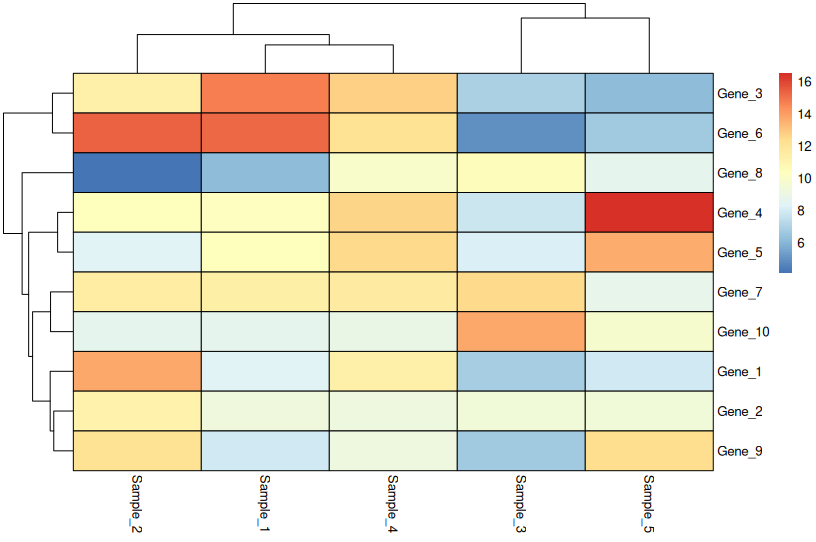
When to use: Only when values are directly comparable across all rows (e.g., all in the same units and scale).
🔄 Row-Scaled Heatmap (Most Common)
pheatmap(
  heatmap_data,
  scale = "row",
  cluster_rows = TRUE,
  cluster_cols = TRUE,
  fontsize = 10,
  border_color = "black"
)
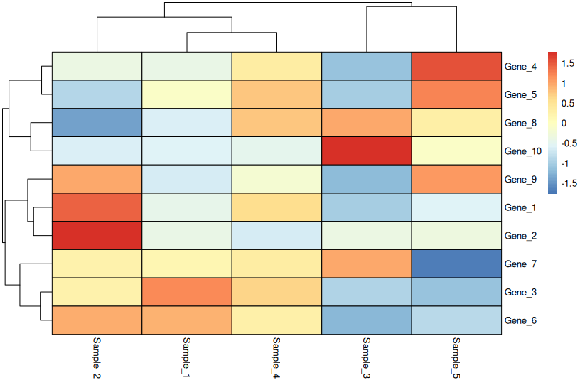
What row scaling means:
- Each row is centered (mean = 0) and scaled (SD = 1)
- Highlights relative differences across samples
- Loses absolute magnitude information
- Perfect for comparing gene expression patterns
Critical: Always state “Row-scaled” in your figure legend.
🖱 Interactive Heatmap (heatmaply)
library(heatmaply)

heatmaply(
  heatmap_data,
  scale = "row",
  xlab = "Samples",
  ylab = "Genes",
  fontsize_row = 10,
  fontsize_col = 10
)
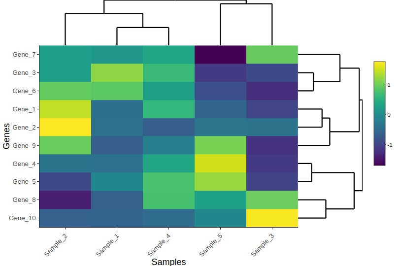
Use cases:
- Exploring large datasets
- Teaching workshops
- Supplementary materials for papers
- Sharing with collaborators who want to dig into the data
🐍 Python Equivalents
Many bioinformatics workflows use Python. Here’s how to create the same plots with seaborn.
Create Toy Data (Python)
import numpy as np
import pandas as pd

np.random.seed(123)

heatmap_data = pd.DataFrame(
    np.random.normal(10, 3, (10, 5)),
    index=[f"Gene_{i}" for i in range(1, 11)],
    columns=[f"Sample_{i}" for i in range(1, 6)]
)
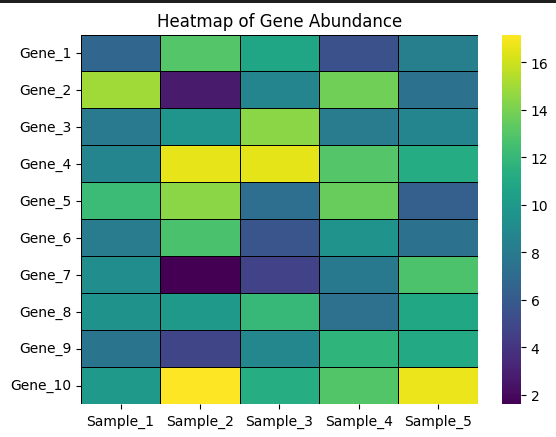
Basic Heatmap (Python)
import seaborn as sns
import matplotlib.pyplot as plt

sns.heatmap(
    heatmap_data,
    cmap="viridis",
    linewidths=0.5,
    linecolor="black"
)

plt.title("Heatmap of Gene Abundance")
plt.show()
Row-Scaled Heatmap (Python)
# Manual row scaling (z-score)
scaled_data = heatmap_data.sub(heatmap_data.mean(axis=1), axis=0)
scaled_data = scaled_data.div(heatmap_data.std(axis=1), axis=0)

sns.heatmap(
    scaled_data,
    cmap="vlag",
    center=0,
    linewidths=0.5,
    linecolor="black"
)

plt.title("Row-Scaled Heatmap")
plt.show()
🎨 Real-World Workflow: From Code to Publication
This is how most bioinformatics papers are made:
- Generate plots in R or Python
- Export as PDF or SVG (vector format)
- Final polishing in Adobe Illustrator:
- Align panels perfectly
- Unify fonts across all figures
- Add panel labels (A, B, C)
- Fine-tune colors and spacing
This workflow gives you reproducible code + publication-quality aesthetics.
📊 Real Example: MAG Abundance Heatmap
Below is a heatmap from my upcoming publication, created using pheatmap. It shows the normalized abundance of the top 100 MAGs (metagenome-assembled genomes) across samples, with abundances estimated using CoverM.
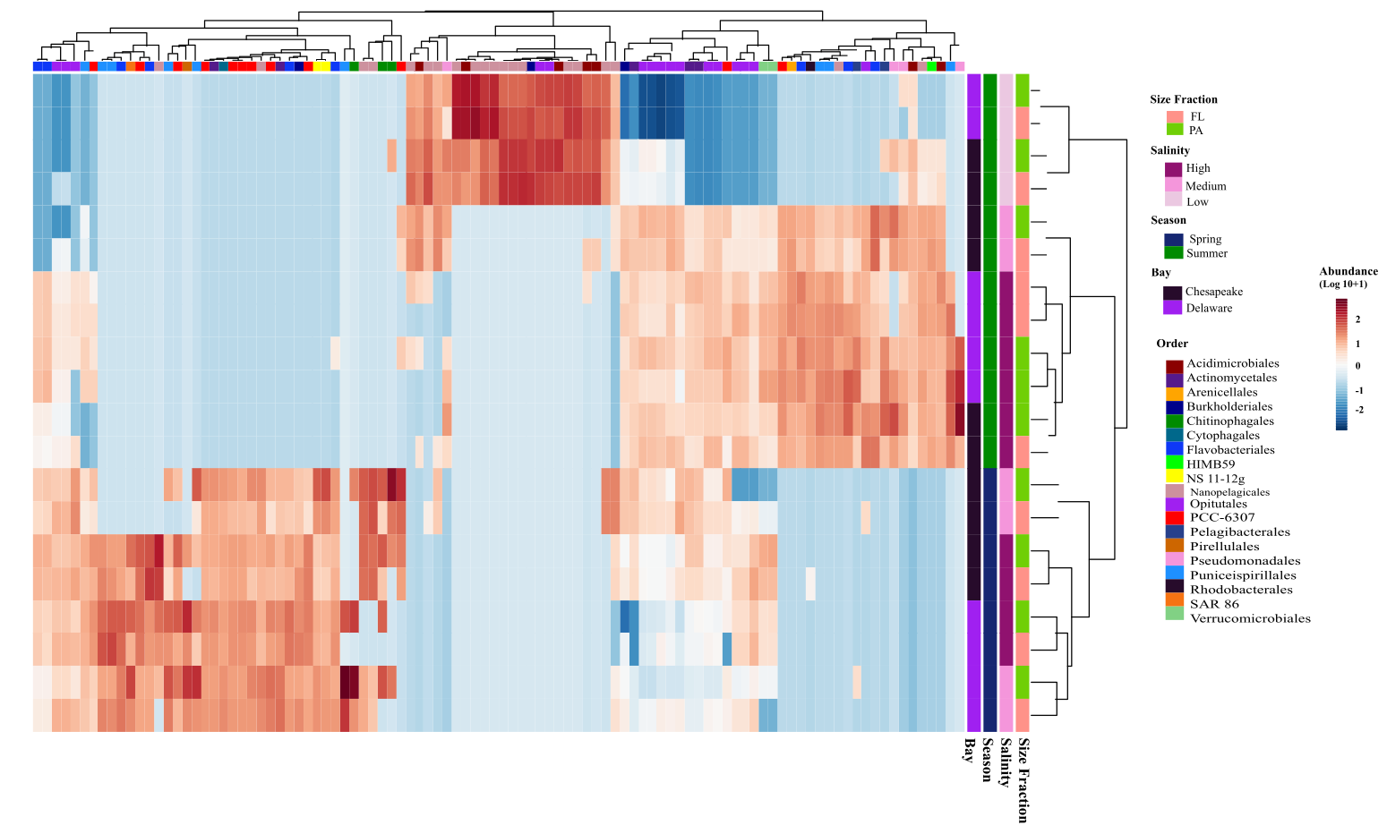
Key features:
- Row-scaled to highlight relative abundance patterns
- Hierarchical clustering reveals sample groups
- Color palette is colorblind-friendly
- Top 100 MAGs selected by mean abundance (pre-filtering)
📌 Key Takeaways
✅ Heatmaps are comparative, not absolute – Use them to spot patterns, not measure exact values
✅ Scaling matters more than colors – Always document whether you scaled rows, columns, or neither
✅ Interactive heatmaps excel at exploration – But static heatmaps are better for papers
✅ Filter ruthlessly – Fewer, well-chosen features beat visual clutter
✅ State your methods – “Row-scaled z-scores of log2(TPM + 1)” beats “heatmap of expression”
What’s Next?
In Day 3, we’ll explore ordination plots (PCA, PCoA, NMDS) for visualizing sample relationships and community structure.
If you’re learning bioinformatics or preparing figures for a manuscript, I hope this series helps you visualize your data with confidence.
Have questions or suggestions? Drop a comment below!
This is part of the “Visualize Your Data” series. Check out Day 1: Box Plots and Violin Plots if you missed it.