Visualize Your Data — Day 1: Box Plot vs Violin Plot in Bioinformatics
📊 Visualize Your Data – Day 1
Box Plot vs Violin Plot in Bioinformatics
After successfully completing my Whole Genome Sequencing analysis series, I’m starting a new daily blog series focused on data visualization commonly used in bioinformatics and molecular genomics papers.
Many learners can generate results but struggle with:
● Choosing the right plot
● Interpreting distributions correctly
● Producing publication-ready figures
This new series — “Visualize Your Data” — focuses on common plots seen in bioinformatics papers, using reproducible toy data and practical tips from real manuscript preparation.
🎯 Today’s focus
Box Plot vs Violin Plot
Both plots visualize data distributions, but they emphasize different aspects of the data.
🔹 When should you use a box plot?
A box plot is ideal when you want to:
● Compare medians across groups
● Highlight quartiles (Q1–Q3) and outliers
● Keep figures simple and reviewer-friendly
📌 Common in:
● Gene expression comparisons
● MAG abundance across conditions
● DNA:RNA ratio analyses
🔹 When should you use a violin plot?
A violin plot is useful when:
You have larger datasets
Distribution shape matters (e.g., multimodal data)
You want to visualize density, not just summary statistics
📌 Common in:
● Transcript abundance distributions
● Functional gene abundance
● Single-cell or large-sample datasets
🧪 Toy dataset (example)
We’ll use a simple toy dataset representing gene expression across two conditions.
Create toy data R version
 set.seed(123)

toy_data <- data.frame(
  Condition = rep(c("Control", "Treatment"), each = 30),
  Expression = c(
    rnorm(30, mean = 10, sd = 2),
    rnorm(30, mean = 15, sd = 3)
  )
)
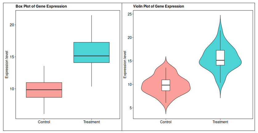
📦 R visualization (ggplot2) *Box plot (R)
library(ggplot2)

theme_pub <- theme(
  panel.grid.major = element_blank(),
  panel.grid.minor = element_blank(),
  panel.background = element_blank(),
  panel.border = element_rect(color = "black", fill = NA, size = 0.8),
  axis.line = element_blank(),
  axis.text = element_text(color = "black", size = 12),
  axis.title = element_text(color = "black", size = 12),
  plot.title = element_text(color = "black", size = 12, face = "bold"),
  legend.text = element_text(color = "black", size = 12),
  legend.title = element_text(color = "black", size = 12)
)
ggplot(toy_data, aes(x = Condition, y = Expression, fill = Condition)) +
  geom_boxplot(outlier.shape = 16, alpha = 0.7) +
  labs(
    title = "Box Plot of Gene Expression",
    y = "Expression level",
    x = ""
  ) +
  theme_pub +
  theme(legend.position = "none")
*Violin plot (R)
ggplot(toy_data, aes(x = Condition, y = Expression, fill = Condition)) +
  geom_violin(trim = FALSE, alpha = 0.7) +
  geom_boxplot(width = 0.15, fill = "white", outlier.shape = NA) +
  labs(
    title = "Violin Plot of Gene Expression",
    y = "Expression level",
    x = ""
  ) +
  theme_pub +
  theme(legend.position = "none")
🐍 Python equivalents (matplotlib + seaborn)
Many bioinformatics workflows rely on Python, so below are equivalent plots using Python.
Create toy data (Python)
import numpy as np
import pandas as pd

np.random.seed(123)

toy_data = pd.DataFrame({
    "Condition": ["Control"] * 30 + ["Treatment"] * 30,
    "Expression": np.concatenate([
        np.random.normal(10, 2, 30),
        np.random.normal(15, 3, 30)
    ])
})
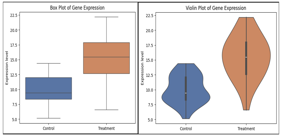
*Box plot (Python)
palette = {
    "Control": "#4C72B0",     # blue
    "Treatment": "#DD8452"    # orange
}
sns.boxplot(
    data=toy_data,
    x="Condition",
    y="Expression",
    palette=palette
)

plt.title("Box Plot of Gene Expression")
plt.ylabel("Expression level")
plt.xlabel("")
plt.show()
*Violin plot (Python)
import seaborn as sns
import matplotlib.pyplot as plt

sns.violinplot(
    data=toy_data,
    x="Condition",
    y="Expression",
    palette=palette,
    inner="box",
    cut=0
)

plt.title("Violin Plot of Gene Expression")
plt.ylabel("Expression level")
plt.xlabel("")
plt.show()
These codes and themes are customized based on my preferences and are routinely used in my manuscripts, posters, and other presentations.
⚠️ Common mistakes to avoid
❌ Using violin plots for very small datasets ❌ Showing density without summary statistics ❌ Overusing colors or inconsistent palettes ❌ Forgetting to label axes clearly
🎨 Note on editing figures in Adobe Illustrator
Even with powerful tools like R and Python, they don’t always give exactly what journals or reviewers expect.
In real-world manuscript preparation:
● Fonts may need adjustment
● Panel alignment may require manual tweaking
● Figure spacing, labels, or symbols may need fine control
● you may need to combine two different figure to 1 single figure
📌 Best practice
● Export plots as vector formats (.pdf or .svg)
● Perform final polishing in Adobe Illustrator (or Inkscape)
● Examples of common Illustrator edits:
● Aligning multi-panel figures
● Standardizing font sizes across panels
● Adjusting legend placement
● Adding panel labels (A, B, C)
This hybrid workflow (R/Python → Illustrator) is very common in published bioinformatics papers.
📝 Box plot vs Violin plot — quick summary
| Feature | Box plot | Violin plot |
|---|---|---|
| Shows median & quartiles | ✅ | ✅ |
| Shows distribution shape | ❌ | ✅ |
| Suitable for small datasets | ✅ | ❌ |
| Reviewer-friendly | ✅ | ⚠️ |
📌 Take-home message
● Box plots are ideal for clean, simple comparisons
● Violin plots reveal distribution structure
● Combining both often provides the clearest interpretation
● Final figure polishing is often done outside R/Python
🔜 Coming next in the series
● Heatmaps (scaling & clustering)
● PCA vs UMAP
● Volcano plots
● Bubble plots
● Presence–absence plots
If you’re learning bioinformatics or preparing figures for a manuscript, I hope this series helps you visualize your data with confidence.