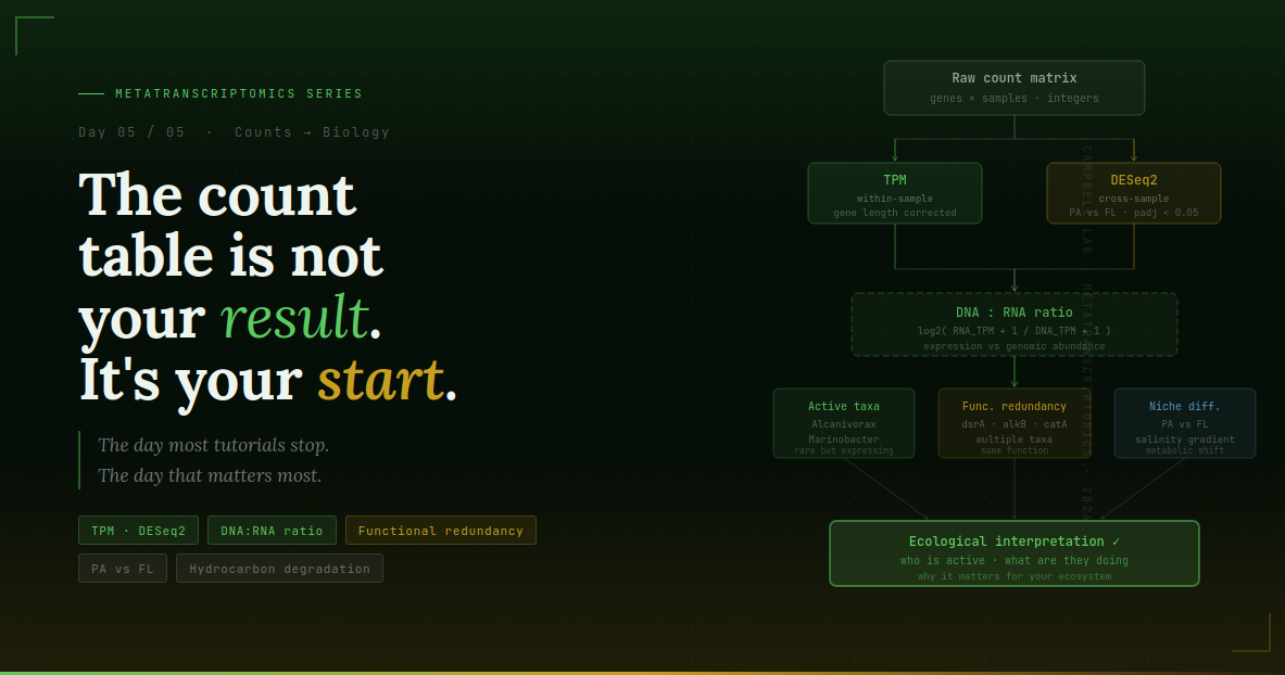
Day 5 — From Counts to Biology: Normalization, DESeq2, DNA:RNA Ratios, and Ecological Interpretation
You made it to the final day.
You have a count matrix. It came from four days of careful work — quality control, rRNA removal, paired-end repair, reference construction, Bowtie2 mapping, featureCounts quantification. Each step was essential. Each step protected the integrity of what you are about to analyze.
But that count matrix — integers in a spreadsheet — is not your result. It is your raw material. Right now it cannot answer a single biological question. Counts are not comparable across samples, not corrected for gene length, and not adjusted for the compositional structure of microbial community data. Before you can interpret anything, you need to transform those integers into meaningful quantities.
This is the day most tutorials skip entirely. This is the day that matters most.
What the count table looks like and why it cannot be used directly
Open your all_samples_counts.txt from Day 4. It looks something like this:
Geneid          Length  CP_Spr15G08  CP_Spr15L08  CP_Spr31G08
MAG1_gene_001   800     4            0            12
MAG1_gene_002   1200    0            2            0
MAG2_gene_001   600     8            8            3
MAG3_gene_001   2400    1            0            4
...
Three problems make these raw counts uninterpretable directly:
Problem 1 — Sequencing depth differs between samples. Sample CPSpr31G08 might have 500,000 total mapped reads while CP_Spr15G08 has 150,000. A gene with 12 counts in CP_Spr31G08 and 4 counts in CP_Spr15G08 might actually have _lower relative expression in CP_Spr31G08 — you cannot tell from raw counts alone.
Problem 2 — Gene length affects count accumulation. A 2,400 bp gene physically intercepts three times as many reads as an 800 bp gene with identical expression per basepair. Without length correction, long genes appear more expressed than short ones simply due to geometry.
Problem 3 — Compositional structure. In community RNA data, samples differ in their total mRNA pool composition. If PA samples have an organism that constitutes 30% of all expression and FL samples don’t, every other gene appears relatively lower in PA — not because it’s less expressed, but because the denominator has changed. DESeq2’s normalization specifically corrects for this.
Part 1 — TPM: within-sample normalization
TPM (Transcripts Per Million) is the standard within-sample normalization. It answers the question: “For this sample, what fraction of all expression does each gene represent?”
TPM is calculated in two steps:
Step 1: Divide each gene’s count by its length in kilobases → this gives RPK (Reads Per Kilobase). Now longer genes no longer dominate.
Step 2: Divide each RPK value by the sum of all RPK values for that sample, then multiply by 1,000,000 → this scales everything so all TPM values in a sample sum to exactly one million.
The key property: TPM values within a sample are directly comparable to each other. A gene with TPM = 500 contributes five times as much to the total mRNA pool as a gene with TPM = 100. TPM values are also more comparable across samples than RPKM (the older alternative), because the sum-to-one-million property holds across samples.
# ── TPM calculation from featureCounts output ─────────────────

library(dplyr)
library(tidyr)
library(ggplot2)

# Load the featureCounts table
# Skip the first comment line (starts with #)
counts_raw <- read.table("counts/all_samples_counts.txt",
                         header = TRUE,
                         skip = 1,
                         sep = "\t",
                         check.names = FALSE)

# Extract gene lengths and count matrix
gene_ids    <- counts_raw$Geneid
gene_length <- counts_raw$Length

# Sample columns start at column 7 in featureCounts output
count_matrix <- as.matrix(counts_raw[, 7:ncol(counts_raw)])
rownames(count_matrix) <- gene_ids

# ── Calculate TPM ──────────────────────────────────────────────
# Step 1: RPK = counts / (length in kb)
RPK <- sweep(count_matrix, 1, gene_length / 1000, FUN = "/")

# Step 2: TPM = RPK / (sum of RPK per sample) * 1e6
TPM <- sweep(RPK, 2, colSums(RPK) / 1e6, FUN = "/")

# Verify: each column should sum to ~1,000,000
colSums(TPM)

# Save TPM table
write.csv(as.data.frame(TPM), "counts/TPM_matrix.csv")
When to use TPM: comparing expression between genes within a sample (“is gene A more expressed than gene B?”), reporting expression levels in publications, and building the DNA:RNA ratio (Part 3). Do not use TPM for differential expression between samples — that is what DESeq2 is for.
What about RPKM? RPKM (Reads Per Kilobase per Million) is the older version. It does not guarantee that all values in a sample sum to the same number, making cross-sample comparison less reliable. Use TPM for any new analysis. Use RPKM only when replicating published analyses that used it.
Part 2 — DESeq2: differential expression across conditions
TPM tells you the relative expression within a sample. DESeq2 tells you which genes are differentially expressed between conditions — PA vs FL, Spring vs Summer, high salinity vs low salinity.
DESeq2 uses a completely different normalization strategy: median-of-ratios. For each sample, it computes a size factor (a single scaling number) that accounts for both sequencing depth and compositional differences between samples. This is more robust for community RNA data than TPM-based comparisons, because it handles the zero-inflation and overdispersion typical of environmental metatranscriptomics.
Setting up the DESeq2 object
library(DESeq2)
library(dplyr)
library(ggplot2)
library(ggrepel)
library(pheatmap)
library(stringr)

# ── Load count matrix (integers only — DESeq2 requires raw counts) ──
counts_raw <- read.table("counts/all_samples_counts.txt",
                         header = TRUE, skip = 1,
                         sep = "\t", check.names = FALSE)

gene_ids     <- counts_raw$Geneid
count_matrix <- as.matrix(counts_raw[, 7:ncol(counts_raw)])
rownames(count_matrix) <- gene_ids
mode(count_matrix) <- "integer"

# ── Load sample metadata ──────────────────────────────────────
# Your metadata CSV should have columns: SampleID, Site, Season, Salinity
# Example:
#   SampleID,       Site, Season, Salinity
#   CP_Spr15G08,    PA,   Spring, Low
#   CP_Spr15L08,    PA,   Spring, High
#   CP_Spr31G08,    FL,   Spring, Low

colData <- read.csv("metadata/sample_metadata.csv",
                    header = TRUE,
                    stringsAsFactors = FALSE)

rownames(colData) <- colData$SampleID

# Align: column names of count matrix must match row names of colData
count_matrix <- count_matrix[, rownames(colData)]
stopifnot(all(colnames(count_matrix) == rownames(colData)))

# Set factor levels — reference level comes first
colData$Site     <- factor(colData$Site)
colData$Season   <- factor(colData$Season)
colData$Salinity <- factor(colData$Salinity)

colData$Site     <- relevel(colData$Site,     ref = "PA")
colData$Season   <- relevel(colData$Season,   ref = "Spring")
colData$Salinity <- relevel(colData$Salinity, ref = "Low")
QC: PCA and sample distance heatmap
Before running differential expression, always visualize your samples. PCA tells you whether your samples cluster as expected. Unexpected clustering (e.g. samples grouping by sequencing batch rather than site) reveals problems before they propagate to your results.
# ── PCA and sample distance heatmap ──────────────────────────

# Build a DESeq2 object for QC only (no design factor)
dds_qc <- DESeqDataSetFromMatrix(countData = count_matrix,
                                 colData   = colData,
                                 design    = ~ 1)

# Filter genes with very low counts (< 10 reads total across all samples)
# These genes contribute noise and inflate multiple testing burden
dds_qc <- dds_qc[rowSums(counts(dds_qc)) >= 10, ]

# Variance-stabilizing transformation (VST)
# This is the DESeq2-recommended way to log-transform for visualization
# blind = TRUE means VST ignores the experimental design (appropriate for QC)
vsd <- varianceStabilizingTransformation(dds_qc, blind = TRUE)

# ── PCA plot ─────────────────────────────────────────────────
pca_df     <- plotPCA(vsd, intgroup = c("Site","Season","Salinity"), returnData = TRUE)
percentVar <- round(100 * attr(pca_df, "percentVar"))

ggplot(pca_df, aes(PC1, PC2, color = Site, shape = Season)) +
  geom_point(size = 4) +
  xlab(paste0("PC1: ", percentVar[1], "% variance")) +
  ylab(paste0("PC2: ", percentVar[2], "% variance")) +
  theme_bw(base_size = 13) +
  ggtitle("PCA — metatranscriptome samples (VST)") +
  theme(panel.grid.major = element_blank(),
        panel.grid.minor = element_blank())

ggsave("plots/PCA_samples.pdf", width = 7, height = 5)

# ── Sample distance heatmap ───────────────────────────────────
sampleDistMatrix <- as.matrix(dist(t(assay(vsd))))

pheatmap(sampleDistMatrix,
         annotation_col = colData[, c("Site","Season","Salinity"), drop = FALSE],
         main           = "Sample distances (VST)",
         filename       = "plots/sample_distance_heatmap.pdf",
         width = 8, height = 6)
What to look for in the PCA:
- PA and FL samples should separate along PC1 or PC2 if site drives community expression
- Seasonal samples may separate if season is a strong driver
- If samples from the same site do not cluster together, check your metadata alignment
Running DESeq2 for each factor
For our dataset we test three environmental factors independently: Site (PA vs FL), Season (Spring vs Summer), and Salinity (Low vs High). Running one factor at a time is the cleanest approach for exploratory analysis.
# ── DESeq2: one factor at a time ─────────────────────────────

run_deseq2 <- function(factor_name, count_matrix, colData) {
  dds <- DESeqDataSetFromMatrix(
    countData = count_matrix,
    colData   = colData,
    design    = as.formula(paste0("~ ", factor_name))
  )
  # Filter low-count genes
  dds <- dds[rowSums(counts(dds)) >= 10, ]
  # Run DESeq2
  dds <- DESeq(dds)
  # Extract results
  res <- as.data.frame(results(dds))
  res$Gene   <- rownames(res)
  res$Factor <- factor_name
  res
}

# Run for all three factors
res_all <- bind_rows(
  run_deseq2("Site",     count_matrix, colData),
  run_deseq2("Season",   count_matrix, colData),
  run_deseq2("Salinity", count_matrix, colData)
) %>% filter(!is.na(padj))

# Save full results table
write.csv(res_all, "results/DESeq2_all_factors.csv", row.names = FALSE)

# Pull significant genes (padj < 0.05, |log2FC| > 1)
sig_genes <- res_all %>%
  filter(padj < 0.05, abs(log2FoldChange) > 1) %>%
  arrange(padj)

cat("Significant genes per factor:\n")
print(table(sig_genes$Factor))
Volcano plots
A volcano plot is the standard way to visualize DESeq2 results. The x-axis is log2 fold change (how much more expressed in one condition vs the other). The y-axis is -log10(adjusted p-value) (statistical confidence). Genes in the upper right are significantly upregulated; upper left are significantly downregulated.
# ── Volcano plot — all genes, faceted by factor ───────────────

ggplot(res_all, aes(x = log2FoldChange, y = -log10(padj))) +
  geom_point(aes(color = padj < 0.05), alpha = 0.6, size = 1.5) +
  facet_wrap(~ Factor, scales = "free_x") +
  geom_vline(xintercept = 0,          linetype = "dashed", color = "grey50") +
  geom_hline(yintercept = -log10(0.05), linetype = "dashed", color = "grey50") +
  scale_color_manual(values = c("grey70", "#e85050"),
                     labels = c("not significant", "padj < 0.05")) +
  theme_bw(base_size = 12) +
  theme(panel.grid.major = element_blank(),
        panel.grid.minor = element_blank(),
        legend.position  = "bottom") +
  labs(title = "Differential expression by environmental factor",
       x     = "Log2 fold change",
       y     = "-Log10 adjusted p-value",
       color = NULL)

ggsave("plots/volcano_all_factors.pdf", width = 10, height = 5)

# ── Faceted volcano with top 5 gene labels per factor ─────────

# Extract short gene names for labels (text inside parentheses)
res_labeled <- res_all %>%
  filter(!is.na(padj)) %>%
  mutate(
    ShortName = str_extract(Gene, "(?<=\\().+?(?=\\))"),
    ShortName = ifelse(is.na(ShortName), Gene, ShortName)
  )

top5 <- res_labeled %>%
  filter(padj < 0.05) %>%
  group_by(Factor) %>%
  slice_min(order_by = padj, n = 5) %>%
  ungroup()

ggplot(res_labeled, aes(x = log2FoldChange, y = -log10(padj))) +
  geom_point(aes(color = padj < 0.05), alpha = 0.6, size = 1.5) +
  geom_text_repel(data = top5, aes(label = ShortName),
                  size = 3, max.overlaps = 50,
                  box.padding = 0.3, point.padding = 0.2,
                  segment.color = "grey50") +
  facet_wrap(~ Factor, scales = "free_x") +
  geom_vline(xintercept = 0,           linetype = "dashed", color = "grey50") +
  geom_hline(yintercept = -log10(0.05), linetype = "dashed", color = "grey50") +
  scale_color_manual(values = c("grey70", "#e85050")) +
  theme_bw(base_size = 12) +
  theme(panel.grid.major = element_blank(),
        panel.grid.minor = element_blank(),
        legend.position  = "bottom") +
  labs(title = "Top differentially expressed genes by factor",
       x = "Log2 fold change", y = "-Log10 adjusted p-value",
       color = "padj < 0.05")

ggsave("plots/volcano_labeled.pdf", width = 10, height = 5)
Interpreting the volcano: In our dataset with 2% alignment and a small MAG reference, do not expect hundreds of significant genes. Even five to ten significantly differentially expressed genes with strong fold changes are biologically meaningful — they represent real expression differences between PA and FL estuarine communities for the organisms you have reference for.
Part 3 — DNA:RNA ratio: expression above and beyond abundance
This is where metatranscriptomics diverges from standard RNA-seq and becomes genuinely powerful.
A gene can appear highly expressed in your count table for two very different reasons:
- The organism carrying it is abundant — there are many gene copies in the community, so even modest per-cell transcription yields many reads
- The organism carrying it is actively upregulating this gene right now — few copies but intense transcription per cell
These two scenarios have completely different biological meanings. The first is constitutive expression tracking abundance — background activity. The second is active metabolic engagement — the ecologically interesting signal.
The DNA:RNA ratio separates them. By computing TPM from a paired metagenome (DNA) of the same sample and dividing it into your metatranscriptome TPM (RNA), you get a ratio that reflects expression relative to genomic copy number.
# ── DNA:RNA ratio calculation ─────────────────────────────────
# Requires: TPM from metatranscriptome (RNA_TPM)
#           TPM from paired metagenome   (DNA_TPM)
# Both computed the same way, mapped to the same reference

# Load RNA TPM (computed in Part 1)
RNA_TPM <- read.csv("counts/TPM_matrix.csv", row.names = 1)

# Load DNA TPM (from your paired metagenome mapping)
# (same workflow: map metagenome reads to master_mags.fa → featureCounts → TPM)
DNA_TPM <- read.csv("counts/DNA_TPM_matrix.csv", row.names = 1)

# Align: keep only genes present in both
shared_genes <- intersect(rownames(RNA_TPM), rownames(DNA_TPM))
RNA_sub <- RNA_TPM[shared_genes, ]
DNA_sub <- DNA_TPM[shared_genes, ]

# ── Compute log2 DNA:RNA ratio ────────────────────────────────
# +1 pseudocount avoids log(0)
# Positive ratio = more mRNA than DNA predicts (active upregulation)
# Negative ratio = less mRNA than DNA predicts (gene present but silent)
# Near zero      = expression tracks abundance (constitutive)

DNA_RNA_ratio <- log2((RNA_sub + 1) / (DNA_sub + 1))

write.csv(DNA_RNA_ratio, "results/DNA_RNA_ratio.csv")

# ── Visualize: heatmap of top variable ratio genes ───────────
top_variable <- DNA_RNA_ratio[
  order(apply(DNA_RNA_ratio, 1, var), decreasing = TRUE)[1:50], ]

pheatmap(top_variable,
         annotation_col = colData[, c("Site","Salinity"), drop = FALSE],
         scale          = "row",
         show_rownames  = FALSE,
         main           = "DNA:RNA ratio — top 50 variable genes",
         filename       = "plots/DNA_RNA_ratio_heatmap.pdf",
         width = 9, height = 7)
Reading the ratio:
- Positive ratio (RNA > DNA): this gene is transcribed at higher levels than its genomic abundance would predict. The organism is actively upregulating it. This is your ecological signal — stress responses, substrate activation, niche differentiation.
- Negative ratio (RNA < DNA): the gene is present but mostly silent. The organism is there but not using this pathway.
- Near zero: expression tracks abundance. This is constitutive expression — housekeeping genes, stable metabolic maintenance.
For hydrocarbon degradation in our estuarine system: alkane monooxygenase genes (alkB) and ring-cleaving dioxygenases in contaminated sites should show strongly positive DNA:RNA ratios — a few rare organisms expressing intensely. Background Bacteroidetes might show near-zero ratios across the same samples.
Part 4 — Python workflow: TPM, ratio, and summary statistics
For users who prefer Python or want to automate the analysis as part of a larger pipeline:
# day5_analysis.py
# TPM normalization + DNA:RNA ratio + summary statistics
# Usage: python day5_analysis.py

import pandas as pd
import numpy as np
import matplotlib
matplotlib.use('Agg')
import matplotlib.pyplot as plt
import seaborn as sns
from pathlib import Path

# ── Paths ──────────────────────────────────────────────────────
COUNTS_FILE   = "counts/all_samples_counts.txt"
DNA_TPM_FILE  = "counts/DNA_TPM_matrix.csv"   # from metagenome mapping
METADATA_FILE = "metadata/sample_metadata.csv"
OUT_DIR       = Path("results")
PLOT_DIR      = Path("plots")
OUT_DIR.mkdir(exist_ok=True)
PLOT_DIR.mkdir(exist_ok=True)

# ── Load featureCounts output ──────────────────────────────────
counts_raw = pd.read_csv(COUNTS_FILE, sep="\t", skiprows=1, index_col=0)
gene_lengths = counts_raw["Length"]
count_matrix = counts_raw.iloc[:, 5:]   # sample columns start at position 6 (0-indexed 5)

print(f"Loaded count matrix: {count_matrix.shape[0]} genes × {count_matrix.shape[1]} samples")

# ── TPM normalization ──────────────────────────────────────────
def compute_tpm(counts, lengths):
    """
    counts  : DataFrame, genes × samples (raw integer counts)
    lengths : Series, gene lengths in bp
    returns : DataFrame, genes × samples (TPM values)
    """
    # Step 1: RPK = counts / (length / 1000)
    rpk = counts.div(lengths / 1000, axis=0)
    # Step 2: TPM = RPK / (sum RPK per sample) * 1e6
    tpm = rpk.div(rpk.sum(axis=0) / 1e6, axis=1)
    return tpm

RNA_TPM = compute_tpm(count_matrix, gene_lengths)
RNA_TPM.to_csv(OUT_DIR / "TPM_matrix.csv")
print(f"TPM matrix saved. Column sums (should be ~1e6):")
print(RNA_TPM.sum(axis=0).round(0))

# ── DNA:RNA ratio (if DNA TPM available) ──────────────────────
if Path(DNA_TPM_FILE).exists():
    DNA_TPM = pd.read_csv(DNA_TPM_FILE, index_col=0)

    shared = RNA_TPM.index.intersection(DNA_TPM.index)
    shared_samples = RNA_TPM.columns.intersection(DNA_TPM.columns)

    RNA_sub = RNA_TPM.loc[shared, shared_samples]
    DNA_sub = DNA_TPM.loc[shared, shared_samples]

    ratio = np.log2((RNA_sub + 1) / (DNA_sub + 1))
    ratio.to_csv(OUT_DIR / "DNA_RNA_ratio.csv")
    print(f"\nDNA:RNA ratio computed for {len(shared)} genes, {len(shared_samples)} samples")

    # Plot: distribution of ratios per sample
    fig, ax = plt.subplots(figsize=(8, 4))
    ratio.boxplot(ax=ax)
    ax.axhline(0, color="grey", linestyle="--", linewidth=0.8)
    ax.set_title("DNA:RNA ratio distribution per sample")
    ax.set_ylabel("log2(RNA_TPM + 1 / DNA_TPM + 1)")
    ax.set_xticklabels(ax.get_xticklabels(), rotation=45, ha="right")
    plt.tight_layout()
    plt.savefig(PLOT_DIR / "DNA_RNA_ratio_boxplot.pdf")
    plt.close()
    print("DNA:RNA ratio boxplot saved.")
else:
    print(f"\nDNA TPM file not found: {DNA_TPM_FILE}")
    print("Skipping DNA:RNA ratio. Provide paired metagenome TPM to enable this.")

# ── Summary statistics ─────────────────────────────────────────
total_genes   = count_matrix.shape[0]
expressed     = (count_matrix.sum(axis=1) > 0).sum()
zero_genes    = total_genes - expressed
mean_tpm      = RNA_TPM.mean(axis=1)
top10         = mean_tpm.nlargest(10)

print(f"\n── Expression summary ──────────────────────────")
print(f"Total genes:              {total_genes}")
print(f"Genes with ≥1 count:      {expressed}")
print(f"Zero-count genes:         {zero_genes}")
print(f"Median mean TPM:          {mean_tpm.median():.2f}")
print(f"\nTop 10 expressed genes (mean TPM across samples):")
print(top10.round(2).to_string())

# ── TPM heatmap: top 50 expressed genes ───────────────────────
top50 = RNA_TPM.loc[mean_tpm.nlargest(50).index]

fig, ax = plt.subplots(figsize=(10, 12))
sns.heatmap(
    np.log2(top50 + 1),
    ax=ax, cmap="YlOrRd",
    xticklabels=True, yticklabels=False,
    cbar_kws={"label": "log2(TPM + 1)"}
)
ax.set_title("Top 50 expressed genes (log2 TPM)")
plt.tight_layout()
plt.savefig(PLOT_DIR / "top50_TPM_heatmap.pdf")
plt.close()
print("\nTop-50 TPM heatmap saved.")
print(f"\nAll outputs in: {OUT_DIR}/ and {PLOT_DIR}/")
Connecting everything to the biology
We started this series with one question: “Who is active, not just present?”
By Day 5, you have the tools to answer it at multiple levels:
TPM tells you which genes dominate the expressed community within each sample. In our estuarine data, expect ribosomal proteins, transport systems, and central metabolic genes to dominate — these are the constitutively expressed housekeeping functions that run constantly.
DESeq2 (Site: PA vs FL) identifies genes that are systematically more expressed in one estuary than the other, controlling for sequencing depth and compositional differences. These are your ecologically differentiated functions — the pathways that distinguish PA estuarine activity from FL estuarine activity.
DNA:RNA ratio reveals which of those differences reflect genuine upregulation versus simply more organisms being present. A gene with high TPM and a strongly positive DNA:RNA ratio is being actively induced — the organism carrying it is responding to something in its environment. That is where the ecological narrative lives.
Series complete
Five days. One complete pipeline. Every step documented with real data, real numbers, and honest interpretation of what those numbers mean.
The 2% alignment rate from Day 4 is not a footnote — it is a starting point. As you add more MAGs, expand your reference, and pair your metatranscriptomes with matched metagenomes for DNA:RNA ratios, the biological picture gets richer. The framework you built this week scales to any number of samples, any community, any ecological question.
For co-expression network analysis of metatranscriptomics data — identifying modules of genes that are co-regulated across samples — see the WGCNA and network analysis post in the Applied Stats series and deatailed codes for practice in Git hub Repo.
For multi-omics integration connecting your metatranscriptomics to metabolomics and metaproteomics — see the multi-omics integration post and corresponding codes in git hub repo
📦 All R scripts, Python script, SLURM scripts, and toy datasets: github.com/jojyjohn28/metatranscriptomics → Day5_Counts_to_Biology/scripts/
📦 All code, SLURM scripts, and toy datasets used in this series are available in the companion repository 📦 Github repository
Questions about this workflow? Drop a comment below. The complete R script and SLURM submission scripts are available in the companion GitHub repository.