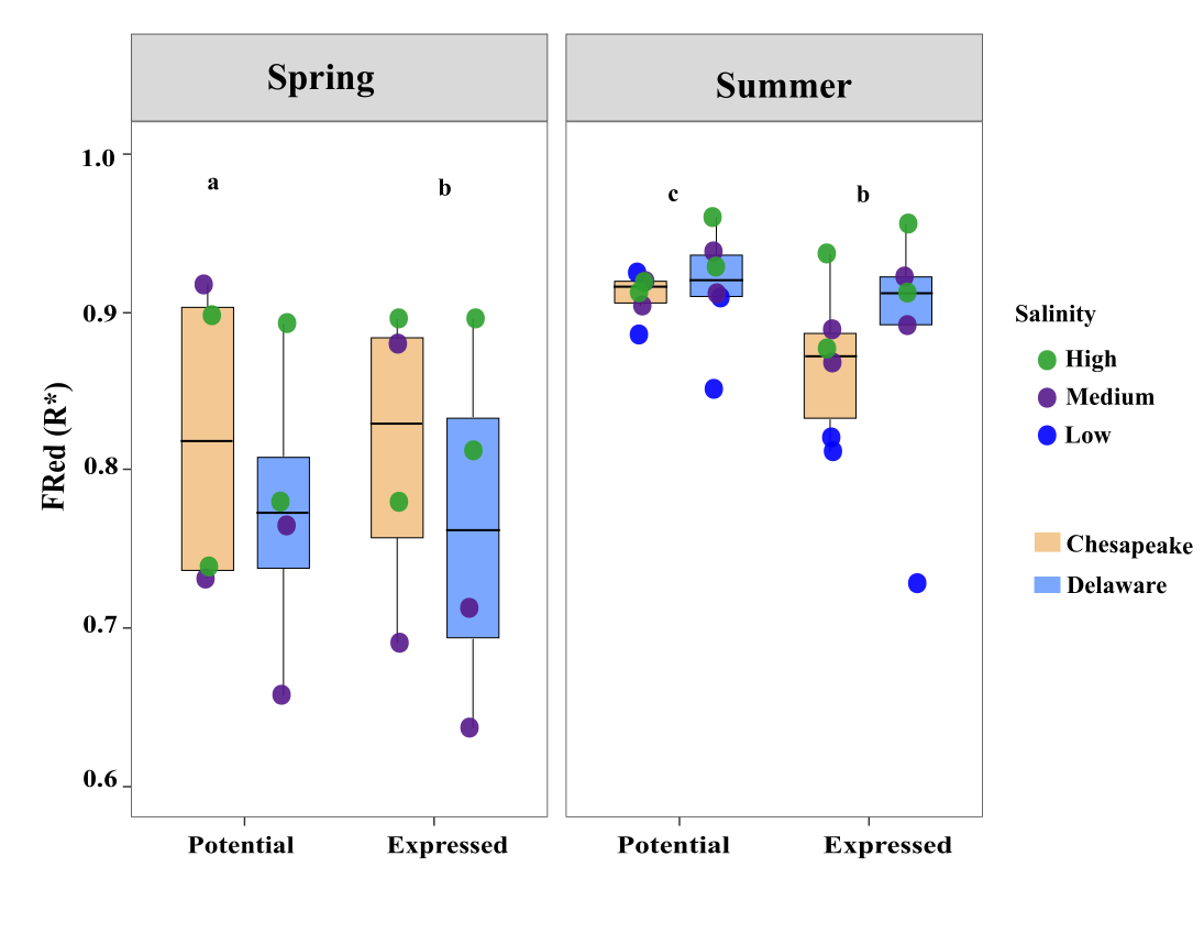
Re-working Figure 5: Visualizing Functional Redundancy (FRed) Across Bays, Seasons, and Salinity
Today I worked on the final revision of one of the main figures (Figure 5) in my manuscript on microbial functional redundancy (FRed).
The goal was to create a clean, publication-quality visualization comparing:
- Potential vs. Expressed FRed (R*)
- Across Chesapeake vs Delaware Bay
- Separated by Spring vs Summer
- Points colored by salinity (Low / Medium / High)
- Boxplots grouped by Bay
- And significance letters (a, b, c) added manually
🔧 Step 1 — Data Cleaning & Long Format Setup
df <- read_excel("pot_Fred_and_exp_Fred.xlsx")

df2 <- df %>%
  rename(
    Bay = Bays,
    Potential = potential,
    Expressed = Expressed
  ) %>%
  mutate(Expressed = ifelse(Expressed < 0.25, NA, Expressed)) %>%
  pivot_longer(
    cols = c("Potential", "Expressed"),
    names_to = "Type",
    values_to = "FRed"
  ) %>%
  mutate(
    Type   = factor(Type,   levels = c("Potential", "Expressed")),
    Season = factor(Season, levels = c("Spring", "Summer")),
    Bay    = factor(Bay,    levels = c("Chesapeake", "Delaware"))
  )
🔧 Step 2 — Final Figure (Boxplots + Salinity Colors + Significance Letters)
pd <- position_dodge(width = 0.8)

sig_letters <- data.frame(
  Season = factor(c("Spring","Spring","Summer","Summer"),
                  levels = c("Spring","Summer")),
  Type   = factor(c("Potential","Expressed","Potential","Expressed"),
                  levels = c("Potential","Expressed")),
  label  = c("a","c","b","c"),
  y_pos  = c(1.02,1.02,1.02,1.02)
)

ggplot(df2, aes(x = Type, y = FRed, fill = Bay)) +
  geom_boxplot(
    width = 0.55,
    color = "black",
    outlier.shape = NA,
    position = pd
  ) +
  geom_point(
    aes(color = Salinity, group = Bay),
    shape = 16,
    size = 4,
    alpha = 0.9,
    position = position_jitterdodge(
      jitter.width  = 0.10,
      jitter.height = 0,
      dodge.width   = 0.8
    )
  ) +
  geom_text(
    data = sig_letters,
    aes(x = Type, y = y_pos, label = label),
    inherit.aes = FALSE,
    size = 6,
    fontface = "bold"
  ) +
  scale_fill_manual(values = c(
    "Chesapeake" = "#f3c892",
    "Delaware"   = "#7ba7ff"
  )) +
  scale_color_manual(
    breaks = c("High", "Medium", "Low"),
    values = c(
      "High"   = "#2ca02c",
      "Medium" = "purple4",
      "Low"    = "blue"
    )
  ) +
  facet_wrap(~ Season, nrow = 1) +
  coord_cartesian(ylim = c(0.6, 1.05)) +
  labs(
    x = "",
    y = "Functional Redundancy (R*)"
  ) +
  theme_bw(base_size = 16) +
  theme(
    panel.grid.major = element_blank(),
    panel.grid.minor = element_blank(),
    strip.text  = element_text(size = 18, face = "bold"),
    axis.text.x = element_text(size = 14, face = "bold"),
    legend.title = element_blank(),
    legend.text  = element_text(size = 12)
  ) +
  guides(
    fill  = guide_legend(override.aes = list(shape = NA, color = NA), order = 2),
    color = guide_legend(order = 1)
  )
🎨 Step 3 — Final Touches in Adobe Illustrator
After saving as an SVG, I edited:
- Font sizes
- Gridlines
- Box spacing
- Alignment
- Exported at 300 dpi
📌 Summary
This workflow produced a clean, publication-ready figure:
- Chesapeake vs Delaware
- Seasonal contrast
- Salinity structure
- Potential vs expressed redundancy
- Added significance letters (a, b, c)